Chevrolet Logo
Chevrolet today is one of the most successful brands that has a wide range of models. Due to its popularity, this brand is sold all over the world, and to simplify deliveries and reduce prices, production facilities are located in different countries. Powerful SUVs, playful and distinctive sports models, as well as supercars are produced for the American buyer. Buyers from other countries were offered budget cars of South Korean or other local production under the logo of an American company.
Meaning and History
The history of cars of this brand begins in 1911. It was at this time that the first Chevrolet Classic-Six car was produced. The first head of Chevrolet was Louis Chevrolet, a well-known racer who represented the interests of the French car factory in the United States. From the very beginning, Chevrolet was part of the General Motors concern, which was created by William Durand. It is with the friendship between Chevrolet and Duran that the history of the creation of Chevrolet cars begins. For the American market, they continue to produce expensive models that have brought the company the greatest popularity. South Korea is currently in charge of serial production and budget segment cars. Many Chevrolet models have managed to create a cultural resonance around them that lasts for years. In 2021, Chevrolet introduced all-electric car models.
1911 – 1913

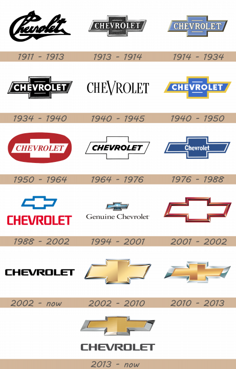
The initial logo was more of a signature, featuring the brand’s name in thick, cursive writing. It was completely black.
1913 – 1914
Chevrolet vehicles have been associated with the famous bowtie emblem since 1913, which makes it one of the longest-standing logos in the world. But how did it originate?
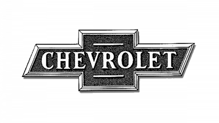
The 1913 design was the first instance of Chevy’s bowtie emblem. It was essentially a cross with a stunted vertical line and a long horizontal one. The latter was cut at an angle at both ends. The word ‘Chevrolet’ was written in big and bold serif letters. The entire logo was black-and-white.
1914 – 1934
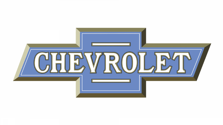
This version is the same design, yet colored. They converted the inner parts into pale blue, and the edges became greyish-brown. The text was given a white appearance with grey borders.
The first Chevrolet cars bore a rather simple signature of the founder, Louis Chevrolet. However, the company was looking for an eye-catching emblem that would propel the brand to success and it didn’t take them long to introduce the cross-like bowtie logo. However, there is no single confirmed theory explaining the origin of the emblem.
According to the company’s co-founder, William C. Durant, he found inspiration in a wallpaper design while staying at a Parisian hotel.
Yet, his family members disapproved of this theory as his daughter stated that Durant had designed a sketch of the logo while having a family dinner. His widow suggested he had found an attractive logo in a newspaper back in 1912 while being on holiday in Virginia. That logo, shaped as a bowtie, was the base for Chevrolet sign. The original newspaper was never found to prove this theory though.
Another version relates the iconic logo to the national roots of Louis Chevrolet. He was born to French parents in Switzerland and might have taken inspiration from the Swiss flag to create his own cross-like emblem. Anyway, the iconic Chevrolet logo was introduced in 1914 and has never left the american car company’s vehicles since then.
1934 – 1940
By 1934, the logo was turned into a mostly black drawing of itself. The previous designs had some semblance of volume, but this one seems flat. It’s jet black with some white bits, including parts of the border and letters. The font also switched to a regular bold sans-serif.
1940 – 1945

This logo features solely the brand’s name, written in tall, capital letters. This style uses thin, serif characters colored completely black. The letter ‘V’ is notably bigger than the other letters.
1940 – 1950
The 1940 logo uses the 1934 design as basis, except they colorized it and made it cleaner. The inner sections are bright blue, while the edges (now thicker and homogenous) are bright yellow.
1950 – 1964
This time, they took the same bowtie figure, turned it white and placed it inside a red ellipse, making it look vaguely like a Swiss flag. Lastly, the word ‘Chevrolet’ was placed inside the emblem, on its usual place. The style changed to red letters of a typical bold sans-serif font. They were also tilted slightly.
1964 – 1986
After 1964, they used a very simple, black-and-white version of the same bowtie. It’s now a white figure with a thin black border. Furthermore, the letters inside turned to very bold sans-serif. These were also tilted, as well as black.
Through late 1970s it was designed in black and white colors and bore Chevrolet name inside.
1976 – 1988
The logo was painted blue in 1976 but held on to the inscription till 2000 when another change of color occurred.
This extra emblem was a blue version of the bowtie emblem. It had a double edge of white and blue. The name was reduced to a small inscription near the center, unlike the previous text designs that spanned the whole width of the cross. Unlike them, it was also not completely capitalized.
1988 – 2002
This logo uses the bowtie figure, but only as a small blue outline above the name ‘Chevrolet’. The latter is the centerpiece of the logo: a collection of tall, red letters. Together, they are about 2 times the width of the emblem above. The font is a sleek, bold sans-serif with rounded curves.
1994 – 2001
The 1994 logo uses a similar concept. For it, they introduced a realistic Chevy badge with a metal edge and a peculiar coloring inside. It looked like a bunch of thin rays, radiating from the center. That included black, white and blue lines. The writing also changed to ‘Genuine Chevrolet’, written in black letters of a typical serif font.
2001 – 2002
The 2001 logo was now solely the frame of the bowtie. They gave it a red edge that looked deeper thanks to the inclusion of an inner wall of the border, visible throughout the emblem.
2002 – today

This is the general use inscription they used for their brand since 2002. It was incredibly similar to the name featured in the 1988 design, but stretched wider and colored black instead of red.
2002 – 2010
The millennium emblem was designed in different shades of gold color, symbolized enthusiasm, paired with excellence and stood out among other car logos.
This one includes only the bowtie, without the names anywhere. It’s gold inside and with a silver frame all around. Notably, they gave it a lot of volume, as well as heavy illumination.
2010 – 2013
The update, introduced in 2010 to commemorate the company’s centennial anniversary, saw the logo turn more vivid and get attractive polish.
The 2010 evolution seems not as tall as its predecessor, but it’s mostly because they enlarged the edge at the expanse of the inner section. They also brightened the color scheme, but changed little else.
2013 – today
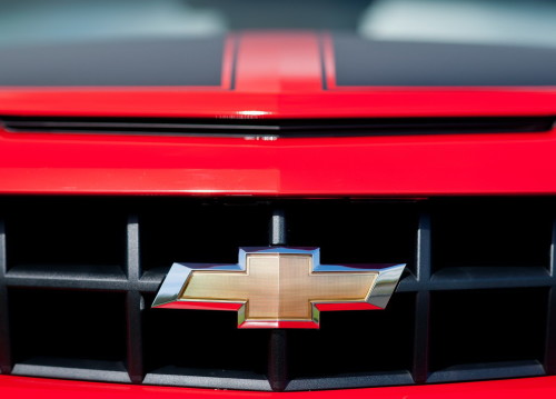
The 2013 logo uses the same bowtie as before, but it was turned visibly more realistic. They got rid of the excessive lighting and granted it a more natural-looking texture. Below, there is their name in the usual writing, but colored dark grey rather than black.
Description
Chevrolet has one of the most recognizable logos in the world and it has changed little through the history. It is often described as a cross and is known in North America as a bowtie. However, despite featuring two intersecting patterns, the logo has little to do with both cross and bowtie. The horizontal parallelepiped is overlapped by the square to form a cross-like figure. It is painted yellow and gold and is easily associated with one of the biggest car brands.
Shape
Chevy logo’s shape has remained virtually intact since 1914, giving the idea of consistency, tradition and recognizable image to the customers over the decades. Commonly known as ‘The bowtie’, the logo basically features two thick stripes, overlapping each other in the shape of a cross. The horizontal bar that used to bear the name of the company on earlier versions is designed as a rhomboid.
Emblem
The famous Chevrolet logo is designed in gold and yellow colors, decorated with a silver border. Such vivid colors stand out the brand’s logo and call for enthusiasm and strength. The company’s name beneath the logo is written in black letters. Yet, the present colors have only been used since the beginning of the 21th century. Before that, the emblem used to be black and white or blue.
Official Chevrolet website: www.chevrolet.com
