Mercedes-Benz Logo
![]() Mercedes-Benz Logo PNG
Mercedes-Benz Logo PNG
However, the life journey of the brand started in 1926, when Daimler-Motoren-Gesellschaft merged with Benz & Cie, thus competition turned into partnership, and the brand of Mercedes-Benz was born. It took its name after the daughter of an Austrian car-seller and racer Emil Jellinek.
Ferdinand Porsche, who became the engineer of the startup, fully renovated the working program, and last models of Daimler became the basis of the first Mercedes-Benzes. S and SS sports series were produced under his command. Afterwards, in the 1930s, the company manufactured a 770 model, which was a success among Nazi leaders.
Mercedes is a big league producer of most luxury and comfortable vehicles, the car brand of ultimate recognition, development engineering and first-class performance. It is a most long-standing automobile brand, and its journey began in 1886, when Karl Benz manufactured the first gasoline-powered car. The first cars under its name were sold in 1901, and soon the first racing car, Blitzen Benz, was produced.
The company’s producing facilities were critically destroyed during World War 2, but soon it managed to recover. As consequence, first models with diesel engines appeared in the postwar time.
By the end of the 1960s, the brand gained the worldwide recognition. In 1973, Mercedes-Benz was subjected to a test, as due to the oil crisis car sales keenly went down. But in response to such a situation the producer succeeded in the designing of the most reliable model series in the history of the brand — W123.
In the beginning of the 1980s, the company enters a new niche — the market of off-highway trucks, with its offroader Gelandewagen, which earned fame for its all-terrain and reliability. In 1999 another groundbreaking event for Mercedes took place: it bought AMG that had been its official tuning company. That permitted them to produce luxury modifications of some Mercedes series, and to produce their own racing car — Mercedes-Benz CLK GTR.
This car manufacturer keeps producing flagship models of cars, tirelessly improving its advanced technology and stylish outside appearance, as “The Best or Nothing” is its slogan. This unrivaled miracle worker rules the world of automobile manufacturing turning the heads of other carmakers and setting the high standard for them.
Meaning and History
![]()
For over a century Mercedes’s three-pointed star encircled into an orbit masterminds conservatism, reliability, first-class performance and breakthrough engineering. Although the evolution of the logo comprises more than 120 years, most of its life it has been represented by today’s badge — the triangle star, one of most well-known logotypes in the car industry.
1902 – 1909
![]()
The first edition of the logo, the word “Mercedes” surrounded by an ellipse, appeared on cars manufactured by Daimler, its predecessor, in 1902.
The name uses white letters in a peculiar style. They are tall, narrow and vary in size: they get smaller the closer they get to the tips of the figure. Other than that, it’s a regular enough sans-serif.
1909 – 1916
![]()
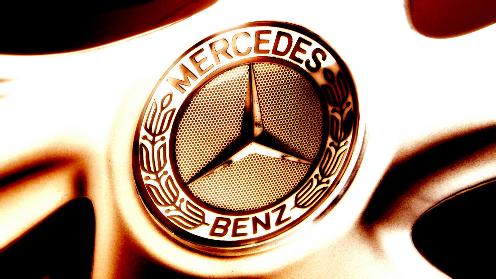
The logo, used by the legendary automaker in the 1910s, featured a black-and-white roundel with a thick frame, where the white wreath was drawn against a black background. As for the central part of the logo, it had a white background and a black stylized uppercase “Benz” inscription in a fancy custom font with some sharp serifs and arched bars of the letters.
1909 – 1916
![]()
After a while, the company introduced a new brand logo in 1909 — the glorious star of three points. Technical Director of Deutz, Gottlieb Daimler, designed it. He drew this badge on a postcard, which he mailed to his wife as far back as in 1872, vowing that one day this image would become the symbol of a car giant.
In short, it resembles a 3-tip star, colored in various shapes of gold. Each line has two sides, creating a sense of volume.
The next emblem is a circle of white and black. The very core is a round white area, surrounded by a thick layer of black. The former includes the word ‘Benz’, written in tall black letters with decoratively sharp tips here and there. They vary in size, like the previous design, but some are also heavily warped in shape to fit well into a limited circle. The outer frame, for its part, accommodates a white laurel wreath.
The redesign of 1909 introduced an elegant and ornate circular badge in black and white, with a bold stylized “Benz” lettering in a fancy font with elongated and sharpened tails, written against a white background in the center of the logo, enclosed into a thick black frame with a leafy white pattern around its perimeter.
1916 – 1926
![]()
He created it as the attribute of class and perfection, meaning that three points of the star stood for the Mercedes’s dominance over land, air and sea, as its vehicles run in all the three environments. It was registered as a trademark, and one year on it was taken as the logo for cars. The emblem was put into a circle with four little stars above the circumscription “Mercedes” on its bordure in 1916.
1926 – 1933
![]()
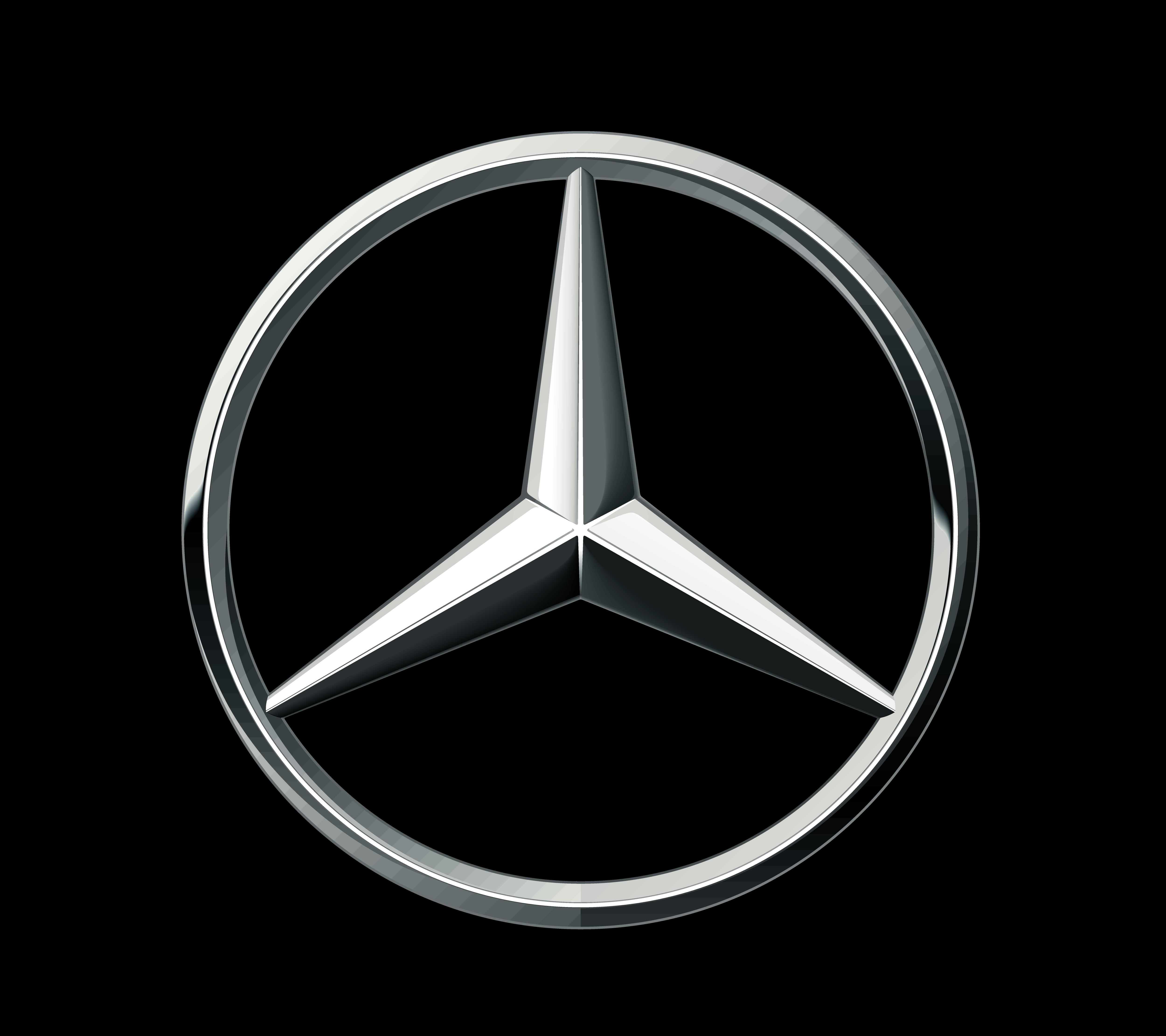
In 1926, after the merging of Benz and Daimler, which resulted in the inception of a new german automobile brand – Mercedes-Benz, the actual trademark was finally developed. It is a star of three pikes embosomed with a bordering with laureate wreath and the brand name on it, which still designates Mercedes cars. Since then the logo has experienced insignificant amendments, the bordering of laurel wreath morphed into an unpretentious circle.
1933 – 1989
![]()
The following Mercedes emblem depicts the same star, placed inside a thin ring, as seen in the center of the previous design. Unlike then, the logo is an entirely black silhouette that lacks any other details.
1989 – 2009
![]()
The following logo uses the same combination of star and a ring. However, this time they made it look as if made from metal. What’s more, it seems excessively chromed, what with all the shading and lighting effects. There is also much more volume in this variant – the lines of the star are once more double-sided, for starters. Beneath, there is the name ‘Mercedes-Benz’, written in white, thin letters of a serif typeface.
2009 – today
![]()
By 2009, everything in the emblem became thicker and wider. As such, it’s become more prominent and bulky. The color scheme also changed to a greyer specter. The name bit beneath was enlarged, but suffered no other changes.
Emblem
![]()
![]()


-
 Taiwan car brands
-
 Romanian car brands
-
 Czech car brands
-
 Spanish car brands
-
 Dutch car brands
-
 Indian Car Brands
-
 Canadian Car Brands
-
 Russian Car Brands
-
 Swedish Car Brands
-
 Italian Car Brands
-
 American Car Brands
-
 Japanese Car Brands
-
 European Car Brands
-
 Chinese Car Brands
-
 Korean Car Brands
-
 Australian Car Brands
-
 British Car Brands
-
 French Car Brands
-
 German Car Brands