Honda Logo
Honda Motor Company Ltd. (HMC) is one of the largest motorcycle and automotive manufacturers in the world. For more than 70 years, the Japanese manufacturer has managed to produce successful cars and successfully compete with industry titans like Mercedes, Toyota, and BMW. The Honda logo has achieved worldwide success and recognition for its impressively reliable vehicles. Also, the developments of this brand were repeatedly bought or borrowed by other brands, while the founder, Soichiro Honda, is still considered an outstanding engineer. The patents of a talented self-taught designer brought millions, worldwide fame, and helped to modernize the production process. Honda surprised the world in 2000 with the introduction of the friendly Asimo humanoid robot. The robot could walk and recognize human speech. The practical purpose of creating a robot is research in the field of automotive safety, although it can also help in everyday life.
Meaning and History
Soichiro Honda felt great passion for cars since he was a little boy. He was interested in everything connected with mechanics and auto producing industry. Not surprising that this self-taught gifted engineer always wanted to run his own auto making factory. In spite of all obstacles and downs throughout his career he was eventually noticed after designing his own pistons rings which made it possible for him to win a contract with Toyota.
After WWII he eventually decided to set his own small motorbike company with further establishment of the Honda Technical Research Institute in Hamamatsu, Japan. His motorcycles became very popular over the globe which helped him to obtain good reputation and fame. This was the starting point of Honda Motor Company development. People still argue over the exact date of brand’s foundation. What is known for sure is that the company proved to be the largest motorcycle producer in the world by 1963.
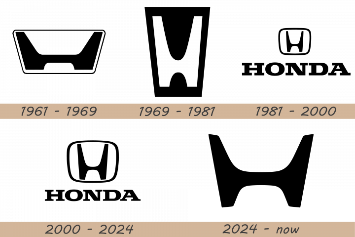
1961 – 1969

The initial logo uses a trapezoid shape as its base. It’s essentially a rectangle with rounded corners that grows slightly narrower further down. The inner section is mostly white, except for a big black ‘H’. It’s not the usual typographic ‘H’. The outer sides of both sides are perfectly parallel with the sides of the trapezoid. The bars are thick, and their other sides go down at a larger angle. The two bars are connected by a central line close to the bottom.
1969 – 1981

The second badge uses a similar trapezium figure, but fully black and much narrower. The letter is now white, but the form is pretty consistent. It is much narrower, as they didn’t compromise on the height. As such, the central like is much less pronounced, making the letter curvier in that area.
1982 – 2000

The 1982 logo uses a very similar ‘H’. This one is slimmer, almost upright and placed inside a more regular square. The square has rounded corners. It has a white core with a black outline, and the letter is located in the center of that core, colored black. Beneath it, there is the brand’s name, ‘Honda’, written in a much less exotic way. The letters are capitalized, black, and the font is just a blocky serif.
2000 – 2024
This was the time to conquer other segments and expand its influence on the entire industry. That is why the logo was essential for such purposes. Honda japanese car brand introduced a simple yet recognizable logo, consisting of an “H” letter embedded into a trapezoidal from. Now the Honda symbol is one of the most recognizable and eminent badges in automotive market. It represents magnificence, durability and confidence of every vehicle produced under company’s name.
2024 – Today
The image is the simplistic yet iconic emblem, recognized globally as the representation of the Honda brand. The logo is comprised of a bold, uppercase ‘H’ that stretches beyond its usual proportions, with extended vertical bars and a tightly fixed crossbar, manifesting the brand’s stability and strength. The ‘H’ is enveloped in a rectangular figure with soft, rounded corners, which adds a touch of modernity and approachability to the design. This emblem is often seen in a metallic sheen, symbolizing innovation and the cutting-edge technology that Honda is known for in their automotive and machinery products. The stark black and white contrast used in this version of the logo ensures high visibility and instant brand recognition.
The emblem portrayed in the image is a masterful blend of tradition and contemporary design. The bold ‘H’ at its heart is more than a letter; it’s a symbol of heritage, standing tall and unwavering, much like Honda’s reputation in the industry. The surrounding border, with its softened edges, provides a modern contrast to the rigidity of the ‘H’, suggesting that while Honda is rooted in its traditions, it remains adaptable and forward-thinking. This logo encapsulates Honda’s commitment to innovation while honoring the principles that have guided the company since its inception.
Description
The Honda logo depicts attractive and stylish letter ”H” inscribed in Roman style which gives it a simple yet eye-catching look. Another feature that makes this badge so popular in comparison with others is its bold font.
Shape
Honda has various logos for different departments. But all badges have one single basic which is confined in letter “H”. For example, Honda motorcycles have the famous Honda Wings badge while letter “A” can be found on the bodies of Acura autos. It actually looks more like reversed letter “H”. Traditional badge is broader on top and thinner at the bottom.
Color
The Honda symbol features liver-grey metallic tone that adds inspiring and radiant look for the logo. At the same time it looks simple, elegant and stylish. Such combination represents the philosophy of the brand which is based on magnificence, durability and confidence.

