Citroen Logo
![]() Citroen Logo PNG
Citroen Logo PNG
Citroen is a well-known French brand headquartered in the cultural capital of the world, Paris. The company is part of the Peugeot-Citroen concern. Not so long ago, the company began active cooperation with the Chinese company Dongfeng, thanks to which the brand’s cars received high-tech equipment. The company’s offer has a lot of interesting cars with exciting powerful aggregates and unusual design features. In Europe, these cars are considered a budget class.
Meaning and History
![]()
Andre Citroen, once the technical director of the French company Mors, founded his company in 1917 in Paris and introduced the first Citroen model “A” car in 1919. After 10 years of producing unremarkable cars, he took up risky traction avant project. Andre Citroen, who died in 1935, made a name for himself as a chevron gear manufacturer. Over time, it became the emblem of the company’s cars. The company has always been pursued by financial risks. Eventually, in 1974, Michelin, the new owner, was forced to sell the Citroen to Peugeot. By the end of the 80s, each new Citroen project was accompanied by a parallel Peugeot model. The individuality of the machines has practically disappeared. Nonetheless, by this time, the Peugeot-Citroen group had become the largest French car manufacturer and was ahead of another French giant – Renault.
1919 – 1922
![]()
Citroen logo that first saw the world in 1919 has turned into one of the most iconic emblems, associated with engineering innovations and exquisite French style. Introduced by the company’s founder and outstanding engineer Andre Citroen, the famous double chevron represented the paired helical gears that he developed and patented. The logo looked like a reversed pair of ‘V’ letter or two arrows facing upwards. At the time of the company’s foundation, Citroen became the leading European car manufacturer and the first mass car maker outside the United States.
1922 – 1932
![]()
It’s essentially the same oval emblem, but colored yellow and placed inside a dark blue octagon. The latter reflects the proportions of the former.
1932 – 1935
![]()
This secondary emblem used an orange circle as a base. Inside of it, there were the same two lines. Unlike the previous designs, these went slightly beyond the circle’s boundaries. The logo’s center was occupied by a rough depiction of a swan swimming in dark blue waters. The waters also held some written bits, including the name ‘Citroen’ in bold capitalized letters.
1935 – 1959
![]()
The company has embraced engineering genius with sophisticated marketing vision in becoming arguably the most innovative car manufacturer. Citroen has introduced or developed such automobile concepts as front-wheel drive, unitary frameless body, independent suspension, self-levelling hydraulic suspension, disc brakes, adaptive headlights, aerodynamic design and many more. The French company stood behind the creation of true sales and service network.
1959 – 1966
![]()
The 1949 logo depicts the same two V-like marks. This time, they made them even more acute and gave them a semi-realistic look with several sides of varying shading. These were then placed in front of a thin grey oval. The other elements from previous designs aren’t present.
1966 – 1985
![]()
Through the glorious history of the brand the double chevron logo has always accompanied its vehicles. The first emblem featured a double helical gear embedded into an oval frame. It was designed in navy-blue and yellow colors. Citroen stuck to this color scheme through mid-1980s, but played with the background and shape of the frame.
1985 – 2009
![]()
In 1985 Citroen redesigned its emblem, introducing the red background and making the white chevrons look sharper than ever.
They arranged this emblem in the shape of a square and added the company wordmark beneath. It was written in a pretty regular sans-serif with bold, capital letters.
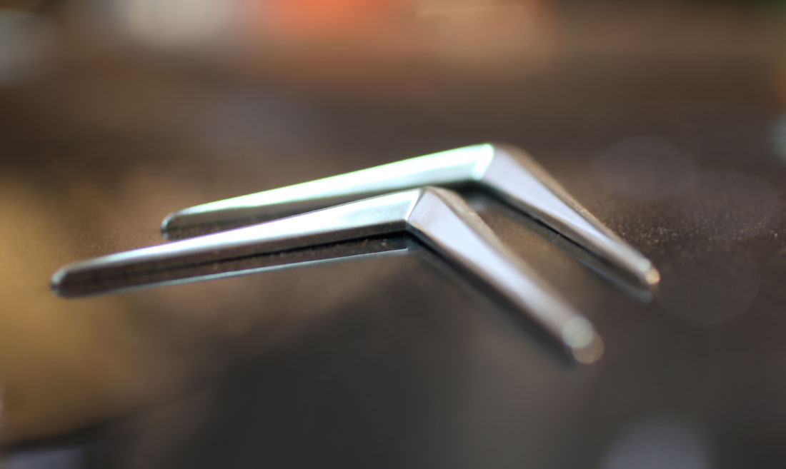
2009 – 2016
![]()
The modern three-dimensional emblem, launched in 2009 to mark the company’s 90th anniversary, was designed in silver color with black shades and saw the chevrons blur the edges and become smooth. The Citroen inscription below the logo completes the emblem.
In particular, they made the font smoother and rounder. Moreover, the color switched from black to red.
2016 – 2019
![]()
By 2016, they simplified the previous logo into a collection of largely grey shapes. The writing didn’t change a bit, save for the mentioned recoloring. The layout of the chevrons didn’t change, but they did take on a new appearance. They were the same shapes but got rid of the excessive shading and complex coloring. The inner bits were largely white, with a streak of grey along the left side to signify shading. The borders were also grey.
2019 – 2022
![]()
The Citroen logo redesign, held in 2019, has refined and strengthened the previous version of the badge, switching its color palette to a darker one and cleaning up the contours of all elements, making the lettering more compact and stable.
2021 – 2022
![]()
In 2021 the French automaker came up with a new logo. It was a solid black chevron emblem placed in the left of a heavy enlarged uppercase lettering in an extra bold sans-serif typeface with some interesting elements in the characters, such as a slightly arched bar in the “R” and a curved diagonal of the “N”.
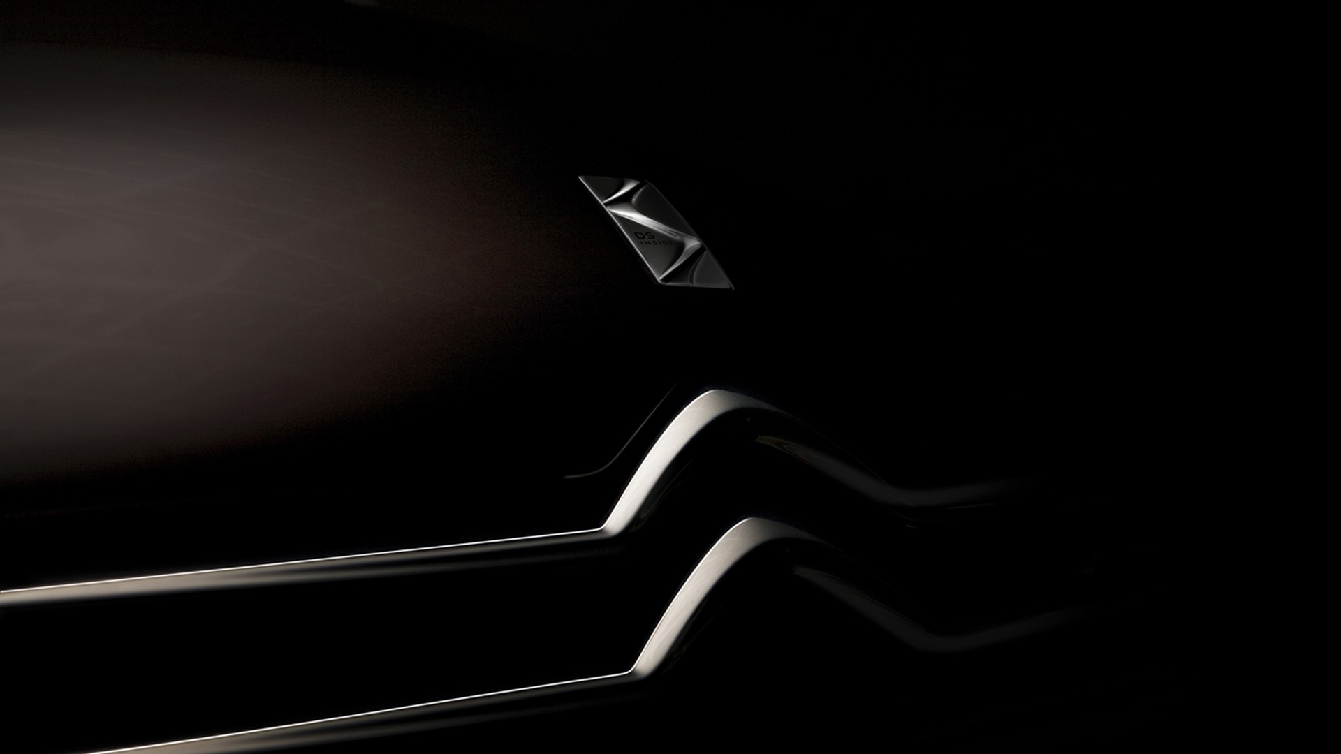
2022 – now
![]()
The Citroen logo redesign of 2022 has created a strong futuristic version of the iconic badge with the neat triangular double chevron inscribed into a vertically-oriented oval frame, set above a medium-weight uppercase logotype in a modern sans-serif typeface, with some of the characters set in the lowercase, and others — capitalized, but all featuring one size and style.
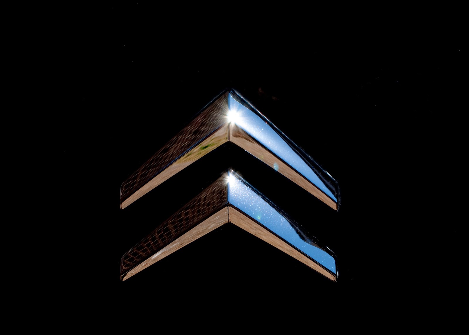
Description
The famous Citroen logo features a stylized image of double helical gears, paying tribute to Andre Citroen’s engineering background and early gear business. It also looks like a double ‘V’ sign, turned upside down, or a double arrow facing upwards. The logo is completed with a red Citroen inscription below it.
Shape
The earlier Citroen emblems featured simple double helical gears embedded into an oval. Later on they became sharper and acquired extensional form. However, the latest logo was given a softer, roundish look, with the ‘V’-shaped gears becoming three-dimensional. The Citroen inscription was redesigned in the new custom font, contributing to the new smooth corporate styling.
Color
![]()
Citroen logo’s color has changed through the history, with the combination of yellow and navy-blue being the longest-standing palette. The current 3D emblem, introduced in 2009, is silver with black shades, while the Citroen inscription is designed in red letters. Silver color gives the logo a modern and elegant look, with the red adding passion for car creation.
Emblem
![]()
![]()

![]()
Official Citroen website: www.citroen.com


-
 Taiwan car brands
-
 Romanian car brands
-
 Czech car brands
-
 Spanish car brands
-
 Dutch car brands
-
 Indian Car Brands
-
 Canadian Car Brands
-
 Russian Car Brands
-
 Swedish Car Brands
-
 Italian Car Brands
-
 American Car Brands
-
 Japanese Car Brands
-
 European Car Brands
-
 Chinese Car Brands
-
 Korean Car Brands
-
 Australian Car Brands
-
 British Car Brands
-
 French Car Brands
-
 German Car Brands