Nissan Logo
Nissan is a Japanese automobile company with a rich history and an excellent position in the market that continues to develop, cooperating with powerful global manufacturers. Today, the Nissan brand has a huge number of models, both for the external and domestic markets. The company’s assembly plants are scattered around the world. Nissan Concern has become one of the most powerful Japanese car manufacturers, offering customers cars in different classes and with different technical characteristics. Besides passenger automobiles, they also have commercial, trucks, spare parts, as well as satellite communication systems, sports boats, etc.
Meaning and History
From the foundation of the company in 1930s Nissan Motor Company produced both Datsun and Nissan-branded vehicles. However, according to the company’s policy, it was Datsun that provided cars for export markets and required a recognizable logo to advertise them. A simple yet clever logo was introduced — a blue rectangle with Datsun inscription in white letters, embedded into the red circle, reflecting the sun. It was a Japanese symbol and Datsun cars quickly became associated with the land of the rising sun. Nissan-branded vehicles mainly targeted the Japanese car market and a modest Nissan wording was sufficient.
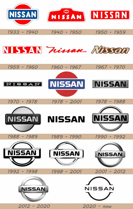
1933 – 1940
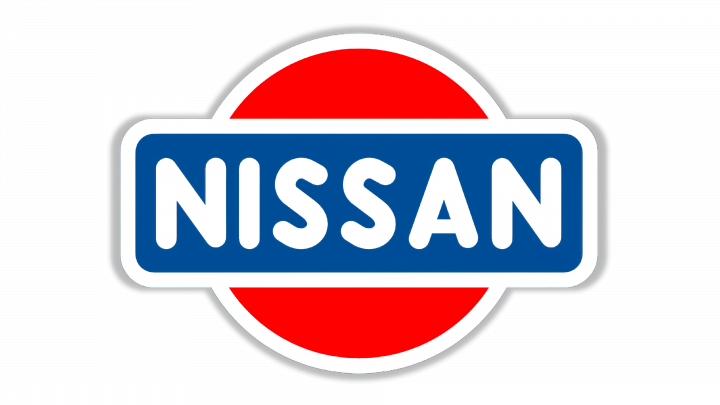 The earliest Nissan logo depicts a combination of two geometric figures. One is a red circle, a reference to the Japanese flag. The other is a blue rectangle in front of it. Both are smooth shapes with big white frames. Inside the blue one, there is also the name ‘Nissan’, written in white, capitalized sans-serif characters. The font uses tall, rounded letters.
1940 – 1950
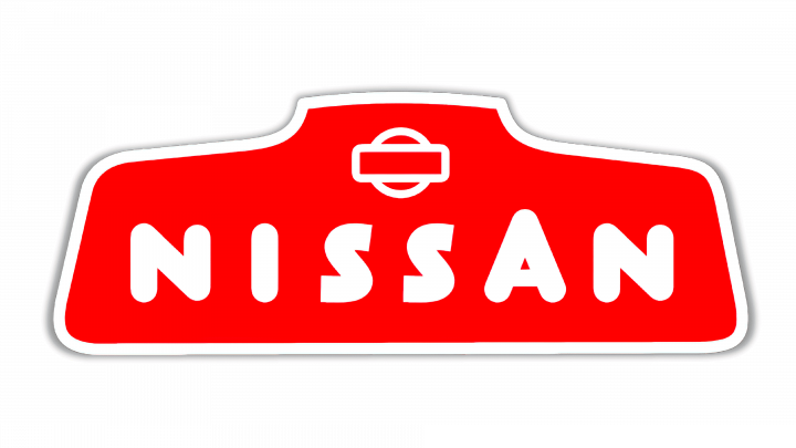 The next design follows a similar style, but with a different layout. The new main figure is a red trapezoid with a short extension at its top. It’s also rounded and outlined with a thick layer of white. Much of it is occupied by the company name. The letters are now bolder and different in a few aspects. Furthermore, they placed them further apart and made them shorter. Curiously, the previous geometric combination is represented in a smaller size near the top of the emblem, as a white outline of those two.
1950 – 1959
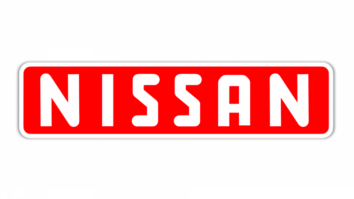 The 1950 logo is still a similar style. It’s now a long red rectangle with the same white border and rounded corners (albeit to a smaller degree, now). The only thing is this figure is the company name. The letters are now taller, but still far apart. The font is also more angular now, although the letters still look balloon-like.
1959 – 1960
 The 1959 design uses concepts of the previous emblem. It consists of the same letters, but bigger and much more angular. There’s almost no trace of the former roundness on them, but the general shapes are the same. They are no longer placed on some figure, but rather create a figure themselves. There is a thin outline around all of these, as well as streaks of red between them, which creates a vaguely rectangular shape.
1960 – 1967
 The 1960 emblem incorporates the brand name solely. It’s now just a red writing, done in a new font. The letters are cursive, seemingly lowercase and reminiscent of a hand signature more than anything.
1967 – 1970
 In 1967, they adopted a new style for their name wordmark. From the previous one, this design inherited the rough positioning of letters and a strong tilt all of them have. This time, however, the letters are smooth, artistic sans-serifs with a good deal of elegance. The color is beige, but there is a thick brown shadow.
1970 – 1978
1978 – 1988
1978 – 2001
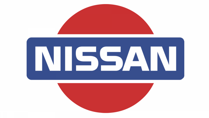
The company’s designers experimented with fonts and colors, but it was not before 1978 that Datsun division was discontinued and Nissan inherited the blue and red emblem. Slight changes were introduced to the logo and the company went on with using virtually unchanged emblem that had been active since 1932. However, the company was looking for new identity and a more elegant badge to keep up with the times.
1988 – 1989
The new logo was introduced in 1988 as the blue color was replaced with grey and the red circle turned silver.
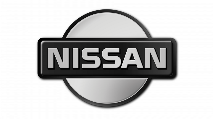
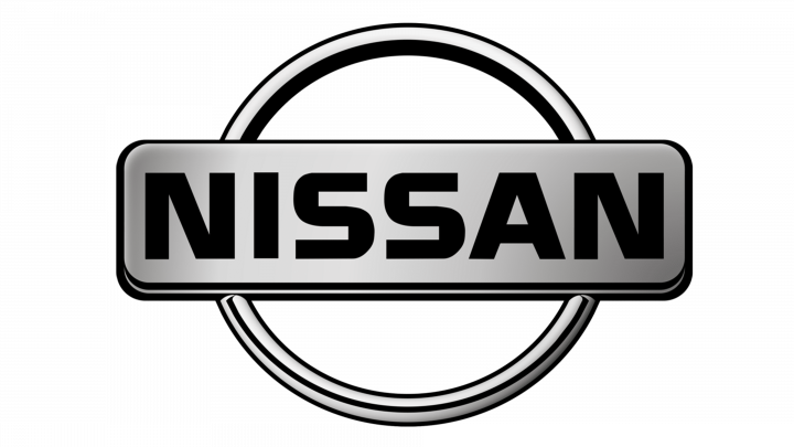
The 1988 evolution uses the same layout, but with some modifications. Notably, the color scheme switched to mostly black and grey shades. The circle now looks metallic, and they gave it a new black frame. The nameplate also received one, instead of the previously blank outline around it. The letters are still the same, although they look like they have a slight relief.
1989 – 1990
A stylish Nissan font was used as a logo from 1989 to 1990.
The next design uses the wordmark from the previous three logotypes, almost unchanged, save for the coloring. This time, the letters are completely black.
1990 – 1992
Shifting back to the rectangle and a circle in 1990 Nissan painted the logo black and white.
This one is another black-and-white variant of the same figure combination. In this one, there are only two prominent figures. One is the same nameplate. This one, they made it look even more metallic: grey with a good degree of shading, encased in a black border. The other is a ring that served previously as a frame for the circle. The circle is now gone. In fact, they made both these elements seem inclined forth – both show their undersides to increase the sense of volume and depth.
1992 – 1998
The circle merged with the horizontal block, when the company’s takeover by the French automaker Renault in late 1990s, Nissan was going through major restructuring to make it through financial difficulties.
This is essentially a black-and-white drawing of the previous design. They took some liberties. For instance, the inclination effect is no more. The nameplate has additional facets all around it, which connect to the ring above and below. The ring is also much wider now. Lastly, the coloring switched to plain black and white, distributed artistically.
1998 – 2001
The emblem was part of this process as the stylish and modern silver and black logo guided the company into the new era.
The same details are true for this design, but there are also some modifications. Namely, it’s drawn with more nuance in mind, and the spots of black are less common now. The facets are also smaller in size, and the ring is visibly slimmer.
2001 – 2012
The circle and rectangle disintegrated to add sharp and elegant look.
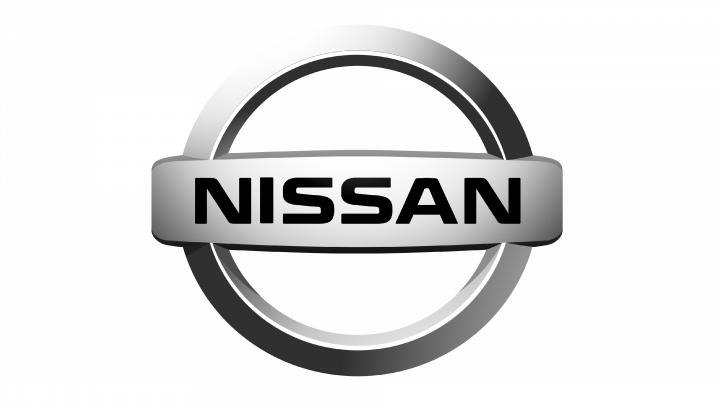
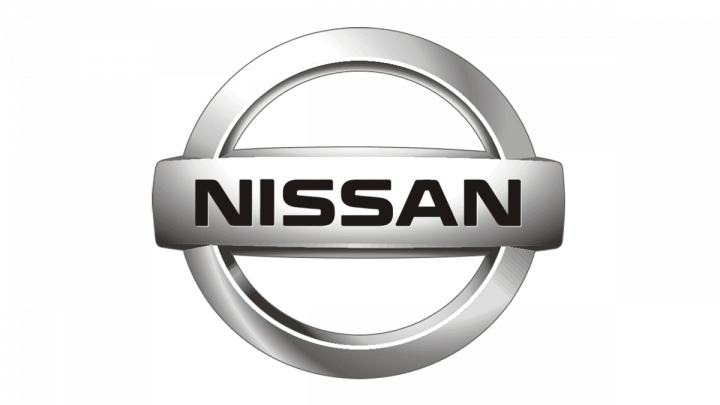
By 2001, the design was implemented in 3D. They made both elements look like metal parts, but the layout and details are largely unchanged. The ring is now much wider than before, while the nameplate is visibly rounder and with even smaller facets all around. There’s also a good degree of shading effects now. The letters stay unchanged from their first appearance many years before.
2012 – 2020
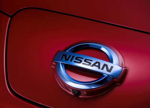
The update from 2012 saw the logo acquire gradient shades of silver and grey. Matched with the company’s new slogan, ‘Innovation that excites’, the emblem reflect the brand’s new identity but refers to long-standing traditions. Today Nissan cars are recognized for quality, innovation, elegance and have leading positions in many global markets.
2020 – today
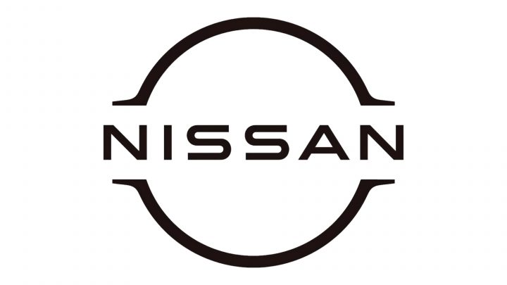
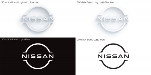
The 2020 is a futuristic reimagining of the previous designs. They took two halves of the same ring, made it thinner and turned it into a 2D silhouette of itself. It also extends into small horizontal stunts from all four tips – a remnant of the nameplate, which is now gone. The name is still largely where it was, although the letters now have larger gaps between them, and they go beyond even those stunts that symbolize the boundaries of the former plate. Furthermore, the letters are thinner. Other than that, it’s the same font.
Description
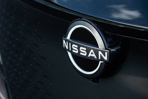
One of the global leaders in car manufacturing, Nissan inherited the logo from its predecessor and sister company Datsun in 1984, replacing ‘Datsun’ inscription with ‘Nissan’ one. Ever since their emblem has consisted of a horizontal block with the company name, embedded into a circle. Several updates turned it into the emblem, recognizable around the world. The silver elegant sign is associated with Japanese quality, innovation and elegance and powers the company to success.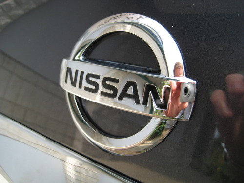
Shape
Like its predecessors, the present Nissan emblem features two simple geometric shapes — a horizontal rectangle with Nissan inscription and a circle overlapping it. This has been a trademark shape of Nissan logos since the introduction of the first Datsun logo back in 1930s.
Color
The present Nissan logo is designed in different shades of silver and black to highlight excellence, sophistication, modernism and creativity of the brand. The word ‘Nissan’ inside the logo features the black font.
Emblem and Symbol
Official Nissan website: www.nissan-global.com
