Suzuki Logo
Suzuki Motor Co. Ltd. (Suzuki) is a Japanese automobile manufacturer that first engaged in the production of looms. Currently, it produces small and compact cars with increased cross-country capability. The wide range and quality of cars of the Japanese brand Suzuki ensured their high popularity among car enthusiasts around the world. In order to increase demand for this brand, assembly lines have long appeared not only in Japan but also in other regions. Many technical innovations, especially in the field of engine building, come to the brand’s cars from motorsport, in which Suzuki is one of the undisputed leaders.
Meaning and History
Suzuki was founded in 1909 by Michio Suzuki as a manufacturer of looms and soon turned into successful industrial enterprise. The company’s engineers made attempts to diversify the range of products and created several prototypes of motorized vehicles before World War II.
However, it was not before the end of the war that Suzuki entered the promising motor-vehicle business. Meeting huge demand for their two-wheel bikes, in 1954 Suzuki Motor Company introduced its first four-wheel vehicle, Suzulight 360cc. Four years later the company’s designers presented the iconic logo that was destined to become the brand’s representation for years to come. It was a mere black ‘S’ letter, featuring sharp edges which triggered associations with the Japanese culture.
The image was completed with four strokes, standing for wheels, which highlighted the brand’s entry to automobile business. In 1963 Suzuki Motor Co. entered the US motorcycle market. Later on Suzuki emerged as one of the global leaders in automotive business, particularly in Asian markets.
Today the Japanese car brand produces around 3 million automobiles and over 2 million motorcycles a year.
Its products are known for high reliability and low running costs. Also, they are closely associated with the famous ‘S’ logo, which has virtually remained unchanged since 1958. The first edition of the logo was designed in black color and had the company’s name below the image.
1909 – 1958

The base of the first logotype by Suzuki was the black letter ‘S’. The upper and lower ends were styled as wings. They were cut off the central bar of the letter, which looked like two eagle heads. In front of the letter there was a horizontal stripe where they placed the brand name, written in a fat sans-serif typeface with large letters and fewer gaps between letters.
1958 – today
Then it was replaced with a red one, which proved to be more appealing to large audience. That logo had the company’s name on the right side, printed in blue letters. Suzuki inscription later moved underneath the logo, however, the emblem itself remained intact.
The ends and the central bar became much simpler and received the sharp corners. The brand’s name, however, didn’t get major changes except for recoloring.
The logo of Suzuki Motor Corporation represents the company’s values, which is simplicity, high built-in quality and reliability.
Description
Suzuki logo is arguably one of the most long-standing and globally recognized emblems in automotive world. Introduced in 1958, four years after the first Suzuki car had been built, the emblem featured a stylized ‘S’ letter, the initial of the brand’s name. Completed with full Suzuki name, the logo has become an icon.
Shape
Suzuki logo is both simplistic and elaborate at the same time. It is difficult not to recognize the ‘S’ letter forming the emblem. However, sharp edges and chopped forms are definitely associated with the Japanese culture, reminding of samurai heritage and hieroglyphs. The company’s name below the logo is designed in customized Helvetica font.
Color
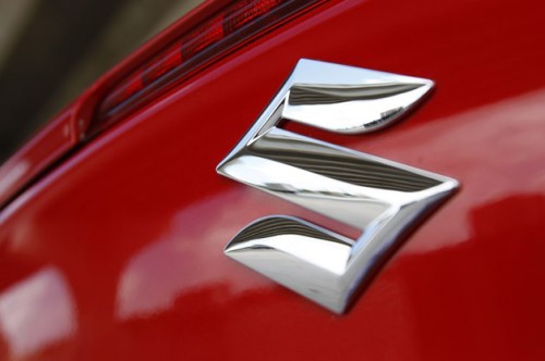
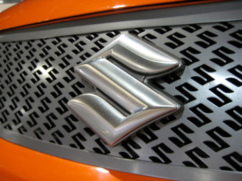
The present variant of Suzuki logo is designed in red and blue colors. The red color represents passion, integrity and tradition, while the blue stands for excellence and grandeur. The earliest Suzuki logo was designed in black and white palette. The emblem, seen of the company’s vehicles, is all silver.
Emblem
Official Suzuki website: www.globalsuzuki.com


