Chrysler Logo
Chrysler company was founded almost 100 years ago, but still remains in demand and is considered one of the most respected in its field. Despite many victories, defeats, and reorganizations, the brand is still well-known, takes an active part in public life, and develops a line of cars. The Chrysler brand is one of the so-called “Big Three” automobile manufacturers in the United States. Chrysler’s most popular model is the Pacifica full-size minivan. Today, Chrysler is renamed Fiat Chrysler Automobiles. However, this does not affect the original goals or development of the business. The reason for the renaming is simple: the transfer of a 100% stake in the American automaker to the Italian company Fiat.
Meaning and History
When Walter Chrysler united some great engineers to establish a new american automotive brand, he had a distinct idea to create affordable luxury passenger cars to compete with the best in the class, such as GM’s Cadillac and Ford’s Lincoln. They introduced innovative engineering solutions to put their cars ahead of the time. Soon Walter decided to establish the Chrysler Corporation that would embrace such companies as Chrysler, DeSoto, Dodge and Plymouth.
Chrysler division was meant to be an upscale make in the company’s hierarchy. Through the long history the brand has seen ups and downs and eventually merged with the Italian giants FIAT to become part of the FCA US. According to the Group’s plan, Chrysler is set to be marketed as a mainstream brand with certain premium features.
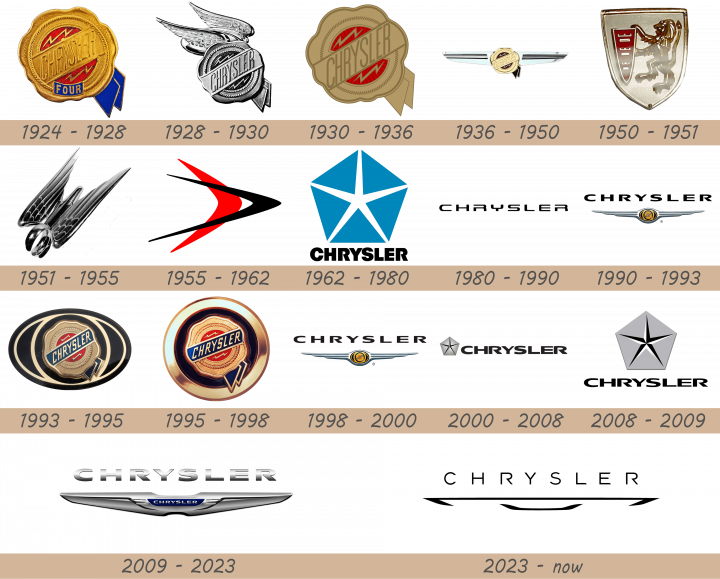
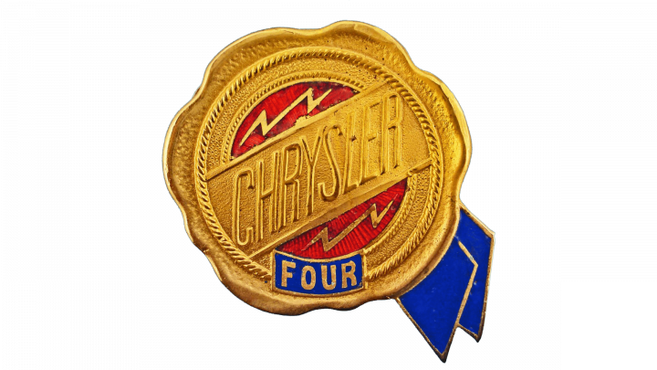
1924 – 1928
As a premium make in the Chrysler Corporation, Chrysler division required a special logo that would appeal to the customers. In 1924 Oliver Clark, who made part of the engineering team around Walter Chrysler, came up with two emblems that were meant to become the brand’s iconic symbols for years to come. The original logo represented a wax seal that symbolized the approval of Chrysler vehicles’ quality. It was matched with a blue ribbon in the lower right side.
Silver-winged radiator figure was another creation of Oliver Clark. The wings represented the speed of the Roman god Mercury. These two iconic symbols have always been associated with the company and were united into one logo at certain times. In 1930s the seal was placed in the middle of the wings for the first time. In 1940s Chrysler introduced a new emblem, with the seal placed onto a heraldic shield with a crown on top, Chrysler inscription and silver wings supporting it.
1928 – 1930
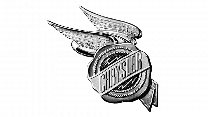
The first redesign was held by the company in 1928, and this is when Chrysler decided to add wings to its badge for the first time. Although, those were a very ornate and elegant wings, which looked more like the ones from the well-known drawing of the Hermes god. The badge was set in a cold silver color palette.
1930 – 1936
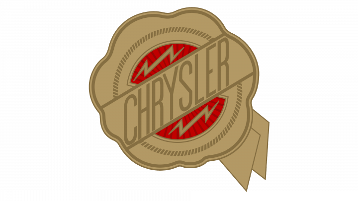
The redesign of 1930 brought back the gold shades to the Chrysler logo, as well as its original shape; with no wings. However, the logo still looked different from the initial one, as it was drawn in flat smooth shapes with no volume or gloss. Also, the name of the brand became more visible after the refinement of the logo design.
1936 – 1950
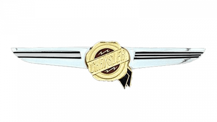
In 1936 the Chrysler roundel was placed on a thin and sleek silver banner, which was stretched horizontally, and resembled two wings, but completely different from the ones in the version of 1928. This logo has became a basis for sever future redesigns, including the most recognizable logo of the automaker in its history.
1950 – 1951
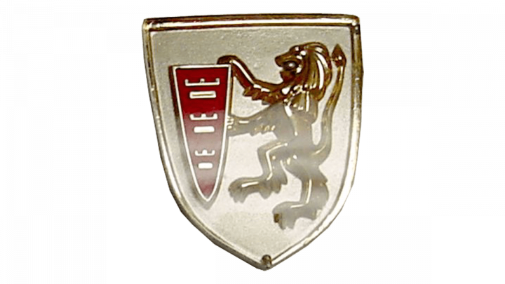
For several months in 1950 Chrysler was using the Peugeot logo, as the companies decided to merge. It was a fancy traditional crest with a glossy silver surface, where the Lion rampant was standing near the narrow and tall red shield with three silver elements and crowns above them.
1951 – 1955
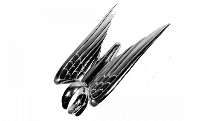
The redesign of 1951 was a bit of an experiment. The company introduced a voluminous bird with sharpened wings as its log, which was placed on the bonnets of the brand’s cars with no lettering or other attributes, present in all the previous versions.
1955 – 1962
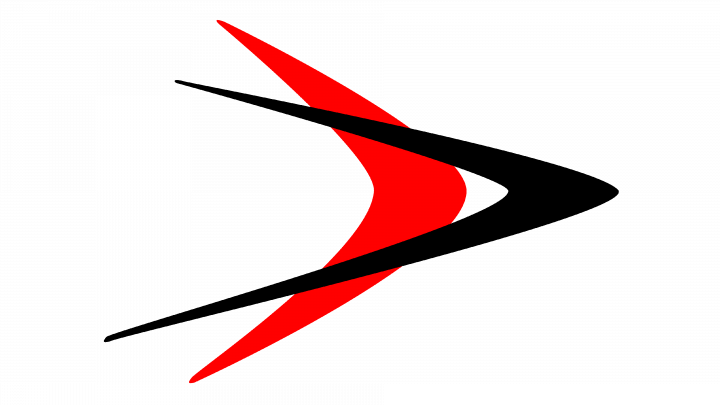
The 1955 emblem had two symbols that resembled the letter ‘V’. One was narrow, tall and black; the other – wider, shorter and red. They placed the former over the other and turned them counterclockwise by 90 degrees (they face right, basically).
1962 – 1980

The 1962 logo is a blue pentagon, whose corners act also as tips for a star, incorporated inside the figure. It’s white and rather thin. Beneath the pentagon, they placed the brand’s name in bold black letters. This style used only capitalized letters of a rather typical sans-serif font.
1980 – 1990
In 1980 the most minimalistic version of the Chrysler badge was created. It was a heavy uppercase logotype in a square designer typeface with interesting details in contours of the characters. The inscription could be seen in black or silver, depending on the placement, and was used on its own without any graphical support.
1990 – 1993
The logo, used by the company in the beginning of the 1990s, was composed of a heavy uppercase logotype and an elegant three-dimensional emblem with the iconic was seal in gold and red placed on a silver banner with the pointed ends, making up a composition with two stylized wings. This badge was only used by the brand for three years.
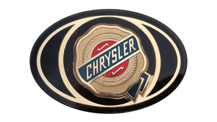
1993 – 1995
They started using a more elaborate image in 1993. It’s a black oval with the Chrysler’s badge inside. The badge is a golden circle with wavy edges and a blue stripe going at an angle through the figure. In that center, there is also a red round piece, much of which is blocked by said stripe. Around it, there is a spiraling, knotted ring acting as its edge. The rest of the big oval is occupied by the outlines of geometric figures: a golden oval and a golden ring inside it.
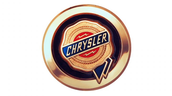
1995 – 1998
In 1995 the logo of the company was again redrawn in a costumer shape. All other elements, including the color palette, remained untouched, but with the more distinctive figure of the logo, it started looking balanced and professional, perfectly representing the automaker.
1998 – 2000
Later on Chrysler used different variations of the shields and silver wings. The famous Chrysler Pentastar emblem was used as a corporate symbol, but was not placed on radiator grills. It was used as a decoration on the hoods of several models instead. In 1980 Chrysler was experimenting with the fonts in search of a modern look, but came back to the roots and created another combination of the wings and the famous wax seal that decorated all the vehicles from mid 1990s. The seal was embedded into an oval that lied in between the wings.
2000 – 2008
The redesign of 2000 has brought back the iconic a Pentastar, but redrawn it in a more masculine and sharp way, with the blue triangles replaced by silver ones, and the white five-pointed star — by a black one. The emblem was placed on the left from the enlarged geometric logotype in black.
2008 – 2009
The badge, created for Chrysler in 2008, has stayed with the brand for just a few months. It was composed of the same elements, as the previous logo, but here the emblem was enlarged and placed above the wordmark, making the badge look more logical and confident.
2009 – 2023
However, after the Chrysler’s takeover by FIAT, the company’s designers came up with the latest version of the winged emblem which was deprived of a wax seal. The word Chrysler is now placed on navy blue background aimed to remind of a historic blue ribbon. The wings became somewhat elegant and noble.
2023 – now
In 2023 the company decided to redesign its badge in order to show its progress and ability to change and grow. The new logo is set in a very minimalistic yet chic style, with the thin lines of the uppercase wordmark being airy yet stable, and the iconic emblem redrawn in only two schematic lines, but brilliantly represents the visual legacy of the company, interpreting it in a completely new way.
Description
The story of the winged Chrysler logo dates back to the very roots of the company. The latest graphic winged badge, introduced after the company’s takeover by FIAT, saw the circle with the famous wax seal being replaced with a stylish Chrysler inscription on deep blue background. Another Chrysler word lies above the winged symbol.
Shape
The latest edition of Chrysler’s famous winged logo sees a pair of elegant silver wings matched with a Chrysler inscription on deep blue background in the middle. Despite the elimination of historic wax seal sign, the logo represents the company’s legacy through the trademark silver wings and looks sophisticated and modern thanks to graceful shape and noble silver color.
Color
The current Chrysler logo is basically designed in several shades of silver and grey. The Chrysler inscription is light silver at the top and saturates to dark silver at the bottom. The winged emblem is all silver with some shades being close to black color. The silver Chrysler word in the middle lies on navy blue background.
Emblem
Official Chrysler website: www.chrysler.com

