Land Rover Logo
Land Rover Logo PNG
Land Rover and luxury brand Jaguar are being sold to India’s Tata Motors. Land Rover’s preferred habitat is the open road. No other all-wheel drive vehicle in the world has managed to win the respect of off-road fans. This makes it a favorite of all walks of life, from Queen Elizabeth to Fidel Castro, from Sylvester Stallone, Michael Jordan, Oprah Winfrey to Michael Jackson and Sting. The hallmark of the Land Rover brand is individualism, authenticity, freedom, adventure, and excellence.
Meaning and History
Land Rover is known all over the world as the manufacturer of sophisticated, luxury all-wheel drive vehicles. However, it was not always the case.
The company has gone through several takeovers since those days, but the famous green logo is still decorating the grills of some of the most sophisticated all-wheel drive vehicles, produced by the glorious British car manufacturer.
In 2023, Jaguar Land Rover has announced major changes. The long name Jaguar Land Rover, formed in 2008 after the transfer of two companies under the wing of the Tata concern, is no longer relevant. Now, the company is officially called JLR, without decoding. The Land Rover brand will soon become part of history. Instead, JLR will have three separate brands – Range Rover, Defender, and Discovery.
1948 – 19??
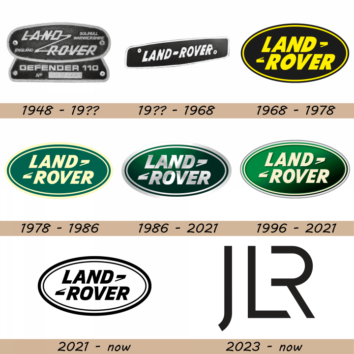
In 1948 Rover decided to launch an off-road car, similar to the famous American wartime vehicle Willys and called it Land Rover. The off-roader featured durable mechanisms, Spartan interior and proved to be a success. As some customers were ready to pay for more comfort, the Range Rover model was introduced in 1970. However, it was not before 1978 that Land Rover evolved into a separate brand. Hence, the logo used from 1948 was rather a model nameplate than the company’s emblem.
19?? – 1968
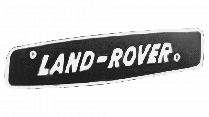
This logo does not hold as much information as the previous one. However, the brand became well-known, so there was no need to add anything else besides the name on the emblem. It was printed using bold, white letters that stood out perfectly on the dark background. The white thin border complemented the inscription and made the emblem look complete.
1968 – 1978
It was a black oval plate with Land Rover inscription, the name of the assembly factory and the type of the vehicle, four wheel drive station wagon. This emblem remained in use through late 1980s, but model names appeared at the bottom side of it after the company was separated from Rover. Said oval had a thin layer of yellow right inside its borders. Furthermore, the words ‘Land Rover’ were written in two lines of yellow text in its center. The font used slightly tilted, capitalized sans-serif letters.
1978 – 1986
The famous green logo dates back to 1989 as the black nameplate was finally replaced with a proper logo. It acquired a regular oval shape and all the inscriptions except for the company’s name were discontinued. The Z-shaped line, connecting Land and Rover words, turned into two small signs which are believed to reflect the company’s motto ‘Above and Beyond’. The coloring is the same change in this one. The black bits became bright green, and anything else turned the straw color. They also added a bold new frame around the oval.
1986 – 2021
The dominating green color is undoubtedly something that attracts attention to the company’s emblem and makes it unique in a very noble way. As the story goes, the logo designer might have been inspired with an oval-shaped oil drop that he saw while having lunch over the drawing table. Not much changed in terms of layout, but the color scheme changed again. The green took on a darker shade, while the straw bits became silver. They also introduced shading and other 3D elements to this one.
1996 – 2021
In 1996, they decided to return the straw coloring for the name, the symbols around it and an oval outline just inside the borders. The frame was still silver-grey. They also kept the shading, but visually removed it for everything but the green background.
2021 – now
Although the previous logos were quite conservative and minimalistic, this version looks even more stylish and contemporary. It features a double black oval frame and a black inscription. The latter uses exactly the same font that the company has used since 1978, which preserved brand recognition and enhanced its trustworthy and stable image.
2023 – now ( JLR Logo )

The company created an impressive logo that will be used by both the Jaguar brand and the Land Rover. It holds the initials of both and represents the new official name of the company. The black color of the emblem gives it a formal and luxurious appearance. The new emblem is meant to represent the new goals and vision of the company. This emblem has everything to stand the test of time without becoming outdated.
Description
The current Land Rover logo is an all green oval with the company’s name on it. The oval is framed with white border. The remnants of a Z-formed sign that used to connect the words Land and Rover on earlier emblems can also be seen on it. Earlier versions of the logo featured the company’s name on black background, embedded into a circumference. The modern logo looks noble and elegant in its simplicity.
Shape
The emblem of the company is a flattened oval which is typically placed in the right bottom side of the grill rather than in the centre. Such positioning along with unique color scheme witnesses the company’s exclusive approach to car manufacturing.
Color
As a sophisticated car manufacturer Land Rover has chosen a very specific color for the logo. It is vivid green with the Land Rover inscription painted white. The green color might stand for vitality and reflect the spirit of the brand, which is wandering far away from grey roads, closer to nature. The white letters embody purity and dignity.
Emblem
Official Land Rover website: www.landrover.com

