Volvo Logo
Meaning and History
Volvo is one of the most respectable car manufacturers in the world, best known for frenetic drive for safety. Its vehicles are also acclaimed for reliability and quality interiors.
It all started in 1927 when Gothenburg-based bearing manufacturer SKF launched its own car division, naming it Volvo. It was a smart piece of naming as the word meant ‘I roll’ in Latin and symbolized the company’s bearing roots as well as movement in general.
Easy pronunciation and spelling were also positive for the brand’s expansion. From the very beginning the company’s executives Assar Gabrielsson and Gustav Larson were eyeing building safe, secure and durable cars to fit rough Swedish climate and road conditions. These guidelines have always been Volvo’s beacons in car manufacturing business and earned it a solid reputation.
The first car with Volvo emblem was ÖV4, or a ‘4-cylinder open car’. Naturally, the company had to build practical vehicles for the Northern climate and Volvo went on with hardtop models. The compact PV444 model changed Volvo’s fortunes in post-war years as the sales rocketed. The best-seller embraced American design, affordable price and multiple innovations. In 1955 Volvo launched its sales in the US market.
The European car manufacturer has always highlighted its commitment to safety and introduced countless innovations in the field. It was Volvo engineer Nils Bohlin who invented a three-point safety belt in 1958. The company made it a standard equipment for all vehicles and even waived the patent so as all manufacturers could use the innovation. Later on Volvo patented the rearward-facing safety seat for children, side airbags as well as inflatable curtains. Volvo’s latest cars feature innovative electronic safety systems, such as roll-over protection system for SUVs, city safety systems, blind spot information system and more.
Today Volvo Cars produces premium-class cars featuring crisp Scandinavian design and near-perfect safety record.
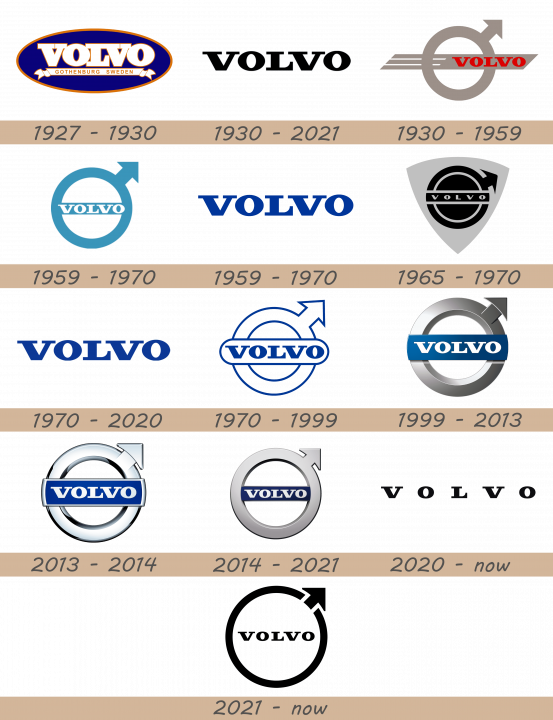
1927 – 1930
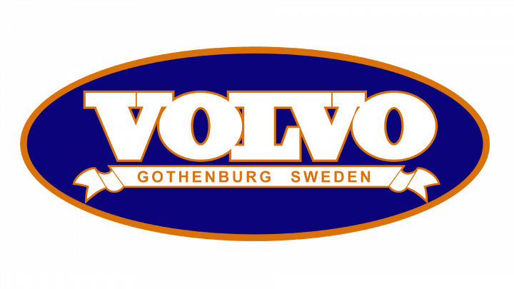
The very first logotype by the Volvo Company was a blue-and-orange oval with the brand name and company address on it. The name had a white serif typeface with an orange contour. All letters were connected to each other, and also they were large. The inscription with an address of the company was placed on a white line with an orange contour.
1930 – 2021

The following logotype was just an inscription with the name of the brand. It was written in the same serif font as in the 1927 logo, but the letters weren’t connected to each other and their color turned to black.
1930 – 1959
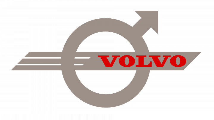
Back in 1930, when the Swedish bearing manufacturer SKF decided to establish its own car production, the owners picked a strong and recognizable logo to represent the new division. It was a silver circle with an arrow pointing diagonally upwards at the top right side. It had long been known as a chemical symbol of iron. Besides, this sign also stood for Mars in the Roman Empire, symbolizing the god of warfare as well as male gender.
These two meanings have a strong connection between them as most weapons used by male warriors throughout the history were made of iron. Hence, the Volvo emblem embodied solid quality, durability and masculine character. It also honored Sweden’s rich traditions in the iron industry. Ironically, Volvo’s famous diagonal stripe that crosses the radiator, passing through the emblem initially had a function of supporting the logo.
As time went by it became obsolete, but later returned as a memorable design element and a heritage feature. Apart from the ‘Iron’ emblem on the grill, Volvo’s first vehicles featured a blue oval with the ‘Volvo Gothenburg Sweden’ inscription. Short time later the two emblems merged as the company name, spelled in red letters, was placed on the right side of the ‘Iron’ sign, creating an image that laid the foundations of a modern Volvo logo.
1959 – 1970
In the 1950s the Volvo name moved inside the circle. The name’s color was turned to white, and the circle itself became blue. The flat going through the circle was also removed.
1959 – 1970
The next update saw the company’s logo acquire blue color that became the brand’s trademark.
1965 – 1970
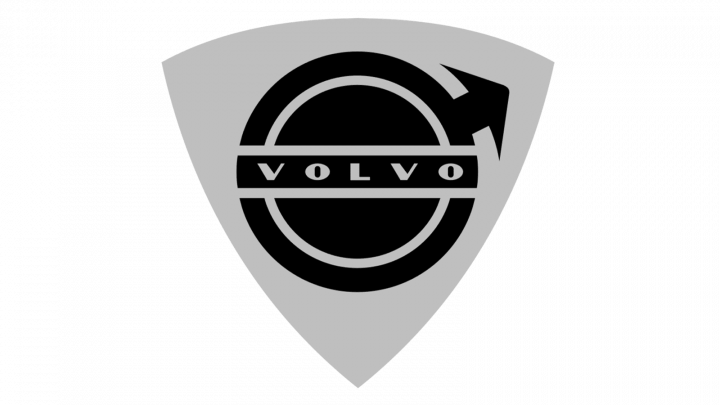
However, the black version of the logo was also used. The circle was redesigned: it became black, was split in several parts by gaps, and inside it there was another circle. The arrow became smaller. On the bar which crossed the circle in the center, there was the name written in a fresh gray font. On the background, we can see the shield-like figure colored gray.
1970 – 2020

1970 – 1999

1999 – 2013
The 1999 variant of the emblem introduced 3D shape, silver circle and white Volvo inscription on blue background. For a new century, the brand renovated its logotype. The central bar was metal blue and the white name was on it. The remaining circle was metal gray and had several flecks on it.
2013 – 2014
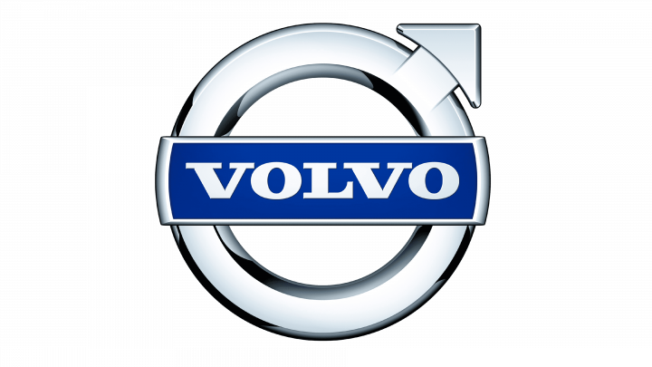
In 2013, they drew another logotype. It was the familiar circle, but the colors were much deeper. The bar now was placed no didn’t cross the circle, rather it was put on the circle, which itself looked polished.
2014 – 2021
The update saw the blue band with the company name become smaller and move inside the circle. The circle became monochrome metal-gray, and it received a small shadow going from bottom to the top.
2020 – today

In 2020, the wordmark ‘Volvo’ was recolored black and acquired larger gaps between letters.
2021 – today
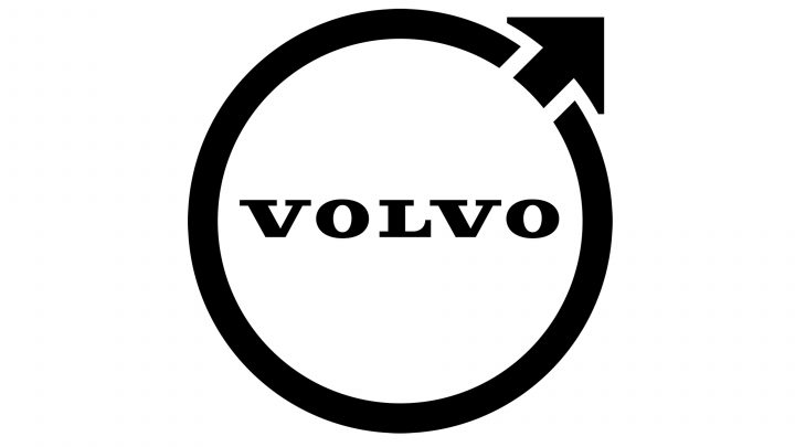
In 2021, the brand designers put the wordmark inside the minimalistic black circle, which this time didn’t have any central bars. The arrow was also cut off the whole circle.
Description
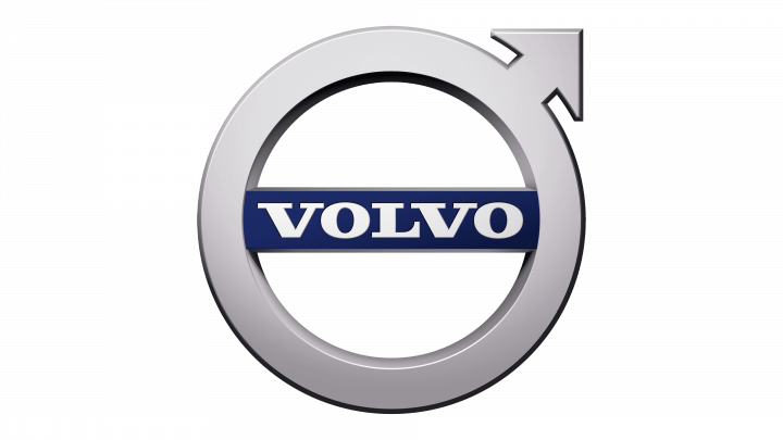
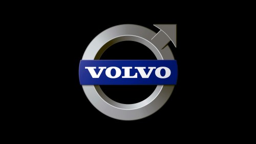
Volvo cars have seen several emblems since the brand’s foundation in 1927. The latest one features a historic chemical sign of Iron, or may as well symbolize Mars, the god of war. The arrow, completing the circle, is directed towards the right upper side, and creates a powerful and masculine image. The emblem is completed with the Volvo inscription, placed on blue background and embedded into the silver circle.
Shape
Volvo’s emblem is difficult to confuse with any other logo thanks to its famous masculine arrow coming out of the circle at the upper right side. The circle itself has an even 3D shape, while the horizontal blue band bearing the company’s name is elegantly fitted inside.
Color
For most of the company’s history the emblem featured blue and white colors and they’ve become Volvo’s trademark choices. The current Volvo logo features several shades of silver, blue and white colors. The ‘Volvo’ inscription is designed in white color and is placed on blue background, while the famous circle with an arrow features gradient shades of silver.
Emblem
Official Volvo website: www.volvocars.com

