Smart Logo
Smart automobiles belong to a particularly small class and are produced by an enterprise that is part of the Daimler AG concern. It is noteworthy that the development and production of these automobiles is carried out not only by the German corporation but also by the Swiss watch manufacturer Swatch, which founded this company. This fact is hidden in the name. Despite the fact that the brand name is an English word, the names of the founding companies are simply encrypted in it: Swatch Mercedes ART. The Smart range represents economical and small city cars, maneuverable and tiny.
Meaning and History
smart is an iconic German manufacturer of subcompact city cars, owned by Daimler AG. The idea to create a new brand of stylish microcars for cities with limited parking space and narrow streets was inspired by the Swiss watch manufacturer Swatch and supported by Mercedes-Benz. These two companies have their names imprinted into the smart brand as ‘s’ stands for Swatch and ‘m’ stands for Mercedes-Benz. ‘art’ reflects the unorthodox approach for car manufacturing that the company has followed since its foundation in 1994.
Around two million vehicles under the smart brand have been sold throughout the world as these stylish tiny cars have promptly become more than just convenient transportation aimed at customers living in restrained European cities. Since 2008 smart cars have been officially distributed in the USA. The company’s two most successful models are Fortwo and Forfour, fitting two and four passengers respectively.
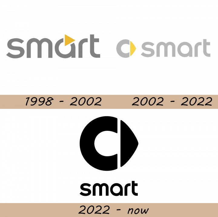
1998 – 2002
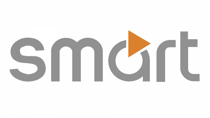
The first Smart logo depicts their name, written in a simple gray sans serif typeface with lowercase letters. The distinctive part of this logo is an orange pointer incorporated into the ‘a’ character.
2002 – 2022
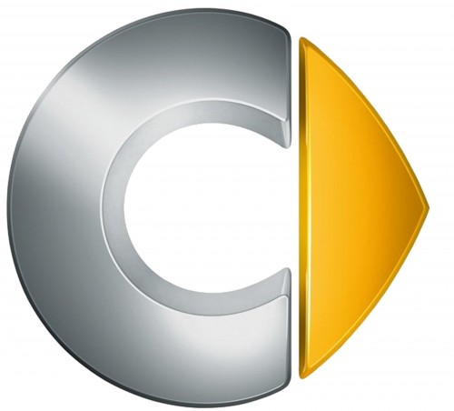
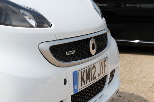
The company’s logo features a silver ‘c’ letter, which reflects the company’s business in compact car manufacturing, and a yellow arrow pointing in the right direction, which is meant to symbolize ‘forward thinking’. The arrow used to be silver on earlier models, but was turned yellow to create a more expressive look.
The word ‘smart’, painted grey, commonly completes the emblem on the right side or below it. In fact, only the lowercase letters are used in the brand’s name for marketing reasons.
2022 – Today
In 2022 the company introduced a minimalistic version of its recognizable logo, following the latest trends in visual identity design. The badge, which kept all of its initial elements, was redrawn in flat black on a transparent background. The rounded emblem with an arrow got enlarged and is now placed above the lowercase lettering, which is still set in the same modern sans-serif typeface.
Description
Just like the company’s name, the smart logo carries specific meaning that reflects the essence of the vehicles, produced under the German brand. The emblem embraces the letter ‘c’, standing for ‘compact car’ and a yellow arrow that symbolizes the forward movement or progress as it points in the right direction. The company’s name accompanies the symbol and is typically written below it or to the right.
Shape
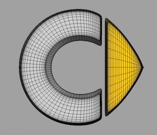
smart emblem is designed in a circle shape that is sharpened at the right side due to the yellow arrow pointing right. The ‘c’ letter, forming the largest part of the logo, has a correct rounded shape, while the arrow is attached to it to complete the circumference.
Color
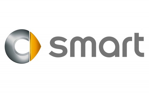
The 3D ‘c’ letter is designed in gradient shades of silver color, while the arrow at the right side is all yellow. The ‘smart’ word, accompanying the logo, is designed in grey color.

