Hyundai Logo
Hyundai Group is an industrial giant for which the automotive industry is one of many areas of activity. For many years the whole group functioned under one common name. After the crisis and related financial problems, a split occurred, and Hyundai Motor Group became one of the formed companies. It became one of the largest vehicle manufacturers in South Korea. Hyundai is an example of an innovative and creative brand that has made great strides in recent years, becoming one of the most important players in the market. Hyundai Motor increases its value and weight among car buyers every year and strengthens its position among competitors. They are chosen for their modern design, practicality unpretentiousness in operation, and reasonable prices. Let’s not forget that Hyundai is a company that is growing at an incredible pace. The constant evolution of the model range is a vivid confirmation of this.
Meaning and History
Hyundai Motor Company was founded in 1967, which makes it one of the youngest automobile companies on global market. However, despite that, in less than 50 years the company, headquartered in Seoul, Korea, managed to reach the level of established Japanese, European and American car manufacturers and broke into the leading makes by sales numbers.
Yet, upon the first years of operation, Hyundai business was the assembly of Ford Cortina. Later on they hired a bunch of British engineers and designers and developed their own model Pony, largely based on Mitsubishi Motors powertrains. The small car proved to be a home success and international sales started. Other models followed and Hyundai went on to become a fast-growing project. Today the company produces all sorts of vehicles, including cars, SUVs, commercial transport as well as hybrid-powered vehicles. Hyundai Motor Company also owns a fellow Korean manufacturer Kia Motors and the luxury division Genesis Motors.
Like many Asian manufacturers, the company used a simple Hyundai nameplate on its cars at the beginning and the image of the manufacturer remained neutral for many years. However, as the company’ business expanded, it became clear that an appropriate logo was required for the customers to associate the vehicles with the brand.
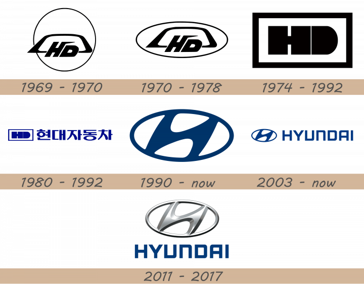
1969 – 1970

The first official logo depicts a black circle with the actual emblem located near its bottom. It consists of the letters ‘HD’, placed inside a black trapezoid shape, in the center of its lower line. The letters are bold, tilted sans-serif letters without many special details. Weirdly, this emblem is not aligned centrally inside the circle. It’s located near the bottom and slightly to the left from the midline.
1970 – 1978

The 1970 logo uses the same emblem, but placed inside an oval this time. It fits the emblem’s proportions much better, and they actually managed to place it at the very center this time.
1974 – 1992

The next logo is blockier design. It’s a rectangular shape with a white filling and black edges. Inside, they placed the same two letters, but with a new look. These characters took on a new, simpler look. The ‘H’ is just two very bold lines, connected by an incredible short central bar. The letter ‘D’ is just a solid black figure, standing a marginal distance from the ‘H’.
1980 – 1992

The 1980 logo is a single line of imagery. It starts with the same emblem, as seen in the previous design, except this one is dark blue. To its right is the name of Hyundai, written in the native Japanese characters, also blue.
1990 – now
Hyundai designers then came up with a simple, yet effective image. The logo was basically a tilted H letter, embedded into an oval shape. Hyundai officials said it was also representing two human figures, one of the customer and the other one of the company, united in a handshake. That was meant to symbolize mutual trust and respect. Overall, Hyundai fluid logo creates a friendly image, which has already become well recognizable all over the world.
2003 – today
Like in one of the previous designs, they took the main emblem (the 1990 variant) and placed it in one line next to the company’s name. Both bits are dark blue, just like then. The name, however, is not a Japanese version, but an international one. The font exhibits big sans-serif letters with abrupt turns and square proportions.
2011 – 2017
This temporary design showed the chromed version of the main logo, as was popular with automotive companies at the time. It was placed right above the usual name wordmark, excessively glossed and illuminated. The wordmark is still dark blue, like in the previous design.
Description
Hyundai is a young manufacturer by the automotive industry standards, but its logo has already become recognizable all over the world as the Korean car company managed to emerge as one of the leaders on the global market.
Hyundai logo is basically a stylized image of the H letter, designed in a very fluid and suave way and embedded into an oval shape. According to Hyundai, the emblem symbolizes trust or handshake between the company and its clients, as the energy flows between the side bars of the logo.
Shape
Hyundai logo was initially confused with Honda emblem, however, as the Korean company emerged as a major automotive power, people got used to its emblem. Basically, the H letter, forming the Hyundai logo, is tilted to the right and gives fluid and smooth impression, designed to give a friendly and attractive image of the brand.
Color
Blue and silver are the colors closely associated with the Hyundai brand. While the 3D emblem itself is designed in several shades of silver color, blue is widely used in corporate design elements and advertisements.
Emblem
Official Hyundai website: www.worldwide.hyundai.com

