Roewe Logo
Roewe is a Chinese auto-making company, which was established in 2006. The company specializes in the production of luxury automobiles, designed according to the latest world’s standards and trends. The name of the brand resembles Rover, as the founders created it after their attempt to acquire the British brand failed.
Meaning and history
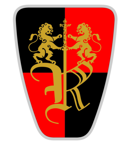
The visual identity of the brand resembles the logo concept of the Rover brand from 1979. The emblem boasts the same shape and color palette, along with the whole style and mood of the badge.
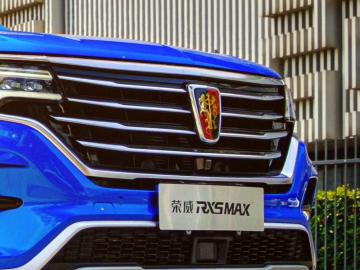
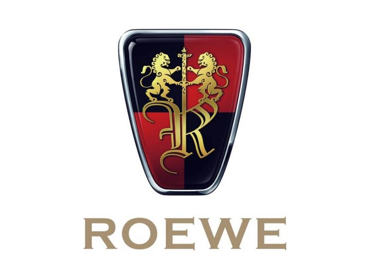
The logo of the Chinese automotive brand is composed of a shield-like emblem, which is also the brand’s badge, placed on the company’s cars, and a solid yet elegant wordmark, usually located under the emblem.
The Roewe shield features a chess red and black pattern of the background with the gold image and monogram on it. Two rampant lions are holding a vertically located sword, which forms an elongated vertical bar of the ornate Gothic-style letter “R”.
The lion is a commonly known symbol or royalty and courage. The bravest and most beautiful wild animal with the sword has always been one of the most popular heraldic symbols. By the way, according to the company, Lion has become the inspiration for the naming of the brand. Roewe was derived from the German “Lowe”. With the version of the name, creation makes sense, considering the history of the company.
The color combination of the company’s visual identity symbolizes luxury and high quality, along with authority and a good reputation. The red and black mix of the background evokes a sense of passion and power, while gold accents add elegance and sophistication. The badge is enclosed in a cold silver frame, which balances the emblem, making it look modern and confident.
Font
The wordmark of the Roewe visual identity is written in gold capital letters and on most of the versions it has the Chinese version of the name written under it. The inscription is executed in a bold serif typeface, which is very similar to Copperplate EF Bold, which was designed by Frederic Goudy at The beginning of the twentieth century.
The typeface features distinct geometric serifs, which make the inscription remarkable and memorable. They also balance smooth lines of the emblem’s contour and add some strength and masculinity to the timeless and fine logo.
