BYD Logo
BYD is a Chinese car producer that prefers to create electric cars. They’ve achieved a lot of success doing it, too. They have now created many models, most of them either compact or crossover designs. BYD also builds trucks, vans and even solar panels, but they are far more known for their innovative streak of electric cars.
Meaning and History
Much like a lot of other Chinese car brands, BYD based their name on a very in-the-face British slogan. This time, it’s an acronym for ‘Build Your Dreams’ (the slogan frequently appears near the logotype). Moreover, their logo, in accordance to Chinese trends, is also unchanging, dull and mostly just features text.
The larger electricity-oriented ‘BYD’ company was created in 1995, but their dedicated car branch didn’t exist until 2003. It’s unimportant, as they use absolutely the same logotypes, but the distinction is there.
2003 – 2005
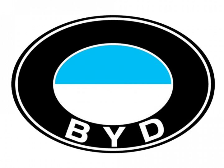
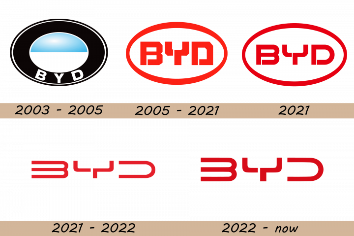
The original logo was a black oval with a thin layer of white just inside the edges. In the center, they put another oval: turquoise in the top, white in the bottom and with a white outline around. Right below it, the acronym ‘BYD’ was written in white, broad sans-serif letters.
2005 – 2021
The emblem itself shows an acronym BYD surrounded by an oval that thins out in the sides. The entire image is a bright red color, except for the inner space that sometimes can be white.
The acronym consists of three letters, naturally. They all have a very mechanical style – the angles are all very sharp and the letters themselves look as if welded from different parts (especially since some parts of them hang separately in the air, which reinforces the effect).
2021
The company created several logos in 2021, and the first one, used for just several months, featured a refined oval medallion with thinner lines of the frame and the characters and a more intense shade of red. The badge started looking more elegant and sophisticated.
2021 – 2022
Another badge from 2021 lasted a bit longer. It was a futuristic uppercase lettering in a custom sans-serif typeface with a stencil in the “Y” and the removed vertical bars of the “B” and “D”. The inscription was written in solid red lines against a transparent background without any framing. Also, compared to the previous versions, the letters were more extended.
2022 – Today
In 2022 the BYD logo was redesigned again, keeping the concept of the previous badge, but strengthening the lines of the characters, and darkening up the shade of red. The taller and narrower characters now look more harmonious and strong, creating a great signifier for the brand.
Emblem and Symbol
BYD has a very interesting principle on naming cars. Some cars are named blandly (e1, e2, S2). These are simple given a badge with the grey BYD acronym inside. But some cars are named after the old Chinese dynasties (Tang, Qing or Yuan). The badges on these models instead hieroglyphs that mean the names of these royal families.
