Ariel Logo
It is one of the smallest car manufacturing companies in the UK, located in Somerset. Throughout its history, the company has released only three car models: Ariel Atom, Ariel Atom2, and Ariel Atom3. The Ariel Atom 3 is the most powerful model in the lineup.
Meaning and history
The first mass-produced car without a body is the Ariel Atom, originally designed as a light sports car, hence its first name “LSC (Light Sports Car)”. It all started in 1996 when a student at Coventry University created a thesis project for this auto and successfully presented it to Simon Saunders. In 1998, the rights of the old car company Ariel were bought out, and the former company was renamed Ariel Motors Ltd. In 2000, the first serial model was released. In 2007, the company changed the design of the car, equipping it with a new 2-liter Honda engine. This was a third generation of Ariel Atom automobiles. In 2018, a completely new model was presented – Ariel Atom 4. Despite all the challenges, the brand continues to surprise with its innovations.
1932 – 1951
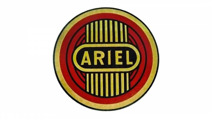
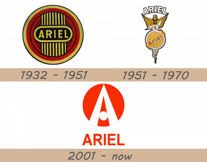
The original logo of Ariel was a red circle, divided into several ring layers of different width by a number of black lines. These are surrounded by an outermost layer of yellow, which is then encircled by a thin black ring. The very center of this figure is occupied by a rounded rectangle shape of the color black with a yellow frame. In it, the word ‘Ariel’ is written using sans-serif capital letters. 9 lines extend from this nameplate up and down towards the outermost red layer, creating a radiator appearance.
1951 – 1970
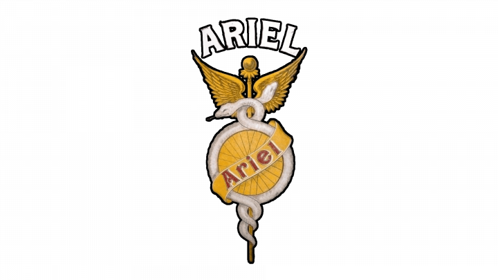
In 1951, they adopted another badge. The base was a golden scepter with two big wings on its either side, near the top. Two white serpents wrapped around the scepter. In the middle of the emblem, their bodies went around a circular shape that resembles a golden wheel. Thus, the bodies act as tires here. A golden ribbon is wrapped around both that wheel, with ‘Ariel’ written in red fancy words on it.
2001 – now
It has the shape of an orange circle, inside which there is a stylized letter ‘A’, reminiscent of a road leading into the distance. Instead of the usual horizontal line that we are all used to seeing in the traditional letter ‘A’, a circle is used here to launch two parts of the letter. Below this symbol is the name of the company in capital letters also in orange color.
Emblem and symbol
The logo of the company is made in orange color, which, together with the letter ‘A’, symbolizing the road, speaks of the company’s self-knowledge, the desire to develop, and the search for adventure.
