Aston Martin Logo
![]() Aston Martin Logo PNG
Aston Martin Logo PNG
One of the most outstanding automobile companies in the world, Aston Martin has rich history, just like its logotype. Let’s find out what it means, and how it evolved.
Meaning and history
![]()
Aston Martin brand was established by Lionel Martin and Robert Bamford. The first car, named Aston-Martin, was created in March 1915 by Martin, who installed a 1.4-liter four-cylinder engine Coventry-Simplex on the chassis of 1908 from Isotta-Fraskini. The “Aston Martin” logo appeared in 1920, although the company began its existence in 1913.
1921 – 1926
![]()
Initially, these were two capital letters of the name – “A” and “M”, which crossed and were circled. “Aston is the name of the racetrack on which the company’s Singer car won its first victory. And “Martin”, which is quite traditional, is the name of one of the founders of the company – Lionel Martin. The letters were colored black and placed against a bronze background. The same colors were used alongside the fringes of the circle.
1927 – 1930
![]()
In 1927, the logo changed dramatically – eagles’ wings were added, which symbolized speed. This element was borrowed from the Bentley logo.
Over time, the wings became more symbolic – without drawn feathers, which became just lines.
The wings included the word ‘Aston Martin’, written in parallel to the bottom lines of each respective wing. The letter ‘M’ was placed in the center, where the wings conjoined. Its tips extended diagonally along the tops of these wings and joined with the tops of the ‘T’ letters.
1930 – 1932
![]()
In 1930, the previous logo was largely as it was, but styled as a black-and-white imprint rather than metal badge. Some changes included thinner lines in some parts of the letters, line in the tops of the ‘T’ letters. The wings also became straighter, sleeker, as well as rotated further upwards.
1932 – 1939
![]()
The 1932 logo turned again into a metal-looking badge. The wings now became almost perfectly horizontal. Much of it was colored golden with silver lines all over it (most radiated from the center, and one was a circular line that surrounded said center). The center itself had a black rectangle with silver edges. Inside, they put the words ‘Aston-Martin’ (with a dash in-between).
1939 – 1950
![]()
Sometime later, they changed the logo again. Much of it was the same as before, except for coloring and some minor details. The golden in the wings turned silver (a darker shade than the lines all over it). Furthermore, the wings lost the rest of their elevation and became perfectly straight now. The letters in the center also changed slightly.
1950 – 1971
![]()
In 1950, David Brown was added to the logo over the words “Aston Martin” in honor of the new owner of the company, but since 1987 this inscription was no longer used.
The next iteration had slightly thicker wings with mostly black fringes. The coloring became more of a bronze, and they also somewhat rearranged the lines that separated the ‘feathers’. The central rectangle now had a smaller extension on its top, where they placed the writing ‘David Brown’ in the same style as the name below.
1971 – 1972
![]()
Most silver bits (including lines and letters) became golden, and that’s essentially all they changed in 1971.
1972 – 1984
![]()
In 1972, the company continued to experience financial difficulties and was sold to the Birmingham-based consortium Company Development Ltd. In 1987, the next owner of Aston-Martin was the American concern Ford, which bought 75% of the company.
As for the logo, they removed the ‘David Brown’ bit, as well as the extension it was placed onto. The bronze areas became a blueish-grey color. The nameplate in the center was elevated slightly.
1984 – 2003
![]()
In 1988, producing about 5000 cars in 20 years, the company finally finished production of V8 and provided Virage. In 1992, the Vantage version was announced, and later – DB7.
In 1993, Ford took full control of the Aston-Martin company and handed it over to the Premier Automotive Group. Since 1994, he has been part of the Premier Automotive Group, a division of the Ford Motor Company, but in August 2006, Ford published its intention to sell Aston Martin. In 1995 the company produced 700 cars.
2003 – 2021
![]()
At the Detroit International Motor Show in 2003, the DB7 heir to the DB9 model was launched and another new model, the Aston-Martin AMV8 Vantage, was announced. Also in 2003 the factory in Gaydon was opened. In the second quarter of 2007, Ford Motor Company sold Aston Martin to a consortium of investors led by David Richards.
In 2017, Aston Martin came with the new round logo, with its diagonal lines forming the letters “A” and “M”, is similar in design to the “Aston Martin” logo, which was used in the 1920s, before the first variants with wings appeared.
2021 – now
![]()
The 2021 logo uses two elements. One is the same badge logo as the one they used until then, except made of black lines with white in-between. In addition, it was simplified slightly, which affected lines and shapes to some degree. Below, the name ‘Aston Martin’ was written in exactly the same styled, but in much bigger letters.
Symbol
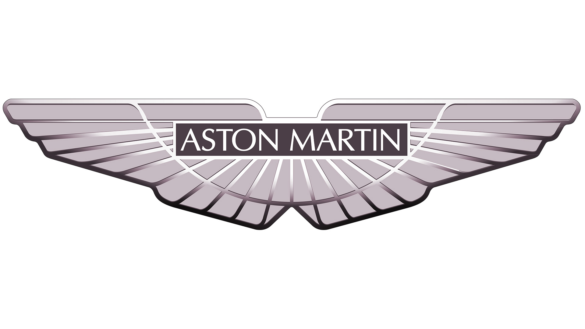
Aston Martin logotype features wings, which symbolizes speed and agility. The ‘A’ and ‘M’ letters stand up for the company name (Aston Martin). The style of logotype is pretty minimalistic and yet looks expensive thanks to use of simple font and silver color.


-
 Taiwan car brands
-
 Romanian car brands
-
 Czech car brands
-
 Spanish car brands
-
 Dutch car brands
-
 Indian Car Brands
-
 Canadian Car Brands
-
 Russian Car Brands
-
 Swedish Car Brands
-
 Italian Car Brands
-
 American Car Brands
-
 Japanese Car Brands
-
 European Car Brands
-
 Chinese Car Brands
-
 Korean Car Brands
-
 Australian Car Brands
-
 British Car Brands
-
 French Car Brands
-
 German Car Brands