Bertone Logo
![]()
Bertone Logo PNG
Bertone, aka Gruppo Bertone, is a company from Italy that specialized in styling and, to a lesser extent, producing cars. They are mostly just a company of designers, and they’ve been designing the cars of other brands for over 100 years now. Their clients include Aston Martin, Lamborghini, Alfa Romeo, Chevrolet and many more.
Meaning and History
![]()
The firm was founded in 1912 by Giovanni Bertone, and the business was mostly lead by his family from then on. Unsurprisingly, the founder named the company after himself. The logo mostly just reflected this fact in all of its versions. That is, until the company dissolved in 2014.
1912 – 1998
![]()
Since the birth and until the close of the century, Bertone seemed to use a car badge both as the emblem for the business and for their products.
This badge had the shape of a shield with wider top and narrower bottom. It was, of course, made from metal for the most part. Inside, most of the space was covered in a kind of metallic scales. On top of them was a big lowercase better B painted blue.
Except for the top side, where the badge was crowned by an additional plate with the name Bertone on it, the badge was lined with two red vertical lines on both sides. In additional, they put a checkered oval on top. It’s possible that this was supposed to remind of a checkered racing flag.
1998 – 2010
![]()
Most of the details were scrapped by the end of the century. The B letter and the name were the only two things left. They were both turned grey and given a good measure of glint, shade and volume.
The letter was noticeably tilted and as if broken across the middle line. The company name below it was written in big bold letters in uppercase. The color on both of them was inconsistent, all in order to create an effect of lighting. In this case, it’s supposed to be somewhere to the left and above the emblem.
2010 – 2014
![]()
Not much changed in this last version, although they did tone down on the shades, lighting and all that nonsense. It still remained, but with much more consistency. So, there were now two dominant colors – white and grey.
In terms of design, both parts of the logo were given a black outline to make it appear even less 3D (in contrast to the previous variant). Furthermore, the font of letters below was slightly changed to serif – the acute tips now appeared on several of the letters.
The only major addition in this iteration was an underline in the colors of the Italian flag, as well as a small grey writing beneath it that said ‘dal 1912’ – ‘from 1912’.
Symbol and Emblem
For some time in the later stages of their history, Bertone used a disc featuring the company name as well as the letter B for car decoration. There were several of these decorative discs, including the one where they mention their home town Turin (Torino) in the bottom and many more.
The Legends
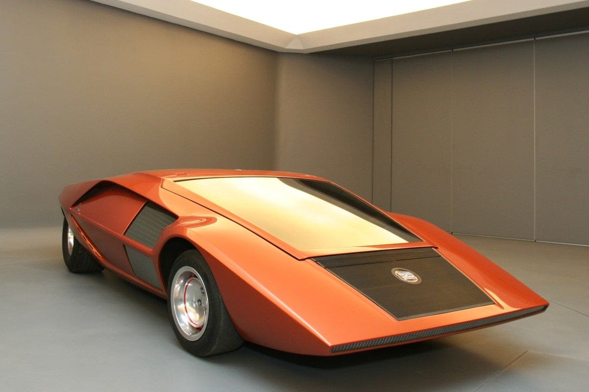
Bertone were renowned for their car designs, which included many shared elements (geometrically strict roofs, acute or square front, etc) spread throughout a lot of models.
The latest designs included Aston Martin Rapide Jet 2+2, Jaguar B99, Alfa Romeo Pandion and many more. The company also produced many cars of other brands’ designs over the years.


-
 Taiwan car brands
-
 Romanian car brands
-
 Czech car brands
-
 Spanish car brands
-
 Dutch car brands
-
 Indian Car Brands
-
 Canadian Car Brands
-
 Russian Car Brands
-
 Swedish Car Brands
-
 Italian Car Brands
-
 American Car Brands
-
 Japanese Car Brands
-
 European Car Brands
-
 Chinese Car Brands
-
 Korean Car Brands
-
 Australian Car Brands
-
 British Car Brands
-
 French Car Brands
-
 German Car Brands