Cadillac Logo
![]() Cadillac Logo PNG
Cadillac Logo PNG
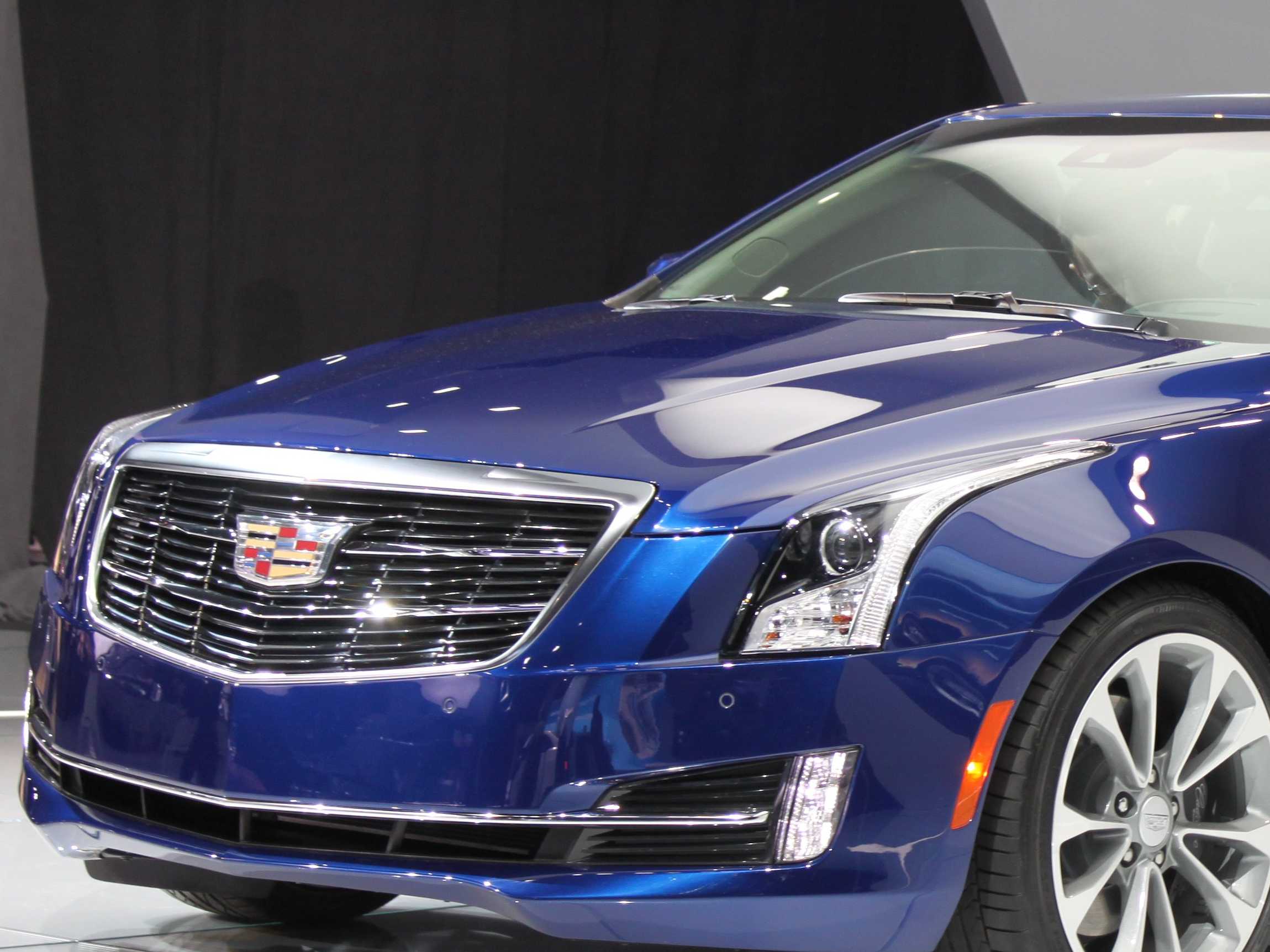
Cadillac, which was named after Detroit founder Ser de Cadillac, is an American luxury car brand. It is currently part of the General Motors concern. The brand is represented in more than 50 countries around the world. Cadillac is a symbol of comfort, safety, and wealth. The first premium car brand appeared more than 100 years ago but is still one of the most advanced. Cars under the Cadillac brand have always been innovative in body design and set the style in the automotive industry. Cadillac’s innovative developments in the field of engine building have served as the basis for many currently recognized American and world standards. Over more than 120 years, Cadillac has become a cult brand throughout the world. A brand to be looked up to and imitated but never surpassed.
Meaning and History
![]()
For over century Cadillac brand has been recognized as producer of luxury powerful american cars which had a great impact on development of this automotive segment. The company was founded in Detroit by Antoine de la Mothe Cadillac. In 1902 the brand got its official name and crest.
There are numerous versions about the origins of logo. There is a legend that the badge has actually been designed before Christopher Columbus made his sensational discoveries including new land. According to another version the father of luxury car brand originated from old counts of Toulouse which means that he affiliated with stock belonged to Royal French. There are numerous stories which make the history of the brand and its logo even more exciting.
Apart from all those versions the majority of specialists and sources are certain that Cadillac was the one who designed the badge for his new company. It was long before the foundation of the company. Some sources say that the crest was actually designed in 1687 when he got married. Few people know that Antoine de la Mothe Cadillac is not the real name of the brand’s founder. He took its during his military service at the age of 24 in order to make everyone believe that he belonged to noble blue-blooded society. Such things were rather common among young French officers during that period of time. Moreover this name turned out to be rather useful after he decided to move to the New World. Of course, no one there could check his true origins. With new name his also decided to borrow coat of arms which at that time belonged to his ex-neighbor Baron Sylvester.
This coat of arms was used by Cadillac in America. Moreover it turned out that Antoine de la Mothe was not connected with any noble family in France. There are no slightest mentioning about Cadillac if archives. It makes it clear that founder of the world’s leading luxury car brands has made up his all story in order to gain success in America. By the way the crest which can be found on Cadillac autos actually belongs to real la Mothe noble family.
Speaking about the meaning of the logo, it is represented as montage of authentic heraldry which consists of several pieces and bits. Antoine decided to put them all together following his own goal. Elements which are used in the logo are considered to be martin heraldic adaptation. For many decades it was not changed and modified. The first official announcement about changes appeared only in 1999. It was the first time since 1963. Several modifications were made in 2002 and in 2014.
1902 – 1905
![]()
The original emblem depicts the family crest of Cadillac, placed in the middle and surrounded by a wreath of flowers and with a crown on top. The crest is divided into four parts. The top left and bottom right depict the same pattern: three black ducklings (two on top, one below). The other two sections are also identical and divided into four further sections of mere striped patterns.
1905 – 1906
![]()
In 1905, they replaced the wreaths along the perimeter with a ring, decorated with smaller black crowns. The big crown became wider and topped with pearls on each peak. Furthermore, flowery ornaments were placed along the edges of the crest. The crest itself didn’t change in design much, except it became a circle rather than a shield.
1906 – 1908
![]()
The 1906 design returned mostly to the original look. It took on simpler shapes, and most of the elements consisted of clean, slim lines. The crown was elevated a bit higher and returned largely to its initial appearance. The insides of the shield are colored black almost exclusively, save for the actual elements, borders and edges. The ducklings turned rather into swans now, while the striped bits replaced the actual striping with 3-5 scratches (it varies).
1908 – 1914
![]()
By 1908, they turned the design into a seal. They got rid of the wreaths and instead planted the whole emblem in the center of a big circle with an edge, which they tried to give some volume by adding sporadic lines here and there. The crest elements actually resemble the second style, adopted in 1905. However, these are simpler, more orderly and arranged within a shield. The crown is also decorated with pearls. The words ‘Cadillac’ and ‘Standard of the World’ are visible above and below.
1914 – 1915
![]()
The 1914 logo is just an oval badge with the brand’s name, written at an angle in the upper half of the figure. The font is a bold cursive, written fully in white. Curiously, the big letter ‘C’ resembles a fading moon for some reason. The year ‘1914’ is present in large digits beneath the right edge of the writing.
1915 – 1920
![]()
This logo resembles an old seal image. However, they got rid of the written bits, added big leaves on both sides and rearranged the crest a bit. They returned the wreath and reworked the crest again. There were again black swans, placed against white background. The striped bits included four black horizontals against a white background, as well as plain black squares in nearby sections.
1920 – 1925
![]()
This design is almost identical to the first seal. The wreath stayed, however, while the written parts are still gone. The crown is connected to the shield by a small extension. The inner patterns only changed in nuances.
1925 – 1926
![]()
This emblem depicts the same ‘Cadillac, Standard of the World’ seal with almost no changes. The one bit change is the addition of an octagon that incorporates the seal within itself. They obviously mean it to be a nut.
1926 – 1930
![]()
This time, they took the same crest with a crown and included it into a bigger white shield. The latter has a wider top with long thin tips.
1930 – 1932
![]()
They basically just removed the bigger shield for this version, leaving the crest itself unchanged.
1932 – 1933
![]()
It’s again a seal, but this time with the black space inside. They added two long wings on each side of the crest that go beyond the edge by 2/3.
1933 – 1939
![]()
The 1933 is essentially the same winged design, except they made the shapes much cleaner and simpler. The wings are now just two triangles with sections in them for feathers. They are longer this time. The seal is gone, but the crest itself is almost unchanged, save for the change of style. The crown is reduced two several pearled peaks rising from the top of the shield. They actually look more like chess pieces.
1939 – 1942
![]()
The 1939 variant is the first instance of a colored emblem. It’s largely the same crest with a crown placed right atop the top edge of the shield. They added gold to the edges and borders and colored some bits bright red. The crest is then placed in the top of a long downward triangle. Its edges are golden, but the core is just brown with thin lines radiating from the shield in all directions.
1942 – 1947
![]()
For the 1942 logo, they placed the shield inside of a peculiar image. Its bottom was a lower half of a burgundy shield. The crest was set right in the middle of that would-be shield. Above the burgundy section, they placed two upward wings made of metal. They seemed almost like blades and extended a long way up.
1947 – 1949
![]()
This time, they utilized the old image with a shield atop a long, narrow triangle. That being said, they scrapped the coloring and got rid of the top of the triangle itself. It was now just the crest between the two tips of a massive tick mark with some filling inside of it.
1949 – 1952
![]()
They simplified it even further this time. Now it’s just the shield (with some changes and wider), placed between a tick mark, which is also much wider and shorter this time. They reintroduced the coloring – mostly golden, black and red for the shield and just gold for the other figure.
1952 – 1953
![]()
In 1952, the same logo was decolored and placed in the center of a circle. There, they also added the words ‘Golden Anniversary’ along the bottom edge, as well as years ‘1902’ and ‘1952’ on either side from the shield.
1953 – 1956
![]()
The 1953 is just the shield, as seen in the two previous logos. It’s colored, and almost identical to the 1949 crest.
1956 – 1960
![]()
The 1956 version is near identical to the 1949 logo, except they squeezed it from top and bottom, making it much wider to eye.
1960 – 1963
![]()
The 1960 emblem is the same crest, but turned into a grey scheme and stretched even wider.
1963 – 1964
![]()
The 1963 emblem uses the same crest, styled as a metal badge. They put it on a pole and connected to the joint of a metal laurel wreath that encircles much of the shield.
1964 – 1965
![]()
The next emblem is only a shield image, again. This time, they made it white with various shades of grey all over the place. The backgrounds of these patterns seem imprinted or chiseled out.
1965 – 1971
![]()
The 1965 logo is again a combination of the shield and a big tick mark figure. Unlike then, the shield is smaller and not as wide. The other figure seems greenish with a blue tint.
1971 – 1980
![]()
The next one resembles the one logo, adopted in 1942. Like then, there are two blade-like wings facing up from the shield. There are no other elements. The coloring was mostly black-and-white.
1980 – 1985
![]()
This time they decided to reuse the more recent 1963 laurel wreath combination, except there is no pole this time, and some minor details also changed in the crest.
1985 – 1995
![]()
The 1985 redesign changed the color scheme. Where the previous logo was largely metal grey of silver, they replaced these shades with gold in this logo. The other colors were made paler, which is the case with red, most prominently.
1995 – 2000
![]()
That’s the same idea and layout as the previous logotypes. That being said, they introduced a new simplistic style instead of the old realistic one. It explains brighter, simpler colors and simpler shapes all over the place. For example, the shield’s border is just a thin black line now, while the laurel wreath is a collection of pale grey flecks. They also removed all pretense of volume. The word ‘Cadillac’ is seen below, written in blue cursive text.
2000 – 2009
![]()
In 2000, they simplified the shapes even further, but also reintroduced the volume-rich, realistic emblem. For starters, they got rid of what was left of the crown and added a metal edge to the shield. The crest patterns also became simpler. They scrapped the ducklings, which meant there are now solely striped patterns on the shield. Where the birds were formerly, there are just black horizontal lines across golden backgrounds. The wreath was turned basically into an incomplete ring with multiple cuts.
2009 – 2014
![]()
They added more volume to the crest patterns in 2009, making some of them more prominent than others. The color scheme also changed somewhat. Furthermore, the entire logo is now darkened.
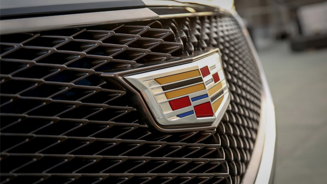
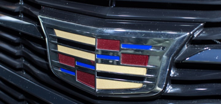
2014 – 2021
![]()
In 2009, they got rid of the wreath bit and focused on the shield. Namely, they made it wider and added even more lightning. All the while, the word ‘Cadillac’ is written in thin cursive below the crest. It’s colored black.
2021 – today
![]()
The 2021 logo is essentially the shield, as seen in the previous logo, except made fully 2D, colored black-and-white and visibly simplified.
Description
Cadillac logo depicts bits and pieces of authentic heraldry which are also supposed to be heraldic adoption of martin. Badge looks like shield made of several different pieces. For almost a century the logo featured crown on top of the shield. But in 1999 designers decided to remove from the badge. Crest has calligraphic custom typeface which is recognizable all over the world.
Shape
Despite the fact that some people still believe that Cadillac logo belongs to La Mothe Cadillac’s noble family coat of arms there are no any evidences that such family has ever existed. The founder of the brand borrowed this coat of arms and customized it according to his own needs. It has a shape of shield coated in circle heraldic pattern.
Colors
Cadillac logo contains wide range of colors including black, red, grey, yellow, sliver and blue. Every color has its own special meaning. They symbolize creativity, excellence, passion, grandeur and business responsibility established by the automaker.


-
 Taiwan car brands
-
 Romanian car brands
-
 Czech car brands
-
 Spanish car brands
-
 Dutch car brands
-
 Indian Car Brands
-
 Canadian Car Brands
-
 Russian Car Brands
-
 Swedish Car Brands
-
 Italian Car Brands
-
 American Car Brands
-
 Japanese Car Brands
-
 European Car Brands
-
 Chinese Car Brands
-
 Korean Car Brands
-
 Australian Car Brands
-
 British Car Brands
-
 French Car Brands
-
 German Car Brands