Dodge Logo
![]() Dodge Logo PNG
Dodge Logo PNG
Dodge is a famous auto making company from the United States, which was established in 1900 in Detroit. Founded by two brothers, John Francis and Horace Elgin Dodge, the brand was originally named Dodge Brothers Company. Since 2014 one of the most popular American vehicle manufacturers is the property of Fiat-Chrysler Automobile Group.
Meaning and history
![]()
One of the oldest and most iconic American automaking brands has had a very long and intense visual identity history with eight major logo redesigns. Though the company was established in 1900, its first official logo was introduced only ten years later, in 1910.
1910 – 1914
![]()
The initial Dodge logo was composed of a circular medallion in white with a monogram enclosed in a double rounded frame. The overlapping letters “D” and “B” (standing for Dodge Brothers) were executed in gold metal, as well as the framing with six small circles around its perimeter. This badge has only stayed with the brand for four years and was the only one in such a light and fancy color palette.
1914 – 1928
![]()
In 1914 the company introduced its new logo, executed in monochrome, and featuring strong symbols. The intertwined “D” and “B” letters were placed in the middle of a six-pointed star, which was enclosed in a circle. The “Dodge Brothers Motor Vehicles” inscription was placed around the frame’s perimeter.
The star with letters was located on a background, featuring the world’s map, reflecting the willingness of the company to expand internationally.
1928 – 1955
![]()
In 1928 the company goes minimalist. The ornate and full of symbols logo from 1914 was replaced by a simple and bold “Dodge” wordmark in capitals, executed in a rounded custom font with smooth lines and cuts.
1955 – 1962
![]()
The redesign of 1955 brings a new color palette to the company’s visual identity — red and black. The image is composed of two elements — two ticks, or V-shaped lines, placed horizontally and pointing to the right. These two stylized arrows feature different thicknesses and lengths — the black one is longer and more elegant, which the thick red works as a perfect background. This logo was a symbol of the passion and progress of a famous American brand.
1962 – 1968
![]()
The new logo was created for the automaker in 1962. It was an abstract image, composed of three black elements, forming two triangles — by their contours and in their negative space. The exterior triangle had its sides arched to the center, while the inner one — to the outside. This logo only stayed with Dodge for six years.
1964 – 1993
![]()
In 1964 the brand starts using a simple logotype in scarlet red color. The strong and straight typeface of a slightly italicized lettering looks modern and powerful, and the bright color reflects the energy, dynamics, and passion.
1969 – 1993
![]()
The redesign of 1969 is not even a redesign, but and extension — two thick red rectangles are added to the logotype from up and down. On the upper one, the thin red five-pointed star enclosed in a white pentagon is placed. The bottom red part is plain and solid.
1993 – 2009
![]()
The logo design of 1993 featured a stylized shield in red with the ram’s head in the same color. The black “Dodge” wordmark in black was placed under it. The head of the animal was a tribute to the brand’s famous trucks, RAMs.
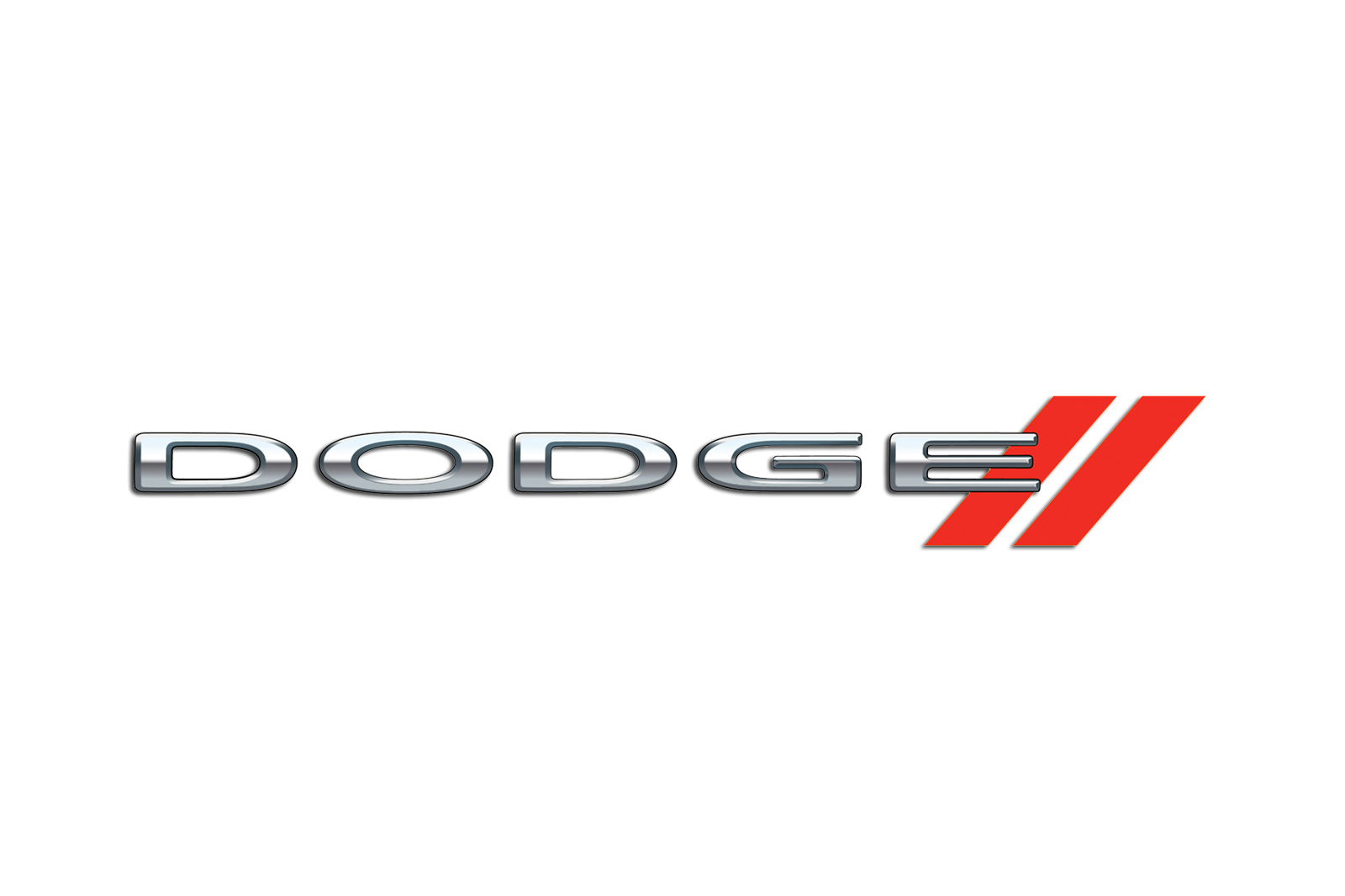
2010 – Today
![]()
The Dodge logo we all know today was designed in 2010. It is a black bold logotype in all capitals, accompanied by two diagonal red lines on its right. The extended sans-serif typeface of the brand’s wordmark looks pretty similar to Ordin font.
2022 – now
![]()
The abstract triangular image drawn for the company back in 1962 was brought back. It was given a completely new spin with the introduction of fiery red that outlined each of the three elements. This image was placed on a black square that echoed the black colors often used in the brand’s logos. It can be said that the designers did a great job presenting the recognizable brand visuals and color palette in a completely new, striking way.
Dodge RAM
![]()
Dodge RAM started to use its own official logo in 1993. Though the logo was repeating the mother-brand’s main emblem, the “RAM” nameplate was placed under it. The lettering was executed in an extra-bold sans-serif typeface, where all the letters looked solid and powerful in their red color.
The logo was redesigned in 2009. The concept remained the same — a stylish and sleek ram’s head in a pentagon is now executed in glossy silver, giving the logo a three-dimensional effect. The black background of the shield is balanced by the black “RAM” wordmark placed under the image.
Dodge Viper
![]()
Dodge Viper is the second most popular car model of the American manufacturer. The logo of this super at fully reflects the mood and individual character of the vehicle. Since the introduction of the car in 1992, its visual identity has undergone two redesigns.
All of the created version had three things in common — a pentagon shield as the framing, a monochrome color palette, and an image of a viper snake as the main element. The only difference was only the viper’s face, which was elegant yet very dangerous on all three versions.
Official Dodge website: www.dodge.com


-
 Taiwan car brands
-
 Romanian car brands
-
 Czech car brands
-
 Spanish car brands
-
 Dutch car brands
-
 Indian Car Brands
-
 Canadian Car Brands
-
 Russian Car Brands
-
 Swedish Car Brands
-
 Italian Car Brands
-
 American Car Brands
-
 Japanese Car Brands
-
 European Car Brands
-
 Chinese Car Brands
-
 Korean Car Brands
-
 Australian Car Brands
-
 British Car Brands
-
 French Car Brands
-
 German Car Brands