Eterniti Logo
Eterniti Motors was a car brand created in 2010, only to bring us one car model and then be frozen. They were a big subject of conversations back in the day, and were featured on many car shows. Anticlimactically, they were suspended in 2014 without any real notice as to why.
Meaning and History
As with their only released car, Artemis, the brand’s logo is noticeably elegant, despite its size. Ignoring the usual desire to bring something new to the industry, it’s possible that their entire design was the attempt to draw attention. After all, why would a British person knowingly make a spelling mistake in the name of their brand?
2010 – 2014
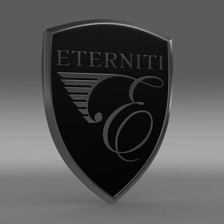
The emblem had two main parts: a big E letter that occupied two-third of the space, and the description below.
The letter above was in an uppercase, although it may not seem like it, because the type is completely and scrupulously handwritten. There are many twirls and twists, because of which the letter initially resembles a kind of an apple with the rich vegetation on top before you focus properly on it.
The description has a lot more normal font of slim and tall letters (like on many perfume brands). It states ‘ETERNITI MOTORS’ and a smaller addition ‘LONDON’ further below. All letters, as everything else on the emblem, is black.
Symbol and Emblem
This company didn’t have any other symbols, by all accounts. That’s why they used this big handwritten letter for car decoration as well. Naturally, it wouldn’t be too recognizable from afar, and that’s why they put it in a big prominent circle in the middle of the front of the car.
The Legends
The only car they ever produced or planned is called Artemis (formerly – Hemera). It’s a ‘first ever’ Super-SUV. That makes sense – the auto is powered by the Porsche V8 turbo engine
Despite being conventionally big, the design of the car is slick and elegant. It was heavily inspired by the design of the racing cars, and a lot of their usual elements were also implemented into the construction.


