Ferrari Logo
Ferrari, a legend that appeared back in the 40s of the 20th century, has been leading the market for many years, leaving behind the strongest competitors. The company arouses respect and admiration among auto admirers. Interestingly, the king of the automotive industry never resorted to advertising, basing the brand on quality alone. Enzo Ferrari’s love for cars was born at a childhood age and a little boy who dreamed of becoming a racer managed to build an entire empire for the production of premium cars. The gorgeous red color, outrageous speed, and a prancing stallion on the emblem of the brand made Ferrari one of the most recognizable and popular in the world.
Meaning and History
The horse was initially the sign of the famous Count Francesco Baracca. He was a legendary professional of the air force of Italy at the World War I, who depicted it on the wing of his planes. Francesco Baracca died very yearly on June 19 in 1918, shot down later on 34 victorious fightings and many team triumphs. He soon turned into a national hero. Francesco Baracca had wanted to depict the hopping horse on the planes because his team, the “Battaglione Aviatori”, became enrolled in a horse regiment, and also since he was the best cavalier at his team.
One day, Enzo Ferrari explained the case of the hopping horse logo. Actually the horse was depicted on the board of the fighter airplane of Francesco Baracca, famous heroic pilot of the World War I. In ’23, Enzo met Baracca’s father, count Enrico Baracca, and then his mum, Countess Paulina, who told to Enzo one day to put her son’s hopping horse on the cars.
She said that it necessarily would bring him a success. The horse became, and still is, colored in black, and Ferrari added the yellow field symbolizing the color of his native Modena.
1923 – 1929
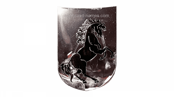
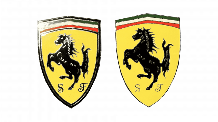
The iconic company’s original logo was created in shiny silver, which provided a dash of luxury, elegance, and modernity. It was a shield with a smooth, rounded bottom and a top that was somewhat caved in. Only a depiction of a leaping horse appeared on the emblem. The horse appeared three-dimensional, bringing in a stylish and sophisticated aspect.
1929 – 1932
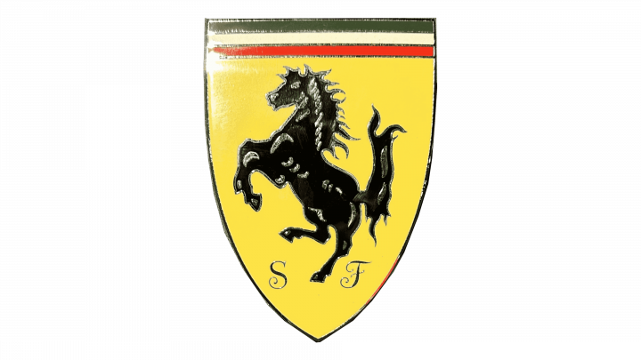
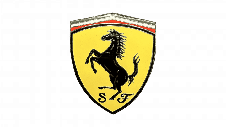
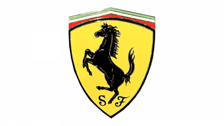
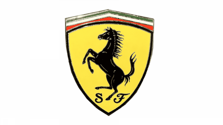
The original logo depicted a yellow shield, divided into two sections. Much of the shield was outlined by a black border. That’s where the central image – the black rearing horse – was placed. This horse was a realistic enough silhouette with specks of white. Beneath it, they wrote initials ‘F’ & ‘S’. The other bit was located above this outlined area and it included a ribbon of Italian colors, stretching alongside the top edge of the main area. The entire emblem was then outline by a layer of yellow.
1932 – 1940
The design was simplified by 1931. The yellow edge was scrapped, and the top edge of the shield became straight rather than curved, like previously. The specks of white on the horse were painted yellow.
1940 – 1945
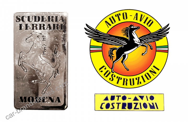
It was somewhat reimagined in 1940. The emblem now used a circle with an orange center and a yellow edge. The writing ‘Auto-Avio Costruzioni’ was divided between the top and the bottom of said edge. The sides were occupied by small Italian flags. The horse was turned into a drawing of a Pegasus. It was comparably more nuanced, colored white and black. The wings stretched way beyond the orange part, and even the yellow edges.
1945 – 1947
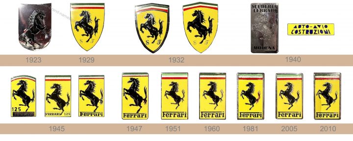
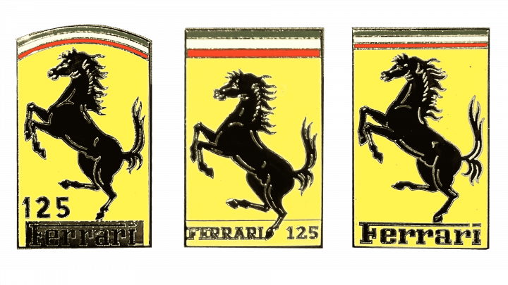
The company has already tested a rectangular shape, but it was during the postwar time that the company created a logo that it tweaked only minimally. It should be noted that there were three versions used during this period. They were similar but each had slight differences that mainly consisted in the way the company name was printed as well as the top portion of the logo where one logo featured an arched top while the other two experimented with different thicknesses of the three lines that represented the Italian flag. Despite minor differences, any version will be instantly recognizable.
1947 – 1951
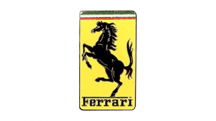
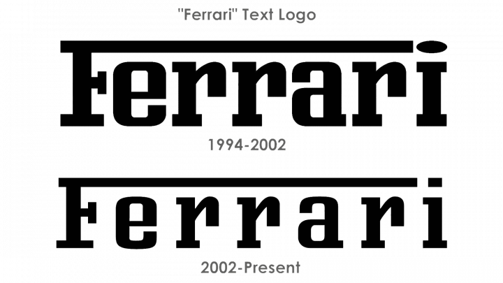
After the war, the company returned to the Ferrari image. They returned the yellow badge with a black horse on it. It was no longer a shield, but a tall rectangular figure. The Italian colors were still stretched in a ribbon along its top edge. The horse still looked natural enough, but it was now more of an artistic depiction. Instead of the initials, the bottom was occupied by the word ‘Ferrari’ in black writing, where the top like of ‘F’ served as an overline for other letters.
1951 – 1960
Small changes followed in 1951. Namely, the letters in the name grew taller, while the horse was reduced in size and placed in the very center of the rectangle. The stripes of the Italian ribbon above were also increased in width.
1960 – 1981
The Ferrari brand never stopped polishing its logo. The top green line of the banner was made darker, which improved the balance of the flag. The horse was somewhat redrawn, but the name was left the same. Although it is not immediately apparent, the mane seems more neat, while the tail has thinner lines. The animal still exudes strength and beauty.
1981 – 2005
In 1981, the horse was redrawn to be bulkier and more generalized in appearance. They basically scrapped some artistic nuances and made some parts look more natural. Furthermore, a metal-looking edge was added around the logo.
2005 – 2010
By 2005, the logo was streamlined and made much cleaner. They adopted brighter colors, removed rough bits and excluded the unnecessary bits (like the thin borders around letters, et cetera). They adopted simpler shapes, but more pronounced details. For instance, the horse was drawn with more effort, but all the shapes were far from elaborate. The metallic frame was replaced with a simple black line.
2010 – today
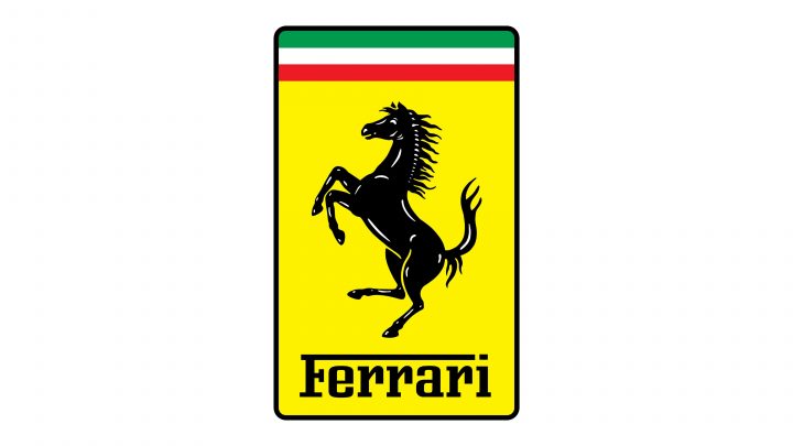
The colors were further brightened in 2002. Moreover, they made this badge wider, but without stretching the imagery. They redrew some parts of the horse, like the snout, which grew longer. Lastly, the borders between the stripes of the ribbon above were erased, as was the border between them and the yellow area.
Description
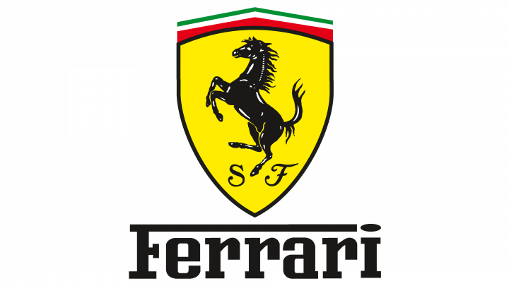
The famous logo of the Ferrari racing team is black prancing horse and a yellow army of coats, usually with the inscription S F that means Scuderia Ferrari with 3 stripes of green, white and red. Company’s title ‘Ferrari’ is depicted at the inferior of the Ferrari symbol. Primarily, at the place of the title, the inscription SF was engraved on the symbol. The font of this logo is stylish and effective, highlighting the brand features of the manufacturer.
Shape
This form belonging to the Ferrari symbol is square with the note ‘prancing horse’. This animal has brought great flourish to the company. Ferrari horse was, initially, markedly different from original Baracca horse in many details, the notable being the tail which in the original Francesco Baracca version was depicted downward. The hopping horse reflects power and nowadays fans of the company instantly feel sports and speed vehicles when they consider Enzo Ferrari logo.
Color
That initial “prancing horse” on Francesco Baracca’s airplane was depicted in red on the white cloud-likeform, but Ferrari decided to have the animal in black. Black color means a grief on Baracca’s team planes after the airman was killed in fighting. Then Ferrari added a canary colored background as this was the symbolical color of Modena, Ferrari’s birthplace. The symbol is crowned with white, green and red strips that symbolize Italian national colors.
The original “prancing horse” on Baracca’s airplane was painted in red on a white cloud-like shape, but Ferrari chose to have the horse in black. Black color means a grief on Baracca’s squadron planes after the pilot was killed in action. Then Ferrari added a canary yellow background as this is the color of the city of Modena, his birthplace. The logo is crowned with green, white and red strips, which symbolize Italian national colors.
Emblem
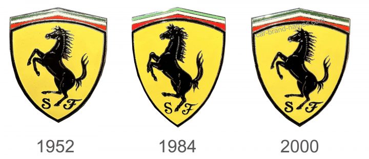
1952
A bright yellow shield serves as a background and gives a feeling of sophistication and at the same time, it is full of energy. The brand showed its patriotism by adding three colored stripes that symbolized the flag of Italy. A black, rearing horse, which fills the yellow portion of the shield, represents power. Besides the animal, the logo has “SF” printed at the very bottom. They stand for “Ferrari Stable”, which further enhances the association with powerful animals and automobiles. When people see the Ferrari logo, they immediately think of sports cars. Obviously, the company is lucky to have such an imposing and respected emblem.
1984
Although the stallion was still standing on its rear feet, there was something grand about it thanks to some minor modifications. The animal had more defined features, which made it look even stronger and more magnificent. The initials were also rewritten and featured sharper serifs.
2000
The previous logo was used by the company for a little over 15 years. Afterward, the brand decided to bring back the logo it designed back in 1952. It was a perfect move to show the new generation that this company has a great history and is proud of it.
Official Ferrari website: www.ferrari.com
