Fiat Logo
Everyone knows that Italy is the birthplace of the Fiat brand, the largest Italian automobile corporation. It produces cars, sports cars, trucks, and various industrial and agricultural machinery. Automobiles are loved in this European country, but this brand has been in the shadow of more famous names (e.g.Lamborghini) for almost its entire history. Nonetheless, it owns many records and discoveries. It was this concern that was the first to implement a heating and ventilation system, and the first Common Rail diesel engine was produced at this plant. Its automobiles were recognized as the best European car over ten times. Many legendary Italian personalities (for example, Felippe Massa and Alejandro Del Piero) prefer to travel on automobiles of this brand.
Meaning and History
Dating back to 1899, Fiat boasts a longer history than most European, US and Japanese rivals and is proud of taking a huge role in developing the entire automotive industry. Few daredevils were able to challenge the automotive field at the dawn of Italian industrialization. However, despite all obstacles Fiat found the way to rapid development far beyond auto production.
Today Fiat is one of the most recognizable car manufacturing companies in the world, offering stylish and economic vehicles in different segments following historical traditions.
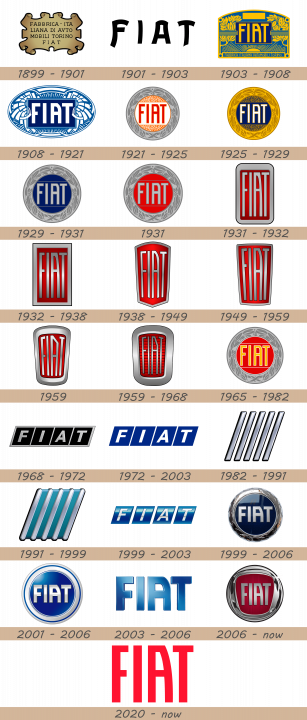
The company’s logo is also one of the most recognizable badges not only in Europe but also on the US auto market. It has evolved since it was first introduced and the latest update came in 2006 to shape it the way we know it.
1899 – 1901
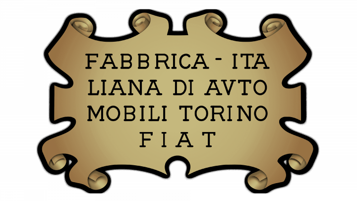
The original logo was styled as a piece of parchment. It was vaguely rectangular and had curls all over the edges. The coloring was yellowish-brown, and they also added a black border around. The parchment itself included the four lines of text that amounted to ‘Fabbrica – Italiana di Avtomobili Torino FIAT’. The letters were thin, black and capitalized. Notably, some of these words were divided and moved to a new line.
1901 – 1903

The 1901 design was instead the word ‘FIAT’, written in a peculiar style. The letters were black, capitalized and had a curvy font with sharp turns.
1903 – 1908
The next emblem is more elaborate. It resembles a brochure, shaped like a rectangle with a domed top. The background is blue, but most illustrative elements are yellow. That includes flowery ornaments inside, the sun in the bottom and edges for the figure itself and the smaller nameplates inside. The latter includes a dark blue rectangle in the center with the yellow letters ‘FIAT’ in it. The full name ‘Fabbrica Italiana Automobili Torino’ is written in a longer, narrower strip of blue in the bottom.
1908 – 1921

The next design is also a rather complex image. It’s got a turquoise oval with various white elements inside, which resemble wings and rays. The center is occupied by the same dark blue rectangle with virtually the same writing, except white and not as tall. They outlined it in white and then light blue.
1921 – 1925
The next emblem is instead a round shape. It includes a grey edge with a multicolored core of mostly orange, white and red. In the latter, they put the wordmark of the same appearance as before, but red and placed onto a strip of white. To its top and bottom, there are orange patterns that resemble cracked sand with specks of white in-between. The grey big, for its part, is home to a laurel wreath, which is also colored grey, but a darker shade.
1925 – 1929
The 1925 redesign is mostly a recoloring attempt. It’s now a golden edge with a bronze wreath; the white strip turned blue, and the name on it – white with an orange outline. The sand bits became brown with dark blue between them.
1929 – 1931

They further recolored it in 1929, but also removed the cracked patterns in favor of plain dark blue background. These sections are still separated from the central strips by lines (grey, this time). Grey is also used for the letters and the outer ring. The wreath on the latter is again a darker shade of grey.
1931
This design is the same emblem, but with bright red instead of dark blue.
1931 – 1932
This logo is an evolution of the previous one in the sense that it uses a similar layout and the same color scheme. It’s a tall rectangular badge with a red core and a grey outer layer. Furthermore, the brand’s name is visible inside that red space in the same style as before, but taller. It’s also colored grey this time.
1932 – 1938
The corners were squared in this version, and it has a more visible measure of shading. It had some before, in the bottom of the badge. Now, the illumination is focused in the middle with gradual shading spreading closer to the edges.
1938 – 1949
They adopted more of a shield shape for their badge in 1938. They made it thinner overall and subsequently squeezed the letters from the sides. The shape of the badge is the biggest change. It now grows slightly narrower closer to the bottom. The bottom itself now has three points and resembles a triangle. The top line, meanwhile, turned into an arch.
1949 – 1959
In 1949, they decided to flatten the top and bottom lines again. The shading is also different again, but that’s about it.
1959
The 1959 variant has a much thicker, silver frame around the red area. Furthermore, the letters became sharper and more acute.
1959 – 1968
Next, they decided to make the metal frame even thicker. The letters, at the same time, became noticeably thinner. Lastly, horizontal stripes appeared all over the red area, colored darker red for contrast.
1965 – 1982
1965 marked the return of the old round logo. It again has a grey outer layer with a darker wreath. The inner bits are bright red with white borders around them. The letters turned orange with white edges. The layout itself is identical.
1968 – 1972
The Fiat logo consisted of alphabets F-I-A-T. There was an inscribed silver line between every separate letter located on the blue background.
In 1968, they adopted this logo: a collected of right-tilted black squares with letters in them. The letters were capitalized sans-serif characters, colored grey. Each was occupied by a single letter from the ‘FIAT’ acronym. The grey borders surrounded each of these figures.
1972 – 2003
The idea to introduce those silver lines was initiated by the chief Fiat designer. He once saw big FIAT letters on the factory building and decided to modify the badge with the spaces inside the logo to make it more stylish and eye-catching.
The 1972 redesign took those squares and painted them blue. The letters turned white. The borders, for their part, vanished. They also removed the shading effects that the previous version had.
1982 – 1991
The 1982 logo introduced five tilted lines side-by-side. They seemed to be made from metal and outlined with black. The idea was that you could fit four letters between these lines, and those letters would be ‘F’, ‘I’, ‘A’ and ‘T’.
1991 – 1999
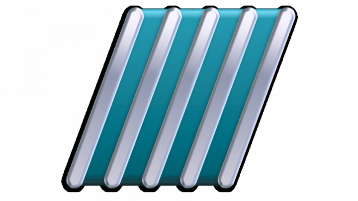
In 1991, they added some turquoise filling between these lines and rounded their tips. It now looks vaguely like a radiator.
1999 – 2003
The Fiat logo, used by the company in the beginning of the 2000s, featured a composition of four slanted parallelograms in glossy gradient blue, with each of the fragments having a bold geometric sans-serif capital letter engraved on it. It was a bright badge with a very energetic and speedy mood, which only stayed with the automaker for a bit less than four years.
1999 – 2006
The 1999 logo is a similar design to the main logo at the time (the four blue rectangles). They basically added gloss and shading to these to make them more 3D.
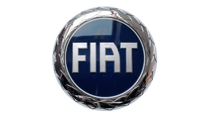
The 1999 logo is inspired by all those round emblems they had before. It has the same acronym in the center, but with bolder letters. They are metallic grey and placed inside a dark blue circle, no separating lines inside it. It’s then surrounded by a thick metallic ring, styled to resemble a collection of petals. It’s supposed to be a wreath, but it still looks like a heavy ring.
2001 – 2006

This secondary logo swapped dark blue inside for a much lighter shade. The wreath ring was scrapped in favor of another wide frame. This one is a layer of white with a thin blue line near the edges.
2003 – 2006

The 2003 logo is just the name, ‘FIAT’. It has exactly the same appearance, except for the bright blue coloring. Furthermore, you can see a lot of depth (thanks to the side walls) and shading.
2006 – today
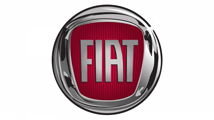
Later these letters had various versions throughout the whole history of the Italian car brand. And only in 2006 it received the world’s famous circle with same old FIAT letters inside on red background.
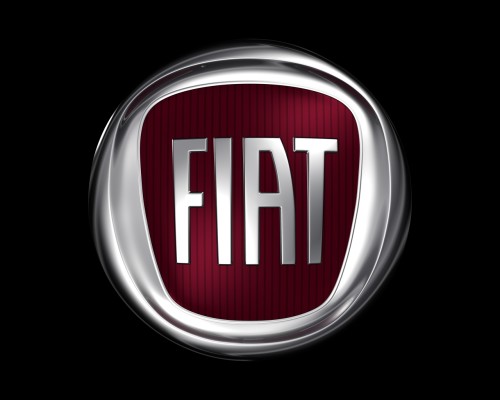
This badge uses the same old ‘FIAT’ writing, but colored grey and placed inside a new environment. The area around it was actually very similar to their 60s logo with a thick metallic frame and a figure that narrowed closer to the bottom. That being said, it’s not nearly as tall, and the letters, therefore, are normally proportioned. The background area is red with darker vertical stripes. The frame around it doesn’t mirror the shape of the core area. Rather, it’s a perfect circle, in which the red section was pressed.
2020 – today
In 2020, they adopted the word ‘FIAT’ as one of the main logos. It’s just these four letters with the same old look and the bright red coloring, nothing more.
Description
Fiat brand does not call for additional introduction. At the moment the Italian automaker is one of the biggest European names on US automotive arena. At the same time it has numerous factories all over the globe as well as thousands of employees, designers and engineers who are working on producing innovative and modern vehicles for all tastes. The brand has changed its logo several times starting from the first version introduced at the beginning of the 20th century.
It depicted bold letters FIAT on blue background which stood for Fabbrica Italiana di Automobili Torino. In 2006 designers decided to replace blue background with red one featuring the same letters on it. Now Fiat logo has a shield-like shape with the message of ongoing change, with the company’s name surrounded by laurel leaves.
Shape
The shape of the Fiat Symbol looks like a shield. It used to be a circle before 2006 modification. The shield contains a message inside of it as well as the brand’s name with laurel leaves which surround the composition.
Color
At first the symbol was mainly blue. It consisted of large FIAT letters which stood for Fabbrica Italiana di Automobili Torino on blue background. But the chief designer decided to make it more stylish and remarkable adding empty spaces inside the letters and silver lines between them. Several changes have been made since then, but the blue background was used through 2006. It was then that the company decided to replace it with red color and change the shape of the badge to make it look more modern and up-to-date.

