Ford Logo
The American corporation Ford Motor Company has long been on the list of the world’s leading automakers. For more than a century of history, Ford has been in fourth place in terms of car sales, and their models are popular on all continents of the planet. Since its foundation, the company has come a long way of formation and mergers. During the wars, it produced army trucks, jeeps, and other military vehicles. The main product is the release of cars to the consumer market. Plants located in many countries produce more than 70 different models under the brands Jaguar, Mercury, and Lincoln, as well as engines, spare parts, buses, and a number of special equipment for various purposes.
Meaning and History
Henry Ford built his first car in 1896, long before he founded his own company. The history of the Ford Motor Company brand began in the summer of 1903 when Henry Ford managed to convince twelve investors of the project’s profitability. Earlier, Henry tried to create a company twice and both times were unsuccessful. The first cars were produced exclusively to order. The first mass-production models were sold at a price that was much lower than the average market in the US. Increasing demand for Ford vehicles demanded an expansion of the plant. Volumes only increased every year, and in 1920, for the first time in the history of the Ford company, more than a million new cars saw the world during one calendar year. It opened a branch in Canada just a year after its foundation. In the period of history from 1911 to 1916, Ford opened new factories in Great Britain, France, Denmark, Austria, and Germany, as well as on three other continents – South Africa, Australia, and Argentina. The Ford family bought out all the shares before the Great Depression. Today, Ford Motor Company continues to be one of the largest automakers in the world.
1903 – 1907
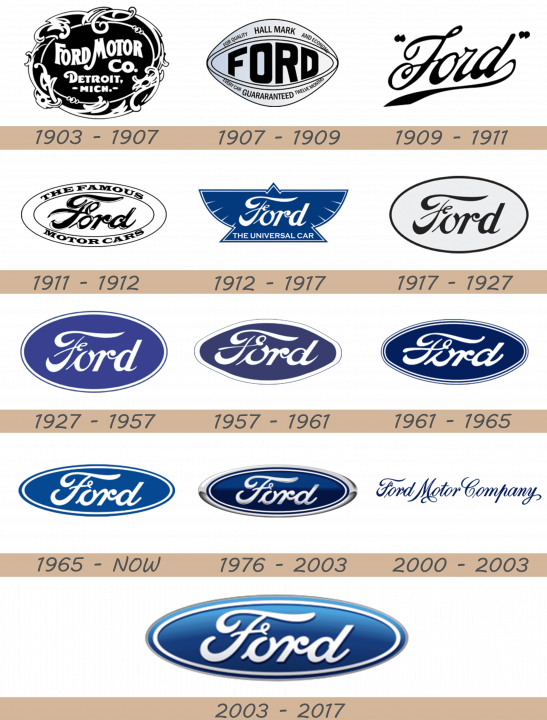
Ford Motor Company is proud to have one of the most recognizable corporate logos in the world, the one that has been used for most of the company’s history. Yet, Ford’s first production car, Model A, introduced in 1903, featured an emblem with stylized ‘Ford Motor Company’ wording, complete with a fashionable artistic border.
1907 – 1909
The famous Ford oval dates back to 1907 when the British entrepreneurs Perry, Thornton and Schreiber, responsible for the company’s advent to Great Britain, decided to highlight Ford cars’ reliability and economy through the oval-shaped logo.
1909 – 1911
From 1906 to 1910 the american car company used a patented script, known as ‘Script with wings’, which was a thoroughly designed Ford signature with extended “F” and “D” letters. By 2010 Ford has come up with the final revision of the wording that has not changed ever since.
1911 – 1912
The idea was supported by Henry Ford in 1911 and the notorious combination of script and oval badge became the trademark of all Ford vehicles sold in Great Britain. Yet, the rest of Ford automobiles and company internal communications went on to use the plain script lettering through the late 1920s.
1912 – 1917
In 1912 the oval logo made way for a new winged triangle design. Originally introduced to symbolize speed, light weight, stability and grace, the logo came out in dark blue or orange color and featured “The Universal Car” wording at the bottom. However, it did not last long since Henry Ford disliked the emblem.
1917 – 1927
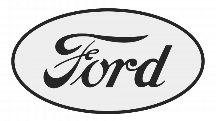
This one is the first instance of the famed Ford oval as we know it today. It’s mostly pale grey with a black border and a black name in the middle. The font is unchanged from the previous emblem.
1927 – 1957
The new 1927 Model A was the first Ford automobile to carry the famous Ford oval on the radiator grill. Deep royal blue background became the company’s trademark and the oval badge has been used on many cars through 1950s.
1957 – 1961
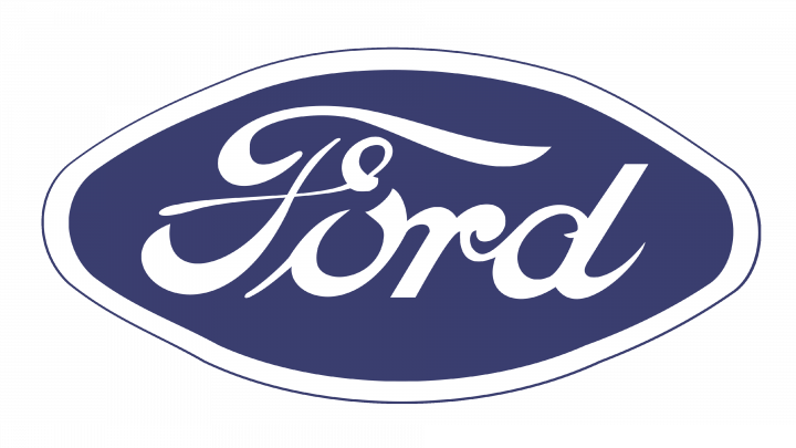
In 1957, they decided to flatten the four diagonal points of the oval shape, making it look vaguely like a wide, round octagon. They also added a big layer of white close to the edges, as well as darkened the color blue inside the emblem. The name part is largely unchanged, but they did squeeze it lightly from top and bottom.
1961 – 1965
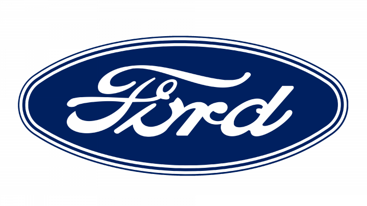
The 1961 design resembles an oval again, although it’s still not as tall, and you can see that those areas are still lightly flattened. The wide area received a blue line that run through its middle all along the oval’s edges. The color remained dark, but became more saturated.
1965 – today
For this design, they essentially made the blue lighter and brighter, returned the edges their homogenous curvature and reworked the edges. There is now a layer of white inside the borders, with a further layer of blue around it. The letters, stretched sideways in the previous design, are back to their normal proportions.
1976 – 2003
Starting from 1976, the blue and silver oval became an essential feature of all Ford vehicles. It has become a recognizable symbol of the company, its facilities and products all around the world and turned into one of the most expensive trademarks. It looks like a dark blue oval with a thick silver frame and a thin line of white just inside the borders of the oval. Also, they started adding shading effects since this design.
2000 – 2003

This logo exhibited the company’s name in full, as ‘Ford Motor Company’, written in one line of cursive blue text. The font is the same as the one used previously, and you can even see that ‘Ford’ is almost unchanged from its previous incarnations.
2003 – 2017
Celebrating the company’s 100th anniversary, Ford introduced the latest version of the logo in 2003. The blue color became gradient, while silver color was replaced with white. The shape of the oval turned more flattened. Essentially, the color palette became lighter and brighter, they got rid of the heavy metallic elements and much of their 3D pretense. The shading is still there, though.
Logo Description
Ford logo is a flattened oval figure designed in several shades of blue and white colors. The famous stylish Henry Ford signature is embedded into the oval. The company has always stressed on the importance of tradition, recognition and elegance and only introduced minor corrections to the logo through the long and successful history.
Shape
Ford has been reliant on oval shape of the logo for most of its history. It looks simple and elegant, provides visual distinctiveness and makes it one of the most recognizable commercial emblems all around the world.
Color
The Ford logo has long been associated with blue color which has earned it wide recognition. The latest version of the logo, introduced in 2003 to celebrate Ford’s 100th anniversary, features a gradient of shades, from light blue at the top to navy blue at the bottom. The ‘Ford’ wording is designed in white letters and there is also a white oval line, embedded into the logo. At the dawn of Ford empire the emblem used to be black and white.
Emblem
Official Ford Website: www.ford.com
