Genesis Logo
Genesis is the high-end automobile brand, established by Hyundai in 2015. The first car of the automaker was introduced in 2017 and became instantly popular. The company has its design facilities in Europe and the USA, and production sites across South Korea.
Meaning and history
Genesis brand started as a luxury sedan model of the famous Korean manufacturer, which was introduced in 2007. After the international success of a high-end vehicle, the company decides to create a separate brand. The Genesis label was born in 2015.
2008 – 2015
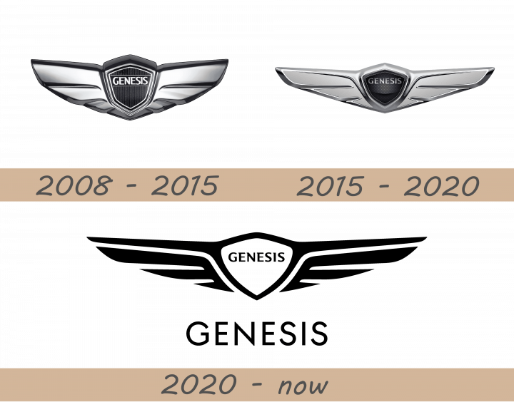
Though the sub-brand of Hyundai was officially founded in 2015, the logo was designed in 2008, it was an alternate badge, which buyers of a luxury-sedan could choose instead of the iconic “H” sign.
The initial concept of 2008 was composed of a black shield set between two wide silver wings. The badge had a clear resemblance with such automotive industry monsters as Bentley and Aston Martin, which accented on the luxury concept and supremacy of the brand.
2015 – 2020
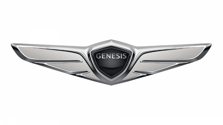
The 2015 emblem lost some of its height, but took on much longer wings. The appearance didn’t change much. Notably, the white edges of the shield were dispensed with. The name part uses the same letters, but they are smaller and heavily shaded. The white lines that underlined and overlined the name are also gone now.
2020 – today
The 2020 design is essentially a simpler black-and-white version of the previous logo. It uses sleek, black strokes to depict the elements, although most of the details are gone now. The shield is much bigger and occupies the entire center of the emblem now. It’s white inside, and there’s nothing inside, except for a black word ‘Genesis’ in pretty much the same spot as before. The wings are represented by two sharp lines that extend from the top of the shield, as well as two three-feathered elements beneath them.
Font
The nameplate, which is placed inside the shield part of the logo, is written in all capitals and executed in a unique and modern font, with serifs in the letters’ upper parts. The typeface is slightly similar to Granada Bold and Astoria Cond fonts, but with its own individual character, representing sophistication and confidence.
The smooth lines and sharp serifs of the wordmark make it look truly luxurious and professional, elevating the whole logo look.
Colors
The brand uses two versions of the color palette for its badges, placed on the cars — silver and black, and silver with royal-blue. Though the official logo is executed in black shades.
Both combinations look professional and strong, evoking a sense of authority and excellence in everything. Black stands for power and courage, while blue is the symbol of responsibility and high-quality. Whatever the main color is, silver-tone adds supremacy and shows the brand’s trustworthiness and loyalty.
Emblem
The emblem of the Genesis brand cars is composed of a shield, executed in a pentagon shape, and two wide wings coming out from both sides. The smooth stylized wings feature two shades of silver-gray, which makes the badge dynamic and adds style and volume.
As for the shield, its glossy surface can be whether black or blue, depending on the model, but in each version, it was a bold silver framing, which is stretched with the emblem’s wings.
The dark background of the shield has an elegant and delicate silver pattern, boasting small dots, sparkling like stars.
Symbol
Two widespread wings are a traditional symbol for the luxury auto-making industry, as this badge represents speeds as nothing else. Executed in silver, the wings also symbolize purity, excellence, and freedom, which the buyers get when purchasing the brand’s high-end cars.
The shield between the wings stands for reliability and protection, and its royal blue or black color with a delicate sophisticated silver pattern reflects the expertise and loyalty of the brand, which aims to provide their customers with the highest quality and the trendiest design available.

