GMC Logo
GMC is a well-known American automaker owned by General Motors Corporation, which has been producing high-quality cars for more than a century. The brand is known for its powerful, tough, and durable trucks and SUVs, perfect for tough jobs and off-road adventures. In the post-war period, GMC experimented with different cars and special equipment, but the production of SUVs, pickups, and light trucks for the North American and the Middle East markets remained a priority. GMC recently introduced Hummer EV, a line of American electric SUVs and pickup trucks. GMC is confident in the future and continues to be one of the largest automakers in the US and the world.
Meaning and History
GMC is an iconic American manufacturer of trucks, vans, buses, SUVs and other commercial vehicles with over a hundred-year history. Founded in 1912 as a truck division of General Motors, following the merger of Rapid Motor Vehicle Company and Reliance Motor car Company, GMC went on to become the company’s successful unit and was soon distinguished into a separate manufacturer of trucks and coaches.
The company was looking for recognition and made its trucks complete the US crossings in 1916 and 1926, proving their reliability and utility. Ever since GMC vehicles have been considered somewhat national commercial transportation as they have been widely used as military trucks during wartime, ambulances, fire trucks, transit buses, light-, medium- and heavy-duty trucks. It is worth mentioning that most of GMC-branded vehicles have been similar to Chevrolet models. Inside the GM corporation, Chevrolet has been targeted at private owners, while GMC has been considered more as a manufacturer of commercial use vehicles.
1911 – 1947
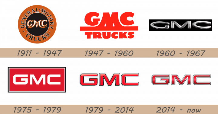
The very first GMC logo was designed in orange, black and white colors. It featured a stylized GMC wording with M stretching the side bars wide as if carrying the other two letters. This symbol was placed on black circle background, which was in turn embedded into the orange circumference that also read General Motors Trucks. The emblem is essentially meant to symbolize a wheel.
1947 – 1960
That logo first used the font that would become the brand’s iconic image. The ‘Truck’ word was soon omitted, leaving the GMC sign alone.
The 1947 logo depicts the same name, ‘GMC Trucks’, but written this time in two lines of bright red text. The upper part, ‘GMC’, has bigger letters, even though they are all capitalized throughout the logo. The style is a bold sans-serif without many special features, except the letter ‘M’ extends further down and joins a bold horizontal bar that separates the two lines of text. The ‘Trucks’ below uses the same font, but with smaller letters.
1960 – 1967
However, first emblem was soon deemed too sophisticated for the commercial trucks manufacturer and was replaced with a simple white GMC Truck sign on black background.
The 1960 logo is just the ‘GMC’ acronym, the word ‘Trucks’ was omitted. The letters used here are stretched very wide and made to resemble metal. As such, the font is much less round, compared to the previous design. That being said, it’s also thinner. The acronym is placed then onto a wide black rectangle.
1975 – 1979
This combination went on to become the brand’s new identity as the red color symbolized raw power and hard-line character of the vehicles, carrying the GMC logo on the grills. The red is given to a new rectangle, which is also outlined by white and then black. Inside it is the same old ‘GMC’ acronym. It’s now white and written with a simpler font. It’s smoother, rounder, but also angular.
1979 – 2014
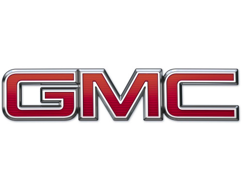
The next GMC emblem was designed in dark-red color and featured a silver border.
The 1979 emblem depicts the acronym solely. Its appearance is exactly the same as in the previous logo, but colored red and with way more volume. They gave these letters a black frame each, but because of the intense glossing, some of their parts look perfectly white.
2014 – now
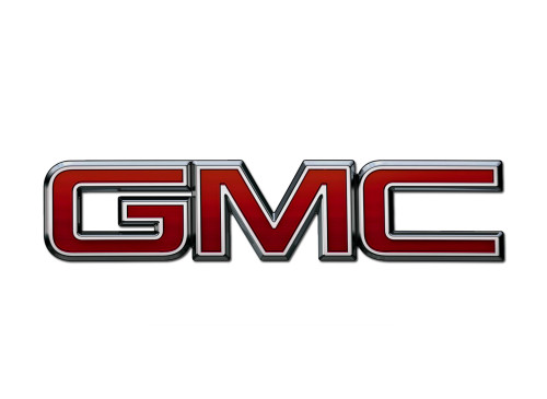
It was later updated as the red color became lighter and the silver border acquired more shades. The color red is notably darker, and they squeezed the letters from the top somewhat. The edges around them are also consistently white now, even though they have grey borders of their own. This logo is now representing the iconic American manufacturer of trucks, SUVs and other commercial vehicles and symbolizes utility and reliability.
Description
The GMC emblem has always been one the most recognizable logos in North America and has always incorporated the three letters forming the company’s name. Basically, it doesn’t carry anything but the G, M and C letters, painted red and decorated with silver borders.
Shape
Despite being a very simplistic emblem, the GMC logo is designed to impress with its large font and symbolizes raw power that is essential for the vehicles produced by the brand. No sophisticated elements, no glamour whatsoever, just brutal utility — this is what GMC owners look for in their trucks and SUVs, and the logo is a perfect representation of these values.
Color
GMC emblem has been designed in several different colors throughout the history, but the latest versions are associated with red color, contributing to the image of brutal commercial vehicles that GMC promotes. The huge red letters are adorned with silver edging that gives a complete look to the emblem.
Emblem
Official GMC website: www.gmc.com
