Isuzu Logo
Isuzu is one of the most well-known names of the Japanese commercial automaking industry. The company was established in 1878 as a petroleum business and re-oriented to vehicle production in 1934.
Meaning and history
One of the most trusted and reputable Japanese brands in the industry, Isuzu boats a very deep branding and visual identity concept meaning. The company was named after a river, and its name can be translated into English as “Fifty bells”. The new title was introduced in 1934, and the first era of the company, while it was working in the petroleum industry, was Ishikawajima.
1949 – 1974

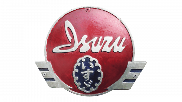
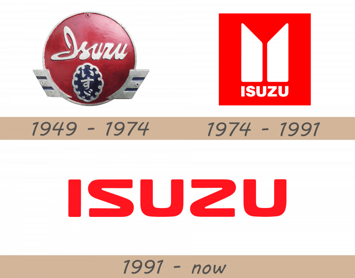
The 1949 Isuzu logo is a badge that consists of a big red circle and a few more details. The circle is a direct reference to the Japanese flag, which many companies back then liked to refer. The circle is surrounded by a thin metallic frame with what seems like small, rectangular wings on each side, near the bottom. Inside the circle, the word ‘Isuzu’ is written in white Latin letters. The font is a cursive handwriting. Beneath it, there is a smaller blue badge. It’s a vertical oval with a wavy silver edge. Inside, the same name is written vertically in Japanese characters.
1974 – 1991
The initial logo for Isuzu was introduced in the 1940s in two color palettes — red and white and monochrome. Later only the red and white version was used.
The logo was composed of an abstract emblem, consisting of two vertical pillars with diagonally cut upper parts, forming kind of a triangular shape pointing down in the negative space. This iconic symbol stands for the first letters of the company name, written in Japanese.
Another meaning of the emblem is the eternal growth and excellence of the company and its products.
The wordmark “Isuzu” in all capitals was placed under the emblem, featuring the same color as pillars.
1990 – Today
The main logo was redesigned in 1990. Though the original concept has been kept, now the wordmark became the main element of the company’s visual identity. The typeface was modified and the emblem is now used as an additional icon, which is sometimes placed in a diagonal oval next to the inscription.
The red and white color palette remains untouched, which makes the Isuzu logo instantly recognizable across the globe.
Color
The scarlet red Isuzu color is a symbol of progress and passion of the company, which never stands in one place, but constantly moving into the future with confidence and strength. Combines with a plain white background, it also stands for loyalty and transparency, along with a value of the customers and their needs.
Some of the logos are accompanied by black taglines, representing professionalism and fundamental approach and making the whole picture more serious, pointing on the brand’s authority and excellence.
Emblem
The iconic Isuzu emblem today is composed of a wordmark and usually executed in red — for documents and advertising campaigns, and silver — when placed on the company’s vehicles.
Font
The inscription in all capitals is executed in a bold sans-serif typeface with smooth lines and softened angles. The font looks like the one close to Fuel Extended or Biome STD Wide Bold, but with the unique letters “S” and “Z” which are the same, but mirrored.
Symbol
The iconic Isuzu symbol, the two pillars, is an example of minimalist elegance and modernity. Two while vertical lines with sharpened tops reflect progress and expertise, showing the high quality of everything the company does and its determination to the process of design and production.


