Lancia Logo
Lancia Logo PNG
Today, Lancia cars are produced in many countries. The basic principles of this brand are progressive and interesting cars, both in the field of design and driving performance. Throughout the twentieth century, Lancia was looking for progressive engineering personnel in Italy and introducing experimental ideas into production. Lancia achieved its greatest success in rally racing. The Italian company is the only one in the world that has won the rally championship 10 times, more than Mitsubishi and Subaru combined.
Meaning and History
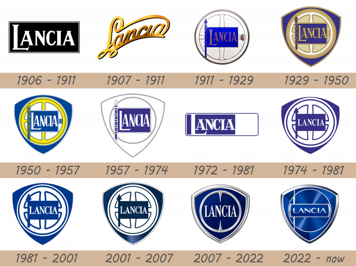
Lancia logo has a long history and underwent many changes as well as the Lancia cars. Vincenzo Lancia and Claudio Fogolin created the first Lancia automobile in 1906 in Turin. Since then the production of the italian car manufacturer was gradually extended.
Initially the car has no special logo, between the years of 1907 and 1910 the cars were marked with special script ‘Lancia’ on the grille to identify the manufacturer.
1906 – 1911
The initial logo was created for the Italian automaking company in 1906 and stayed untouched for the first five years. It was a confident and elegant banner in solid black withheavy white lettering written against it in the uppercase of a traditional serif font with the letter “L” enlarged.
1907 – 1911
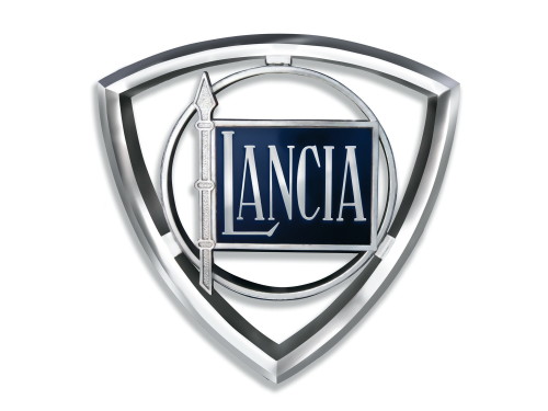
In 1911 Count Carlo Biscaretti di Ruffia designed the logo with a four-spoke steering wheel, which was a background for a lance and shield with a flag and a gold ‘Lancia’ script on it. On the right side there was the hand throttle.
1911 – 1929
The car producers named Lancia models with the Greek letters and the first car to bear a new logo, designed by Count Carlo Biscaretti di Ruffia, was the Gamma 20 HP.
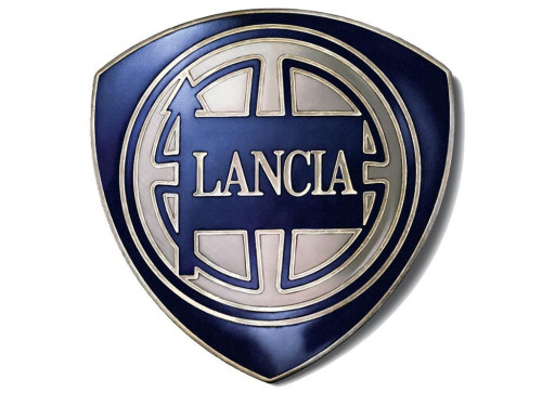
As time went by Lancia underwent the process of innovating and in 1929 the logo was put on a blue enamel Reuleaux triangle. The logo with such background gradually replaced the previous one.
1929 – 1957
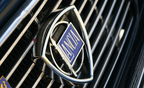
The next logo changes came in 1957 when a blue Reuleaux triangle and a steering wheel were outlined as chrome frames, and the flag remained the only enameled blue element of the re-designed metal logo. That logo lost the hand throttle detail.
1950 – 1957
The redesign of the Lancia logo, held in the 1950s, has introduced the brightest and the most energetic of all the brand’s badges — an electric-blue and acid-yellow crest with a white circle in the center, and the white lettering across the blue flag. This badge was very vivid and lively and evokes a sense of speed, freedom, and power.
1957 – 1974
Nevertheless in 1974 the company’s management brought back the logo of 1929. It was slightly re-designed, the color was changed to silver and blue, but remained practically the same as in 1929, though without the hand throttle. The steering wheel was outlined with blue color. That logo appeared on Lancia Delta in 1979 and remained the same for about 40 years until 2006 with minor change, when a chrome shield surround was added in 2000.
1972 – 1981
The Lancia badge redesign of 1972 was all about coming back to the roots, as this was the second time the company decided to use a rectangular badge as the core of its visual identity concept. The new banner was set in blue and white, with the blue part wider, andelegant white lettering written over it. The banner was outlined in blue and white.
1974 – 1981
In 1974 the company decided to create one more logo, to be used along with the previous badge. This version was fully based on the iconic Lancia crest and was executed in a dark blue and white color palette, with the lettering getting smaller and the contours of all elements — more distinctive. This time all of the characters in the wordmark featured the same size.
1981 – 2001
The redesign of 1981 has slightly modified the colors of the Lancia badge, making the blue softer and more tender. All the elements of the badge remained untouched, but with the new blue hue, the whole logo started looking different — more professional and elegant and started evoking such feelings as reliability and trustworthiness.
2001 – 2007
In 2007 a new logo was introduced at Geneva Motor Show. Robilant Associati designed a new logo. He changed the steering wheel into two-spike chromed one. The new logo with chrome-framed blue shield no longer had the lance and the flag. However, even it was re-designed, the 2007 Lancia logo has retained its traditional style.
2007 – 2022
The logo underwent several changes and modifications, since it was created in 1907. After a simple script ‘Lancia’ it was changed in 1911, 1929, 1957, 1974, 2000 and 2004.
2022 – now
In 2022 the Lancia badge gets a dramatic redesign. The only thing that was left from all the previous badges is the main shape of a crest and the idea of the steering wheel and the flag. The new logo is set in a light gradient blue, with the steering wheel depicted as a thin silver ring, and the banner getting a new elongated and sharp handle. The uppercase Lancia logotype got a new typeface — a sleek futuristic sans-serif with wide contours of the letters and the “A”s having their horizontal bars removed.
Symbol
The steering wheel is the only element, which the logo has kept up to now. Since the company has created its logo, it had the steering wheel, the lance, which gave the name to the car company, the flag with the title on it and the hand throttle.
Since 1957 the logo lost the hand throttle. In 2007 it was modified with a simplified steering wheel and lost the lance and the flag. The title ‘Lancia’ is now placed in the steering wheel, not on the flag. The font of the logo (the letters) has been slightly changed since 1911, in 1974 the designers refused of the capital letter and in 2007 the print, or the font, became a little larger.
Shape
The Reuleaux triangle shape was created in 1929. Earlier the logo was round, as the steering wheel. Since 1929 the steering wheel got its place on the triangle logo. The shape of the triangle Lancia logo remains the same even today, though its elements have been changed several times. In 2000 minor changes in the chrome framing and lines were made, but Reuleaux triangle remains the same.
Color
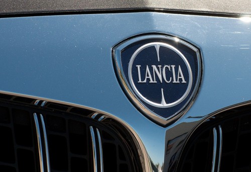
When the script was changed to the logo in 1911, the flag was colored blue. Since then blue color has remained either on the flag or on the shield, as the background color. Even in 1957 when the logo became a chrome-frame, not a shield, and had no color, the flag on it remained blue.
In 1974 the designers switched to 1929-design and put the elements, though without a hand throttle, on a blue shield. After renovations in 2007 the elements on the logo disappeared and the steering wheel became schematic and simplified. The chrome steering wheel was put on the blue background. The logo has never been that blue before.
Emblem
Official smart website: www.lancia.com

