Lotus Logo
![]() Lotus Logo PNG
Lotus Logo PNG
Lotus Cars or simply Lotus is a luxury car making company from Great Britain, which was established in the 1940s by Colin Chapman. The brand is one of the best-known in the world’s industry of sportscars.
Meaning and history
![]()
Founded by a professional car engineer, Lotus Cars has been specialized in the production of racing cars since the very beginning. As its focus, the visual identity of the brand has also barely changed by today, which says about the company’s constancy and a high value of its legacy and history.
The British company Lotus was created in three stages: in 1952 Lotus Engineering was registered, in 1955 – Lotus Cars, and in 1959 the Group Lotus Holding was formed. Ease and efficiency are two keywords that characterize Lotus vehicles. These principles formed the basis of the design philosophy of Colin Chapman, the founder. During the period from 1958 until 1994. There was also a racing team Team Lotus, which had seven design and six driver’s cups of the Formula 1 World Championship. In 1986, Lotus was bought by the American concern General Motors. Then, in 1996, the Malaysian concern Proton acquired a controlling stake, then, in the fall of 2017, most (or rather 51%) of the shares of Lotus Cars were owned by the Chinese concern Geely. Like many automakers, Lotus has been focusing on electric automobiles in the last few years.
1948 – 1984
![]()
The initial logo for the automaker was introduced in the same year the company was established, 1948, and stayed untouched for almost forty years.
The logo was composed of a black triangle with rounded angles, comprising a wordmark with a monogram above it. The lettering was slightly arched and placed along the base of the triangle.
Both the main inscription and the monogram, composed of three overlapping letters, placed inside a big “C”, were executed in light silver color.
The triangle, framed in silver was located on a black circle, which featured the same color of the rounded frame.
1984 – 1986
![]()
The logo in the new color palette was designed in 1986. Now there were two main colors — deep green for the emblem and golden-yellow for text and accents. The shape of the badge was changed to a smoother and more rounded one, making the triangle look like an oval with a slightly pointed top.
During the first two years, the monogram was not placed on the badge, just the “Lotus” lettering in a bold serif font, with letters slightly overlapping each other.
1986 – 1989
![]()
In 1986 the monogram returned and got its place above the wordmark. It was executed in the same yellow-gold tone but was slightly smaller than on the initial version.
1989 – 2010
![]()
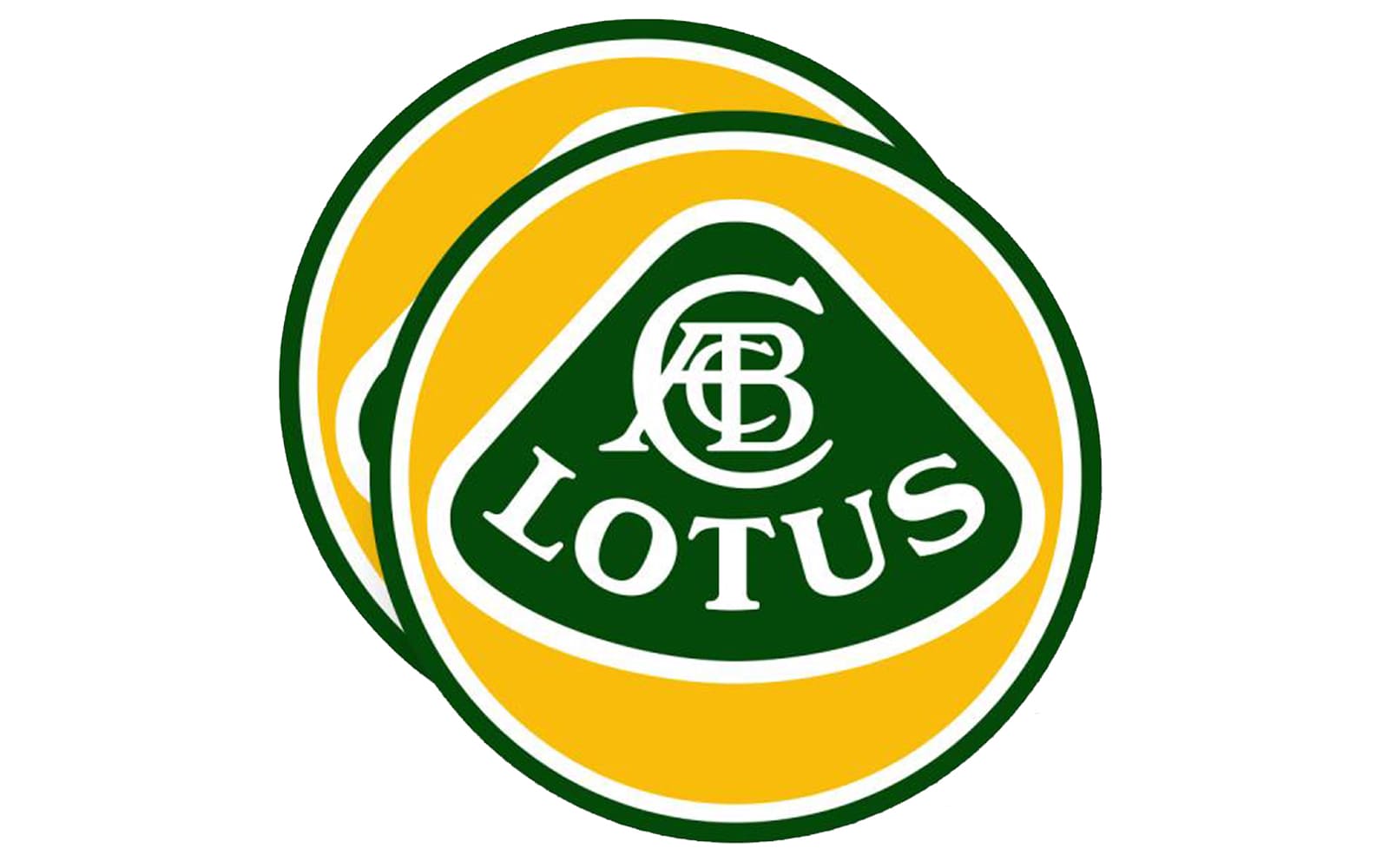
At the end of the 1980s, Lotus decides to come back to the original visual identity design but brings it in a new color palette. Now the iconic rounded triangle features a rich green shade and is placed on a bright yellow circle, while the framing and lettering are in the same light silver gray tone.
The font of the inscription was changed from sans-serif to a more traditional serif typeface, which added luxury and elegance.
2010 – 2019
![]()
In 2010 the brand adds some volume to its emblem, by making the silver details three-dimensional. Light and delicate shadow now accompanied the lettering and framing of the logo, while the contours became more distinct and clean.
The typeface was also slightly modified — the lines of the letters became thinner and more sophisticated.
2019 – Today
![]()
All the outlines were removed from the logo in 2019. The badge got simplified and the color palette was reduced to only green and yellow, all the silver shades were removed.
The typeface and the location of the lettering were also changed — now the text is written in a bold sans-serif font in a straight line.
Today’s flat version looks bright and cool, evoking a modern and fresh feeling, it represents the company’s willingness to develop and grow with the needs of its clients, without losing their iconic style and luxe.
Emblem
The green and yellow Lotus emblem is instantly recognizable across the globe and symbolizes the luxury automaking industry like nothing else. Green, standing for growth and progress, reflects the main values of the company, while yellow adds a sense of energy and determination.
The triangular shape and smooth angles reflect the high-quality and luxury segment of the brand, showing its products as an example of exquisite style and top design.
Symbol
The Lotus symbol, its iconic monogram, composed of three letters ACB, placed inside a bigger C, is an abbreviation of the company’s founder’s name, Anthony Colin Bruce Chapman.
The redesign of 2019 made the symbol look modern and stylish. Executed in thin lines of a sans-serif typeface, it resembles a steering wheel and adds a sense of reliability and excellence.


-
 Taiwan car brands
-
 Romanian car brands
-
 Czech car brands
-
 Spanish car brands
-
 Dutch car brands
-
 Indian Car Brands
-
 Canadian Car Brands
-
 Russian Car Brands
-
 Swedish Car Brands
-
 Italian Car Brands
-
 American Car Brands
-
 Japanese Car Brands
-
 European Car Brands
-
 Chinese Car Brands
-
 Korean Car Brands
-
 Australian Car Brands
-
 British Car Brands
-
 French Car Brands
-
 German Car Brands