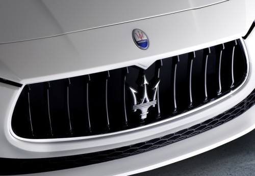
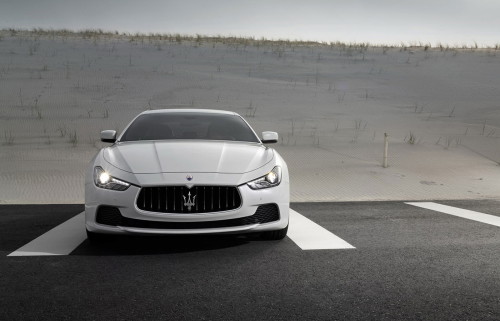
Maserati Logo
Maserati is a legendary Italian manufacturer of exclusive sports cars and business-class cars. Today, the automobile brand is part of a large transnational association “FIAT”. The history of the brand, created by the great Italian automakers, the Maserati brothers, is inextricably linked with records in motorsport, legendary racing cars, and prestigious automobiles that immediately declare the achievements and ambitions of their owners. The name of the brand has long turned into a magic word, saying which, one can imagine being behind the wheel of a luxury sports car, taking it along the winding route of the Italian coast.
Meaning and History
Though Maserati brand history started long before the foundation of the company, it was officially licensed and registered in 1914 in Bologna by Alfieri Maserati. He was born in Italy and had 6 brothers who were also skillful engineers and designers of that time. Five of the Maserati brothers dealt with auto production and development. The sixth brother who was a talented artist is believed to have designed the emblem of the famous luxury car producer.
Since the establishment the company mainly specialized in producing spark plugs. The first ever racing car under was introduced in 1922 as a brainchild of Alfieri and Ettore. The model was named Tippo 20. In spite of failing to win the Grand Prix it proved to be powerful and reliable.
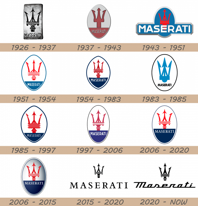
1926 – 1937
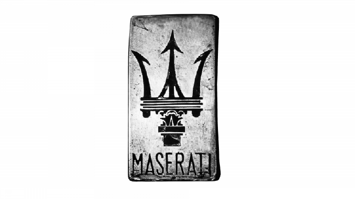
Yet, 1926 is considered to be the year when the first Maserati car was built. It was produced by two brothers and developed on the basis of Diatto vehicles. It was actually the first “real” Maserati which was able to compete with Bugatti and eventually win the Targa Florio race. Tipo 26 is also believed to be the first car having Maserati logo on its body. This was a badge debut.
1937 – 1943
 The next logo uses a vertical ellipse shape as basis. Much of the background is grey, save for the bottom quarter, which is colored red. The same color is used for this version’s trident. It’s not as detailed as the one in the previous design. It’s a simple, smooth shape that occupies much of the remaining space. The bottom area is also home to the word ‘Maserati’, written in thin grey letters.
1943 – 1951
 The 1943 design uses an oval shape. However, there is also a long nameplate that merges with the bottom of the oval. Both bits are blue with a shared grey frame. The trident is bright red and located at the same spot on the oval, except its design is back to the original nuanced appearance.
1951 – 1954
 They returned to the ellipse design in 1951. The layout is similar, but they changed the coloring and the style. It’s not a mostly white figure with a bright blue outline. There’s still a differently colored bottom area, also blue in this one. The ‘Maserati’ bit is written in similar letters, but in white now. The rest is still occupied by a trident, also red and nuanced, but thinner than the previous design.
1954 – 1983
 In this design, the tips of the ellipse became more pointed. Moreover, the color scheme is general became much darker. They also redesigned the trident by changing its appearance in several key bits, as well as making it slimmer. The bottom area grew in size, as well.
1983 – 1985
 The 1983 logo uses a black oval outline to hold a mostly white area with just a few colored elements. One includes the word ‘Maserati’ in largely the same spot, except in a slightly different font now, as well as bolder and black. The trident became much simpler and generalized in appearance. For instance, the elaborate base these had before is how a generally rectangular form. It’s also teal in this variant.
1985 – 1997
The 1985 design largely copies the old 1951 emblem. However, some small changes were introduced, regarding the appearance of the letters and the trident. They also made it bolder, and the color scheme in general is more akin to the later dark version.1997 – 2006
The next evolution is a narrower emblem with a thinner border and a paler color scheme. Some other changes were introduced. The trident is once more slightly changed in appearance. Most notably, it’s also narrower. The letters in the name became much bolder in this version, as well.2006 – 2020
 By 2006, the emblem grew wider again. The trident stayed largely in its old proportions, although some changes in appearance have once more happened. The bottom area grew in size, almost occupying half the inner area of the oval. Because of it, the name was also able to grow in width. They gave it a new font – a thin, more elegant serif typeface. It’s still located along the top edge of said section. As for coloring, the blue remained dark, but the red was back to its older, bright appearance.
2006 – 2015
This design was a 3D version of the previous logo, as was fashionable among car brands at the time. They added another layer of frame to it, a white one. The inner area was richly modified with shading, especially the right half. Other than that, there were no major changes.
2015 – 2020
 The 3D badge was scrapped in favor of this simpler logo. It depicts the same trident image, but black and on its own. They did shrink it in size and placed it right above the company name. It uses the same font – the more elegant serif style – as the main logo. However, the gaps between the letters are wider than before.
2020 – today
In 2020, the badge emblem was scrapped. As their new main logo, they used a modified version of the 2015 logo. The trident looks almost the same, save for a few superficial changes. The writing is what changed most: they gave it a new cursive look, where all letters were connected to one another. It looks like a piece of calligraphic writing, but with rougher, more geometric shapes.Description
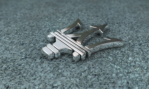
The first brand’s factory was built in Bologna which is the native city of the company’s founder. That is why there is nothing surprising in the fact that Maserati brothers decided to use traditional symbol of their home town as the main emblem.
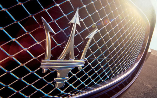
Later they moved to Modena. The composition consists of a trident on blue background base. The trident traditionally represents Neptune’s symbol of power over 7 seas.
There are several versions regarding the creator of the logo. According to one of the versions one of the brothers named Mario was not really passionate about car development and production. He did not want to be involved in automotive industry and proved to be quite a talented artist. They say that he was the one to design Maserati logo based on world’s famous Neptune’s statue located at Piazza Maggiore, Bologna, Italy. The logo was first introduced in 1926 when the brothers produced their first Tipo 26 model.
Shape
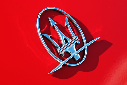
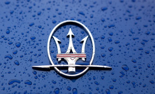
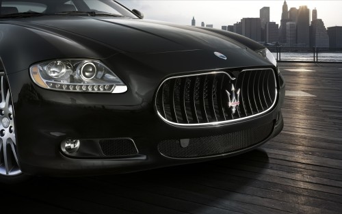
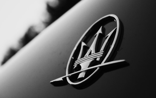
The logo has been slightly modified within a long history of Maserati brand. But the base of the emblem has always been the same making it one of the most recognizable logos over the globe. The red trident is embedded into the vertical oval. There is nothing special about the circling as well as no secret legends. It just made the logo look more elegant and stylish in comparison with other Italian brands. Trident has a classic shape of Neptune’s symbol of power.
Maserati brand has gone through hard times in a long history, survived the oil crisis of the 1970s and today its logo represents power, high level of performance, luxury and style.
Color
Several colors are used in Maserati Emblem. The trident is colored red. There can hardly be any sacred meaning of the chosen tone for Neptune’s attribute. The trident is placed above the blue base and white upper background which divides the oval into two equal pats. Such combination makes the emblem look modern and stylish.

