Maybach Logo
Maybach is the name of a luxury German car-brand, which was organized in the 1900s. One of the world’s best-known high-end vehicles designers and producers, today it is a part of the Mercedes-Maybach group, owned by Daimler since 2013.
Meaning and history
The iconic brand has always been very constant with the highest quality of its cars, the design, and the visual identity concept, which was developed in 1909, the same year when the company was established and stayed untouched until today.
Today the name of the company’s founder, Wilhelm Maybach, has become not just the title or brand, but a common name for luxury cars and top quality.
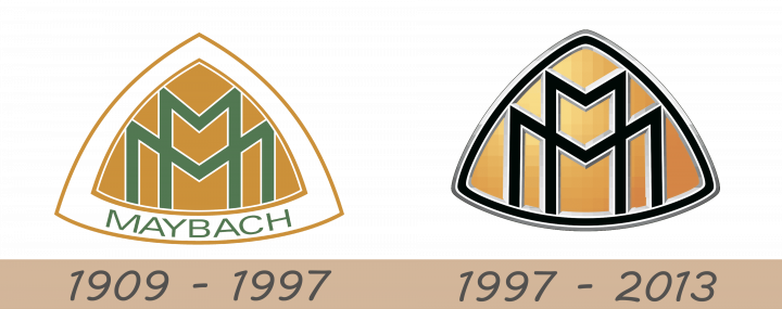
1909 – 1997
The Maybach logo, introduced in 1909, was composed of two overlapping letters “M” (one for “Maybach”, another – for “Motorenbau”), enclosed in a triangular medallion with arched sides. Throughout the years the monogram remained untouched, and the minor changes were only made to the framing. There was a period when “Ms” was placed inside a double outline, with the lettering seated along the triangle’s base.
But the original concept and its delicate style have never changed, staying the tribute to luxury and timeless quality.
1997 – 2013
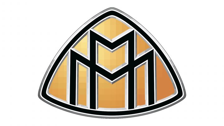 The next design used the same combination of the letters. This time, they colored them black and placed onto the same plectrum-shaped figure. The background was still orange, but they added some shading and lighting to it. Both the letters and the figure itself have volume frames that resembled metal. The emblem is then encased by a black border, which is also framed in metal.
Font
The company’s nameplate, which is usually positioned under the emblem, is written in a custom elegant typeface with thin black lines and a very delicate silver outline, which accents on the clean contours of the symbols and makes its simple sans-serif font look unique and remarkable.
Emblem
The two overlapping letters with black body and white outline, thin yet confident lines, evoke a sense of luxury and sophistication, reflecting and a very strong character and sense of style.
The letters have different shapes — one is thin and tall, while the second one is broad and extended, and it makes the whole emblem unique.
As for the arched triangle itself, it is performed in a gradient gold, adding volume and dynamic to the badge and making the whole image even more luxurious and chic. The black frame in the silver outline completes and balances the look, adding expertise and authority.
The whole outline of the letters turns into a light silver when placed directly on the car, and two different metal colors — silver and gold — are in total harmony on the Maybach emblem.
Symbol
According to some opinions, the Maybach logo has a strong resemblance to the swastika symbol. The reason might be in its distinct and strong lines and monochrome execution of the letters, their sharp angles, and, of course, the obvious confidence.
The two letters “M” also look like mountain peaks, pointing up, higher and higher, which is more about the label and its philosophy.
