Mercury Logo
![]() Mercury Logo PNG
Mercury Logo PNG
Mercury was the name of the luxury Ford subdivision, which was established in the 1930s with the idea of producing high-end cars. The brand successfully existed for more than 70 years and got discontinued in 2011, completely replaced by Lincoln.
Meaning and history
![]()
Founded by the son of Henry Ford, Edsel, the line of luxury-cars was named after the Greek god of merchants, one of the most symbolic figures in ancient mythology. The perfect naming was accompanied by a minimalist yet instantly recognizable visual identity design, which once created in 1938, wasn’t much changed during the history of the brand.
At the very beginning of the brand, there was an attempt to put the Greek god’s profile on the logo, but the company decided to follow a more modern and abstract concept, and it was the right decision.
1938 – 1984
![]() Their original logo was just the word ‘Mercury’, albeit written in a peculiar way. The letters were extremely bold and round. They were placed further apart from one another than usual and tilted to the right. What’s more, both letters ‘R’, as well as ‘U’, don’t have as much of the blank space inside. Instead, all three have a vertical line of blank space coming through them.
Their original logo was just the word ‘Mercury’, albeit written in a peculiar way. The letters were extremely bold and round. They were placed further apart from one another than usual and tilted to the right. What’s more, both letters ‘R’, as well as ‘U’, don’t have as much of the blank space inside. Instead, all three have a vertical line of blank space coming through them.
1984 – 2003
![]()
As Mercury is strongly associated not only with mythology but also with space and even metal, the logo was designed in order to reflect all the meanings of the word. The stylized letter “M”, composed of three parallel lines enclosed in a circle, had a flow of liquid metal, a rounded shape of a planet, and a gold shade of the merchants’ god.
The gold and black color palette looked strong and luxurious, giving the brand a sense of high-end products and quality.
The badge of that time period looked sleek and elegant, due to the glossy black surface, adding a sense of chic and exclusiveness. The three gold lines were accenting on individuality and class.
2003 – 2011
In 1984 the logo was redesigned and simplified. The color palette was switched to white and silver, and the three lines gained a double outline. The “Mercury” wordmark in all capitals was placed under the emblem, written in a simple yet elegant sans-serif typeface with traditional lines and perfectly balanced letters and spacing. The shapes were generally simplified, as well. For instance, the three inner lines are slightly further apart and have more abrupt turns.
Emblem
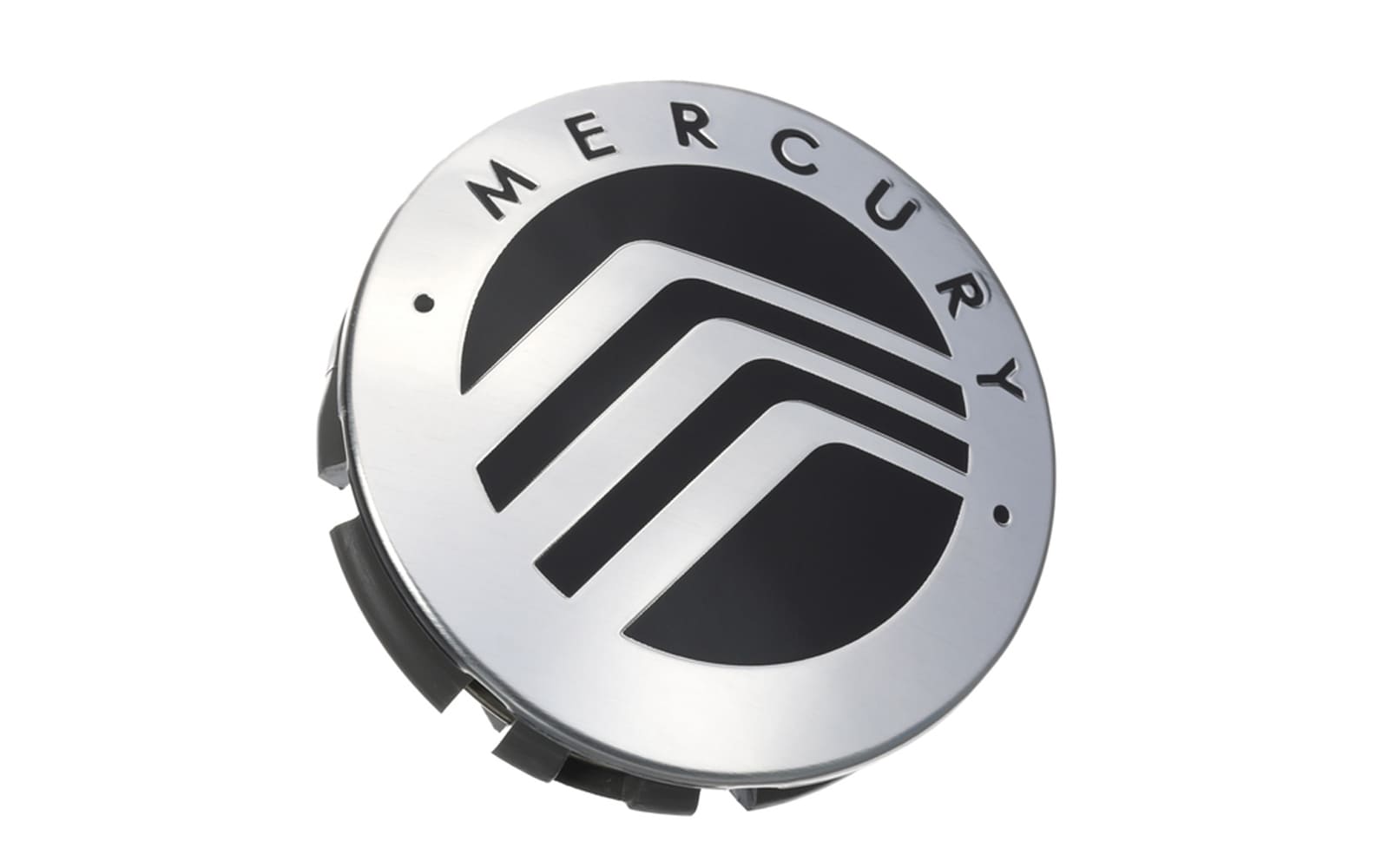
The “Winding Road” is how the iconic Mercury emblem was nicknamed. Its three lines, placed in a circle, sharp turn to the right. Like the wide smooth road changes its direction.
The stylized letter “M”, the road, the liquid metal lines, and the god of merchants and travelers — all the meanings can be seen in one minimalist emblem, which is truly an outstanding designer work.
Symbol
Besides the “Winding road” emblem, the company also used a wild-cat profile as its symbol, as the Mercury Cougar was its most famous model. The symbol comprised an animal’s profile in a circle. The open mouth of the cougar symbolizes danger and power, showing the brand as strong, energetic, and determined.
Color
![]()
The minimalist and simple silver and white color palette represents the luxury brand in its best, symbolizing reliability, loyalty, and professionalism of the company, and accenting the quality of its cars.
The silver metal shade is the perfect solution for any placement, starting from the official documents and advertising campaigns, and finishing with three-dimensional metallic badges, placed directly on the cars.
Font
The typeface of the brand’s wordmark was chosen in order to balance the modest and minimalist visual identity. The simple and clean sans-serif font is pretty close to ITC Migration Sans Regular and OC Pájaro Medium, with their traditional clear lines and straight cuts.


-
 Taiwan car brands
-
 Romanian car brands
-
 Czech car brands
-
 Spanish car brands
-
 Dutch car brands
-
 Indian Car Brands
-
 Canadian Car Brands
-
 Russian Car Brands
-
 Swedish Car Brands
-
 Italian Car Brands
-
 American Car Brands
-
 Japanese Car Brands
-
 European Car Brands
-
 Chinese Car Brands
-
 Korean Car Brands
-
 Australian Car Brands
-
 British Car Brands
-
 French Car Brands
-
 German Car Brands