Noble Logo
Amongst the lesser British car brands, Noble Automotive is a big figure. Although they’ve only been around since 1999, the company has managed to draw some interest to its products. They are specializing on sports and race cars, because of which they’re facing competition from the manufacturers like McLaren.
History and Meaning
Noble has ever only had one logo, which they adopted in 1999. A lot of the elements on it are designed to resemble the aristocratic and prestigious image they’re trying to cultivate. As a result, the color of gold is now stanchly associated with this brand. Regardless, they rarely use any other symbol they can be recognized by.
At the moment, Noble uses a tilted nameplate as their full-time logo. The color, as mentioned, is a bright yellow associated with gold. Their future cars are also going to be painted yellow frequently – they evidently work to make this color associate with them.
The plate is framed in a kind of metal tube which noticeably has a lot of glitter, because of which the exact color is unknown.
The only other element is the text in the yellow space. It’s comprised of the slim black letters that spell ‘Noble’ in uppercase. The letters are as tilted to the right as the object on which they are written.
Emblem and Symbol
There are no distinguishable symbols specific to Noble, and that’s why they mostly use just their logo for any occasion. They do own an artistic image of a crown, comprised of two symmetric N letters, 4 dots and 2 lines. However, they never really use it on cars or other property, and reserve it for the media.
The Legends
These cars are fairly trusty and fast, but they rarely make new cars. For instance, the last model called M600 (the one with the rectangular lights) has been around for 10 years now.
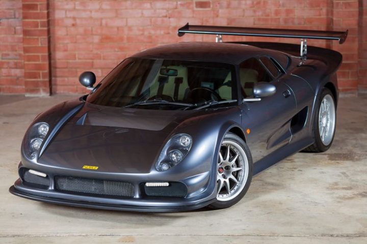
Easily the most iconic car from this family is the M12, which both proved its mettle on countless competitions and was hugely successful on the market. This 4-eyes model makes up the majority of cars ever created by the manufacturer.
