Opel Logo
Opel is one of the central automakers located in Germany. At the moment, the main direction is the production of cars. Opel brand has an interesting history and rich traditions. The main goal since the founding of the company was to make the achievements of science and technology accessible to people of any social status. In 160 years, the Opel brand has evolved from a manufacturer of sewing machines, bicycles, and cars to a high-tech manufacturer of electric automobiles.
Meaning and History
Opel AG, based in Rüsselsheim, Germany, is one of the oldest automobile manufacturers in the world, with its first car produced in 1899. The company itself was founded in 1862 by Adam Opel and specialized in sewing machines and bicycles. Opel’s first cars proved to be a great value for money, which led the company to the leading position on German market. Opel was the first company in Germany to build a complete assembly line to boost its production rate. In 1929 the successful company was acquired by General Motors, looking for overseas ventures. The range of light trucks named Blitz was launched in the 1930s.
The name later inspired Opel owners for the new logo design as it meant ‘lightning’ in German. By the beginning of World War II Opel was the largest car manufacturer in Europe. However, later on Opel plants were first seized by the Nazi government, and then by the Soviets as war time reparation. The company managed to revive after the war, but never equaled its major role in global automotive industry it had had before. Today the GM-owned brand mainly operates in Europe and sells its cars under Buick name in North America and Vauxhall in Great Britain.
Opel has had a number of different logos throughout the history. It all started with Adam Opel initials, designed in bronze and red colors.
1862 – 1910
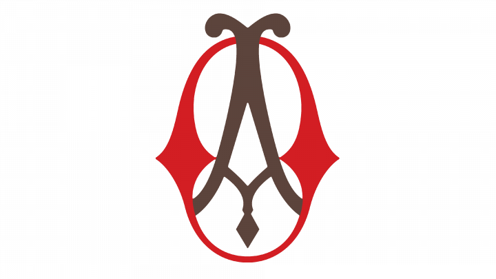
The original logotype was a red oval with brown ornamental symbol inside. The oval had the thickened borders at the sides, so that the inner part of the oval looked like ‘8’ number.
1888 – 1889
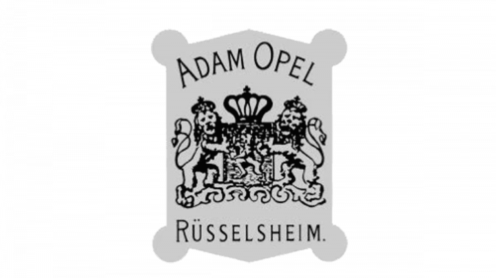
They once used a gray plate with circles at the edges. At the top of the plate, they wrote the founder’s name in a slim thin serif font. In the central part, the brand designers drew a coat of arms, depicting two lines standing right and left from what seems to be a throne with a crown at its top. Beneath, they wrote the address of the company.
1889 – 1893
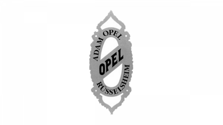
The 1889 renovation made the logo a gray oval turned vertically. The oval had a diagonal bar at the center with the fat black ‘Opel’ word having a serif type with large letters. In the upper part of the oval, we can see the name of the founder. At the bottom, there was the address. The up and down of the oval were ornamented with triangular decorations.
1893 – 1899
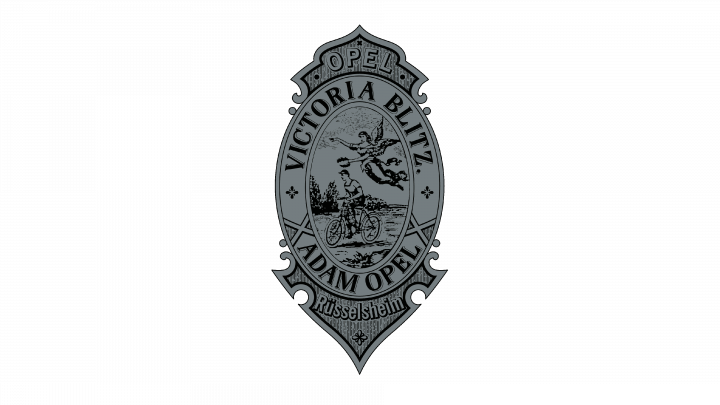
The next logo by Opel was the oval badge with the way darker shades. The words and pictures on the oval were styled as they were engraved. In the central part of badge, they drew a man driving a bicycle, who was accompanied by an angel woman. At the top and bottom of the oval, the founders’ names were showing off. The upper and lower extensions for the oval now showed the company name and its address.
1899
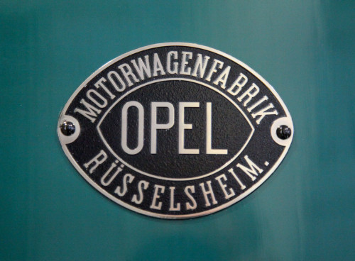
In 1899, they adopted a gray shield emblem with double white and gray outline. On it, they wrote the name in a custom slim serif type, ‘Motorwagenfabrik’ word of a light script and the address written in the same serif light font, but with large uppercase letters. The coloring of the words was black.
1899 – 1902
They drew a fat red bent line with rounded ends. On it, there was the wavy serif name styled as parchment inscription. All over the red line, there were many curvature lines colored bright green. Above the line, we can see the year this logo appeared – 1899. Below the whole logo, they placed the handwritten ‘Fahrrader’ word with all letters separated from each other.
1902 – 1906
The next logo was an oval styled as an eye. It consisted of one fat frame line colored red and white inner part. There they drew the ‘Motorfabrik Russelheim’ inscription of a slim and thin serif script. Also, there was another red oval inside which they wrote the company name of a straight elongated red type.
1906 – 1909
The 1906 logotype was a brown and black rectangle with round top. This rectangle had an ornament styled as Ancient Egyptian stone manuscripts. At the center, they wrote the company name in a heavy, angular typeface with large letters. At the bottom of the rectangle, they put a black stripe with brown ‘A. Opel Russelsheim A/M’ words.
1909 – 1910
One more logo appeared in 1910. This time it was a handwritten inscription colored beige, and having a distinctive understroke.
1910 – 1921
Several badges were shifted at the beginning of the 20th century before the introduction of a ‘blue eye’ logo in 1910. Its almond shape looked like an eye, filled with blue color. The company’s name was written inside. It actually represented a zeppelin, the company’s new symbol.
They made another oval-shaped figure looking like an eye. But this time it had upper and lower parts styled as ornaments with many leaves. There was a dark blue area encircled by them, which had the name in a sharp serif type with letters colored white and having brown contours and no gaps in between. On the right and left sides from the lettering, they drew two big brown trapezes with another trapezes inside.
1921 – 1928
One more oval had a black and yellow coloring. The yellow was used for the inner part of the oval, on which they drew the name. It had a heavy, sharp and angular typeface with large letters colored fat black. On the right and left sides, they had again drawn ornamental symbols, this time two big black triangles with another triangles inside. The yellow zone was incorporated in a black area, and had a black outline.
1928

Another logo was a beige square with the name, written in two levels. ‘O’ and ‘L’ characters were colored white. ‘P’ and ‘E’ letters had a beige coloring and were depicted on two little white squares. The font used for inscription was sans serif and had a smooth and straight style.
1928 – 1937
The 1928 logotype was a red circle contoured yellow. Inside the circle we can see a yellow oval with yellow letters inside, having a script similar to 1921 version.
1930
The oval introduced in 1930 had multiple black rectangles, standing as outlines at the top and bottom. They were split in many triangles. At the edges, they drew double outlines with a black coloring. At the central part of the oval, the ‘Blitz Rad’ words were showing off, and had a heavy serif type. These words were written in a circular position.
1930 – 1936
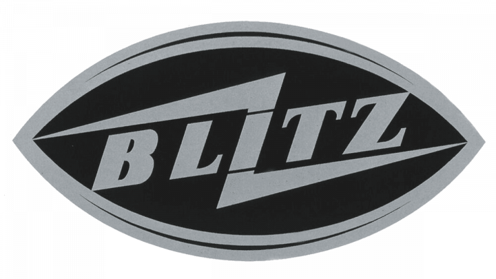
They renovated the oval. It was now recolored black and received a black contour. In the center, there was the ‘Blitz’ word. It had bold gray letters with prominent serifs. They also drew the iconic lightning bolt for the first time. The ‘I’ character served as its middle, connecting two of its sectors.
1936
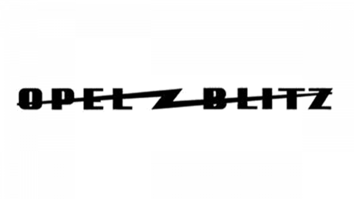
The ‘Opel Blitz’ nameplate had a fat black typeface without serifs. There were bigger gaps between letters. Amidst two words, they drew a lightning bolt also colored black. It had elongated lines so it crossed out two words.
1936 – 1952
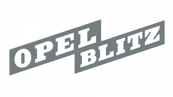
They drew another nameplate. On the bright gray background, the white ‘Opel Blitz’ wording settled down. It had a bold, heavy typeface with prominent serifs. The whole logotype was skewed.
1937 – 1950
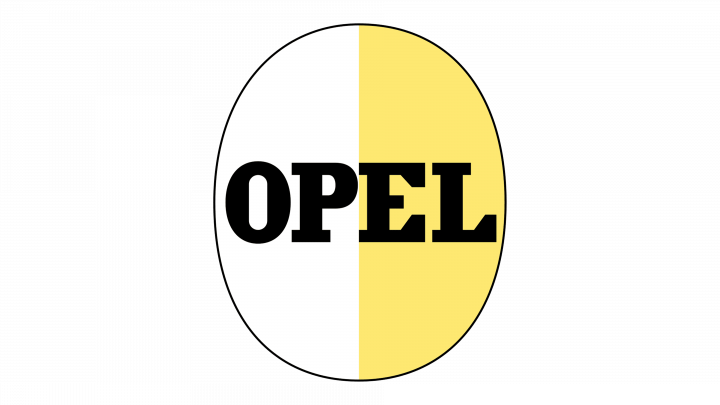
Another logo was vertical colored one half white, one half yellow. On it, they wrote the name with the same type as previous, but a bit less fat. Its coloring was black.
1937 – 1947
A new logo, featuring a stylized grey zeppelin, flying through a yellow circle, was introduced in 1937. The zeppelin had a black outline and two black strokes on it.
1937 – 1938
Yellow circle was later replaced with a grey one. The zeppelin also changed its color. One half was bright gray, while another half was painted white with a gray outline.
1938 – 1947
 The colors of both the zeppelin and circle became way darker. The ring through which the zeppelin came now was made in three lines. The zeppelin itself turned to a full gray palette, though it split in 6 sectors.
1947 – 1954
 They returned the 1937 variant, but elongated and narrowed the zeppelin and made its outline thinner.
1950 – 1970
 White and yellow vertical oval returned as a brand logo in 1950. But it gained a white outline for the yellow half and yellow outline for the white part. The whole logo got a black outline.
1951 – 1953
With the end of airship era Opel was looking for a new logo and a zeppelin was replaced with an airplane.
It had a long, narrowed shape. It palette was gray and outlined gray white. The circle was made of two thin lines separated from each other.
1952 – 1964
The familiar lightning bolt again returned as a corporate logo for some time. It was half dark gray, half black stroke without any background or other elements.
1953 – 1956
Another plane in a circle appeared in 1953. It was a full gray aircraft, separated in two parts by a white line. The plane went through a gray circle, featured in two lines.
1954 – 1963
A bit after the gray watermark came up, they introduced the variant with a bronze coloring. There was also a name written in circle with a heavy angular typeface. It had bigger gaps between sans serif letters.
1956
 The Opel logo redesign of 1956 has removed the lettering from the composition and redrawn the upper wing of the rocket, making it a bit narrower and replacing three thin white stripes with two thicker and longer ones. The frame-ring got a bit smaller, making the rocket look larger.
1956 – 1957
 The redesign of 1956 has played with the shape and shade of the Opel rocket again. The color got a bit colder, closed to green hues, while the Jody of the rocket got thinner and longer, resembling the version, designed in 1954, but with a more even thickness of the element.
1957 – 1959
 In 1957 the badge got another refinement. The ring on the logo got thicker, with the main line outlined in white and gold. As for the rocket itself, it was redrawn; with the upper half being white and outlined in gold, and the bottom in solid gold. This new concept has stayed with the brand for a bit less than two years.
1959 – 1963
 The golden Opel rocket, introduced in 1959 was the most minimalistic of all versions. The shorter and bolder body, clean lines and no white strokes on the wing. The ring was also drawn in a very simple way — just one medium-thick line. This was the last version of this long golden-rocket badge era.
1963 – 1964
In 1963 watermark, a black lightning bolt contoured bright gray was placed over a bright gray circle with a black outline.
1964 – 1970

Year after, they downscaled that watermark, turned its coloring to full black and placed it at the bottom of a thin black rectangular frame. Above it, in bold black sans serif letters there was written the name of the company. Also, the bolt shape changed. Since 1964 it was a z-like symbol.
1964 – 1968
Again, the circle with the bolt over it had returned as the company watermark. However, there were a few changes. First, the color palette now was full bright gray and white, as it was with zeppelin logotypes in 40-50s. The bolt got a double white and gray contour. The circle gained thin white and gray outlines both in its inner and outer sides.
1968 – 1970
The circle style was renovated. There was a thin gray line covered by two also thin white lines. All this was placed between two bold gray rings. The lightning bolt over the circle had a way more oblate shape than previously. There was a white outline, covered from the outer side by various separated lines along the whole symbol.
1970 – 1978
That logo was designed in pale orange color. It was in 1970 that Opel first used a lightning symbol, referring to the Blitz truck (translated as lightning from German) that helped the company to revive after World War II. The emblem was first designed in grey color. Soon, the brand designers made the watermark bold black and downsized it. Below, they wrote the name in a heavy angular typeface with prominent serifs. It was the ont similar to 1937 and 1950 variants.
1978 – 1987
In the 1980s the company updated the emblem, turning it black and completing with a distinctive Opel inscription. The word had a widened black type with bold sans serif letters. The emblem was put in a thin black frame. The frame itself was located on bright yellow rectangle, which, it its turn, received a bold black outline.
1987
 They again made that circle-and-z symbol the watermark. And again, they changed its coloring. Now it was white outlined black.
1987 – 2002
 Remember that 1987 yellow rectangle? They made it white, and the framed zone with the emblem became beige.
1991 – 1995
 They made this emblem white and put it on a black circle.
1995 – 2002

In 1995 logotype renovation, there were no any rectangles or frames. There were just the iconic ‘z over a circle’ emblem and the name below.
2002 – 2007
In 2002 the German car manufacturer introduced a new logo, featuring a 3D shape and painted in gradient shades of silver color.
They also downsized it. The name was repainted yellow and changed its type a sharper one.
2007 – 2009
In 2007, the brand design team of Opel Company came up with a new logo. It was gradient emblem with even more shades of silver white. The name below had a gradient yellow color and a black outline, so it looked 3D.
2009 – 2017
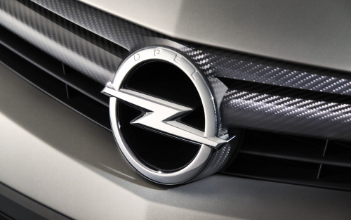
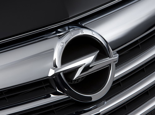
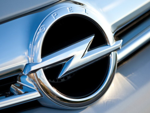
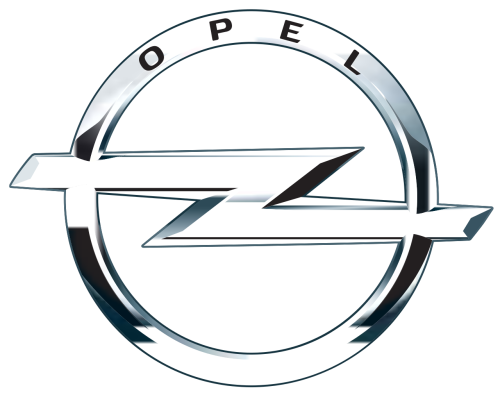
The golden Opel name was placed below the emblem. The emblem, introduced in 2009, features an elegant yet strong and sharp horizontal lightning, embedded into a silver and black circle with the brand’s name at the top.
The name had the similar font with 1995 variant, though it had major gaps between characters.
2016 – 2021
They changed the lighting of the logo to a way darker. The letters became smaller. The ring and bolt narrowed.
2017 – 2020

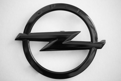
They returned the classic fully black emblem into use.
2020 – 2023
Then, they put it above the name of a straight sans serif font with large gaps among the black letters.
2023 – now
The redesign of 2023 has divided the Opel lighting bolt symbol into two equal parts in a trapezoid shape. The lines got elongated and have their edges cut sharp. The symbol is set on a transparent background with a medium-thick circular frame, overlapped by the lines of the “Z”. The lettering under the graphical part hasn’t changed much since the previous Opel logo version.
Description
The present Opel logo features an iconic sharp lightning, embedded into a circle. The circle is also adorned with the company’s name at the top. The lighting has been used in Opel logo since 1964, while the latest 3D version is designed according to modern graphic standards.
Shape
The lightning, cast in the circle, is sharp and elegant, highlighting the quality and style of Opel vehicles. It is designed in the shape of a stretched ‘Z’ letter. The company name is written in distinctive letters at the top part of the circle.
Color
The emblem of Opel is designed in several hues of silver color, and also features black shades. The silver lightning is adorned with black shades, while the Opel name at the top of the emblem is printed in black letters. It is the first emblem of the German company in long time, deprived of any yellow elements.
Emblem
Official Opel website: www.opel.com
