Plymouth Logo
Plymouth is the name of a famous car brand, which was established in 1928 and discontinued in 2001. The American firm was formed as the division of the Chrysler Group and was mainly focused on the production of affordable cars. For the last three years of its existence, the brand was owned by Daimler-Chrysler.
Meaning and history
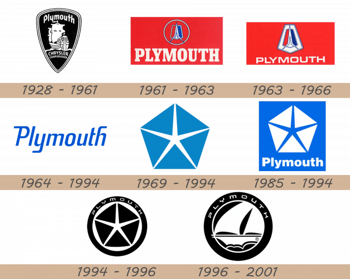
The visual identity history of the American car brand was pretty intense. Named after the colony in the United States, the Chrysler subdivision celebrated pilgrims, by depicting their most symbolic object — The Mayflower clipper, in their first and last logos. In between this tribute to the British colonists, the brand created several modern emblems, along with stylish wordmark versions.
1928 – 1961
The initial logo was introduced in 1928 and stayed with the subdivision for more than 30 years. It was a black shield with a sharp peak pointing down. The white image of the Mayflower was the center of the composition, with “Plymouth” lettering above it and “Chrysler Corporation” inscription in the bottom part of the shield, right under the waves.
The logo featured a thick double white outline and looked strict yet powerful and became instantly recognizable all over North America.
1961 – 1963
The first redesign of the brand’s visual identity was held in 1961, and that is when the concept was dramatically changed. Besides switching the color palette from monochrome to red, white, and blue, the company also decided to completely replace the clipper symbol with an abstract and modern geometric symbol, placed above a two-colored shield and encircled into a thin white ring.
The “Plymouth” wordmark was written in a bold and sleek serif font, in white color, and placed under the emblem, on a scarlet red background.
1963 – 1966
In 1963 the insignia was transformed again. Now the nameplate was smaller and executed in a modern sans-serif, with its letters slightly extended. As for the symbol, the circular frame was replaced by a white pentagon, placed vertically and elegantly balancing the bright red color of the background.
1964 – 1994
The text-based logo was used by the brand since 1964. It was an elegant and fine inscription in a title case, where the “Plymouth” name was written in an italicized sans-serif with thin lines and elongated tail of the letters “P”, “Y” and “H”.
The main color of the logotype was bright blue, symbolizing trustworthiness and professionalism, but the same logo also had a monochrome version, which was used in official documents.
1969 – 1994
Along with the logotype, during the 1960s — 1990s interval, the company used the iconic Chrysler Pentagram emblem in light blue and white. It was a minimalist yet very recognizable image, standing for excellence and high quality.
1985 – 1994
In 1985 the pentagram was drawn in white and placed inside a blue square, with the “Plymouth” inscription in white, placed under the image. The same logo could also be seen in a black-and-white color combination.
1994 – 1996
The visual identity of the brand becomes more elegant in 1994. The famous Chrysler Pentagram in black and white is now placed inside a thick black circular frame, with the nameplate in white placed around its perimeter.
The typeface of the inscription is now very modern and clean, reflecting the progress of the label and its willingness to developers in terms of design and quality.
1996 – 2001
For the last five years of its existence, the brand decides to come back to its roots and places a stylized monochrome Mayflower Clipper inside the black frame with the wordmark on it. The white shop is drawn in profile, moving to the left and its huge white sail represents loyalty and reliability of the company.
Emblem
The Plymouth emblem, when placed on the bonnet of the cars, was executed in two shades of silver metal. With its glossy surface and a three-dimensional structure, it looked solid and strong, and the thin fine lines of the Mayflower contour added elegance and timelessness.
Symbol
The Mayflower Clipper was the main symbol of the group’s subdivision during its history. The tribute to the first British colonists, and explanation of the brand’s name, it was a very sophisticated yet modern image, symbolizing movement and the new beginning.

