Pontiac Logo
![]() Pontiac Logo PNG
Pontiac Logo PNG
Pontiac is the subdivision of the famous GM Company, established in 1926 and withdrawn in 2010. The brand was focused on the design and manufacturing of middle-priced vehicles and was pretty popular across North America.
Meaning and history
![]()
Before getting its iconic name, the label from Michigan was known as the Oakland company, named after the city it was founded in. So until 1926, Oakland used a traditional logo, based on its original naming and simple shapes.
In 1926 the company was acquired by General Motors and remained after a famous Native American Chief Pontiac. And this is when the new era for the brand begins. It lasts until the end of the 1950s when the company decides to go more modern and minimalist.
1926 – 1930
![]()
After getting it’s new Pontiac title, the label decides to keep the shape of the original logo but to make it in solid red color with white accents. Instead of stripes, the white profile of Chief Pontiac was placed on the shield and the nameplate was now arched and placed above his portrait.
1930 – 1959
![]()
In 1930 the visual identity changes its concept and Chief Pontiac changes his direction. Now the white profile of the man, looking to the right, is placed inside a black circle with a thin white outline.
The bold white “Pontiac” inscription in a smooth italicized typeface is placed above the profile, balancing it and making the whole image more elegant and sleek. It was the last logo version, depicting the famous Native American.
1959 – 2002
![]()
In 1959 Pontiac starts its new era. The logo is totally changed and looks like a thin red arrow-head, pointing down. The arrowhead featured a double black and white outline and a fine white four-pointed star in its upper part.
1981 – 2002
![]()
2002 – 2004
![]()
In 2001 the thin and delicate outline is being replaced by a thick three-dimensional silver frame, which added solidness and a sense of excellence and authority to the brand’s visual identity. The frame was shaded, in order to gain more volume and strength.
2004 – 2010
![]()
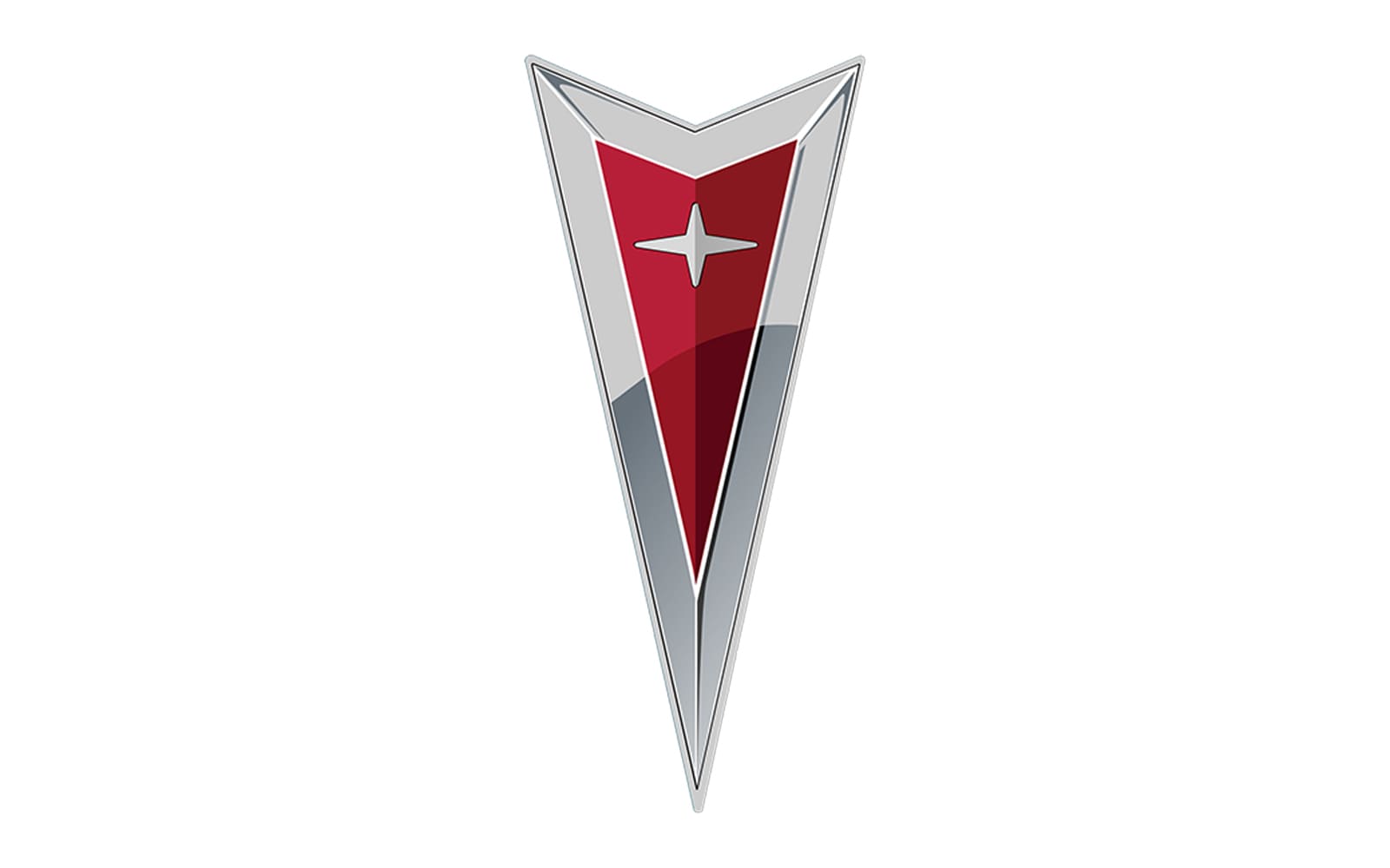
The last logo for Pontiac was created in 2004 and stayed with the brand until the end. The arrowhead concept hasn’t changed, but the color palette was switched to a rich burgundy shade in a light silver-gray, with the star, repeating the color of the outline. The glossy surface and modernized shape of the logo made it look chic and classy.
Emblem
The last emblem of Pontiac looked truly impressive and stylish, due to its elegant elongated shape and a timeless and sophisticated color palette. It combines all the main values of the company — quality, design, trustworthiness, and professionalism, and was instantly recognizable all over the world.
Symbol
Grand Chief Pontiac and the Native American culture have always been the main symbol of the brand, celebrating strength, freedom, and determination. The profile of the great man became an iconic image, which is widely known and loved even after the discontinuation of the brand.


-
 Taiwan car brands
-
 Romanian car brands
-
 Czech car brands
-
 Spanish car brands
-
 Dutch car brands
-
 Indian Car Brands
-
 Canadian Car Brands
-
 Russian Car Brands
-
 Swedish Car Brands
-
 Italian Car Brands
-
 American Car Brands
-
 Japanese Car Brands
-
 European Car Brands
-
 Chinese Car Brands
-
 Korean Car Brands
-
 Australian Car Brands
-
 British Car Brands
-
 French Car Brands
-
 German Car Brands