Porsche Logo
Porsche is a brand that needs no introduction. Considering the fact that the company’s core business is the production of sports cars, Porsche is actively working to create various sports clubs and private meetings for lovers of powerful and incredible cars. The company participates in various rallies and sports races. Interestingly, to this day, the style and design of the models have not changed from the very first developments. It is being updated, becoming more modern, but the concept remains the same. That is why the Porsche brand is so famous all over the world. Interesting facts include the fact that the ignition key in Porsche models is located on the left. It was conceived for racing cars because the car could be started even before you got into it completely. This saved a few extra seconds of valuable time during races.
Meaning and History
Read Also: All british car brands.cts a black horse headlong, an expression of forward putting power and an origin of the city note. For Stuttgart, founded in 950, as stud farm has had horses in the field in varying types since the 13th century. Across the application of the horse, the team of Porsche was creating a clear symbol of the relations they built with the city in which it was based. The crest possesses the outer shape of a coat of arms, while the Porsche word as the overarching inscription, the top over the whole logo, as it were, adds the highly effective picture.
At the initiating of the 1950s, famous Professor Ferdinand Porsche, son Ferry and the trusted circle decided about developing a manufacturer’s emblem that they wanted both to devote to their city Stuttgart and to possess a dynamic, powerful identity.
The emblem was at the start put together the elements from the great history of region Württemberg-Baden, the political region was called at those times: Stylized antlers and such state colors as red and black. It was decided as a clear referring to Swabia, Ferdinand Porsche family’s other home. There was no any reason to meditate changing the Porsche coat of arms’ symbolic and powerful shape and thus to venture modernizing it to end. Although the lettering was slightly trimmed and also the horse’s shape smoothed over years for printed versions, correspondence and brochures, for Porsche fans in Germany and all over the world, which connect the sports vehicles in iconic design with this identity, nothing has transformed for 50 years.
1922 – 1938
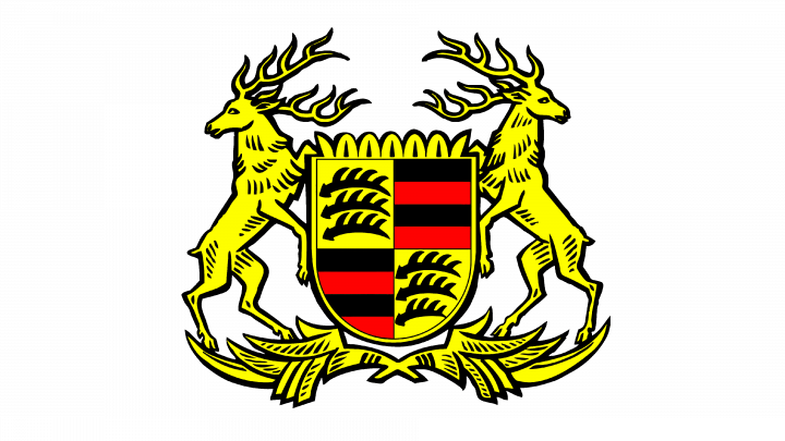
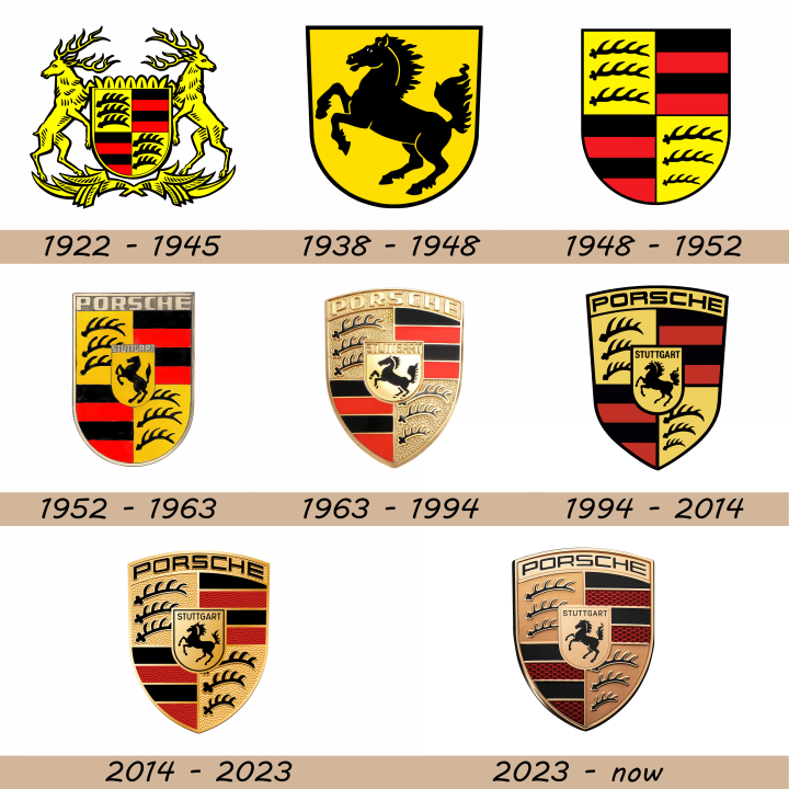
The Porsche logo derives from a heraldic image of two yellow deer standing on the sides from a coat of arms. The coat was styled as a shield divided in four sectors with Stuttgart city symbols on them – black sabers on the yellow background and striped black and red patterns.
1938 – 1948
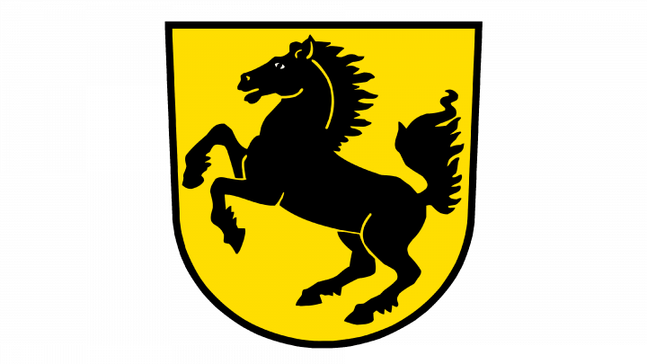
Soon, they pasted a black horse into a yellow shield outlined black.
1948 – 1952
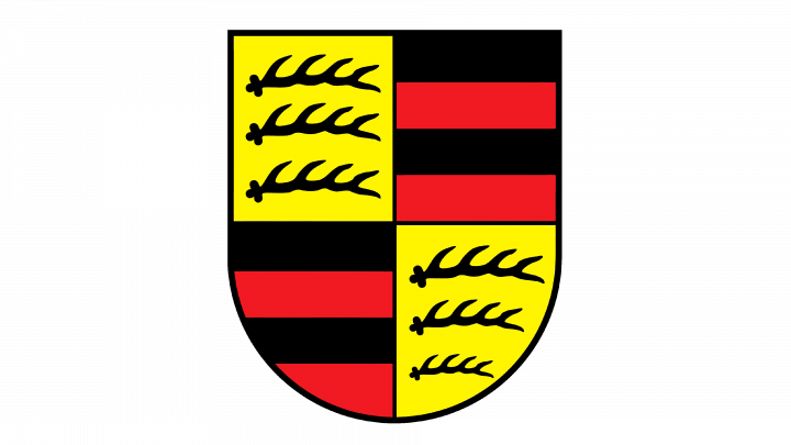
The 1948 Porsche watermark depicted just the familiar shield with traditional symbols of Stuttgart.
1952 – 1963
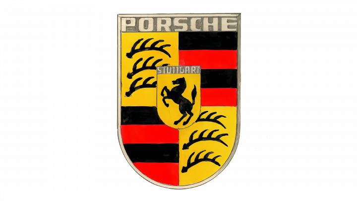
This logo showed the Stuttgart shield elongated and narrowed. It got a dark gray outline, at the top slightly turning into an area with the name. The name received a sans serif font with heavy, prominent letters. They incorporated a smaller shield colored yellow in the central part of the logo. On it, we can see a black horse. At the top, there was a stone-gray area with the ‘Stuttgart’ inscription of the same font as the company name.
1963 – 1994
They brought another shield, which had gotten a circular top and sharper lower part. The solid yellow and shades were removed. Now the shield was styled as there were many grains in zones colored yellow and red. All sectors of the shield got gradient golden borders. The shield itself got an outline as well. The ‘Porsche’ inscription got bold sans serif script with huge golden letters. The small shield turned from a yellow to a gradient golden. The name was written with a black sans serif typeface with uppercase letters. There was also a black outline for the whole shield.
1994 – 2014
The redesign of 1994 has introduced a bold yet flat version of the Porsche badge, with all golden shades replaced by flat yellow ones. The black outlines of all elements became thicker, and the “Porsche” uppercase inscription turned black. The refined badge started looking more brutal and powerful brilliantly reflecting the stability and professionalism of the iconic German automaker.
2014 – 2023
In 2014 the glossy golden shades came back to the primary Porsche badge, with the lettering staying black though. The surface of the golden elements got a grainy texture, which created more volume in the composition, and added distinction to the contours of the smaller elements, placed on the golden background.
2023 – now
Despite minor improvements done in honor of the anniversary, the company says it took about three years to create the new design. An updated version of the logo first introduced in 1952 features a brushed metal finish and a modern honeycomb design inside red stripes. The prancing horse was also slightly redrawn.
Description
The Porsche Company logo depicts a crest bearing the following information: black and red stripes and antlers are symbols of the German region of Baden-Württemberg, the inscription «Porsche» and prancing stallion on the logo reminded that native Stuttgart brand was created as a horse farm in 950. The author was Franz Xaver Raymshpiss. The logo was adopted in 1952, when the brand came to the US market, for better recognition. Previously just the inscription «Porsche» was on the hoods of the cars.
Shape
Manufacturer’s logo symbolizes a crest of Stuttgart, a town located in south Germany which was founded on a stud ranch. As a result, the prancing horse is one of the most important elements of the logo. In addition, red-and-black stripes and antlers are the other fundamental components of the coat of arms of the Württemberg Kingdom. The logo has a shape of a crest that featured the iconic traditions of Württemberg-Baden.
Color
The logo consists of state colors and stylized antlers. The state colors are red and black. Porsche intended to give a rich due to Swabia, Porsche family’s second place of residence. The central part of the crest hole a black horse headlong on a yellow coat of arms, which symbolizes forward putting power and the distinguishing seal of Stuttgart. This city was founded in 950 as stud farm “stuotgarten”, featuring horses on its official crest since the 13th century.
Emblem
Official Porsche website: www.porsche.com
Read Also: German Car Brands
