Rolls-Royce Logo
![]() Rolls-Royce Logo PNG
Rolls-Royce Logo PNG
Rolls-Royce is a true legend in the automotive world. In total, a little over 20 models of this car were released over the long history of the brand, which is very different from the speed with which other well-known car brands release new models. However, Rolls-Royce has never pursued quantity at the expense of quality. The brand was primarily associated with prestige, and this continues until today. Therefore, the company always tries to bring each model to perfection. The luxury brand still inherits the traditional approach to the production of its cars. That is why Rolls-Royce cars are still assembled by hand. This guarantees the unique quality of its automobiles. The only automated process in the entire production procedure is body painting.
Meaning and History
![]()
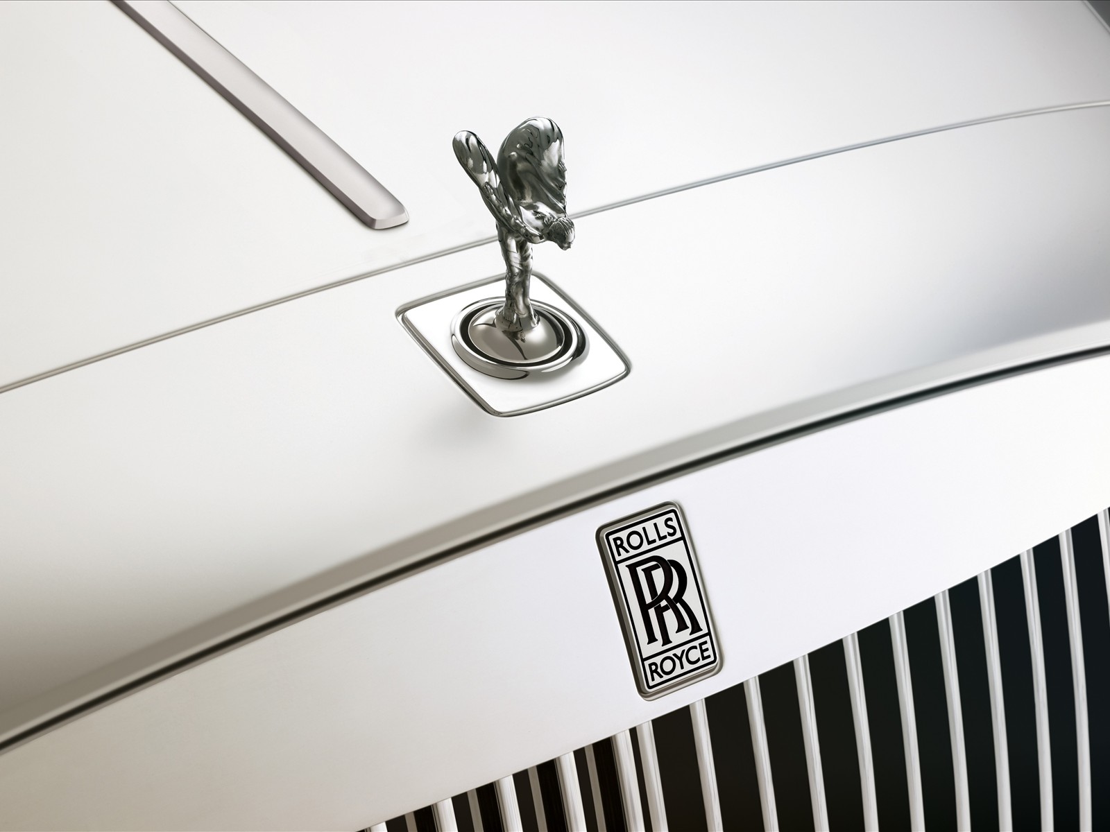
Aside from the logo depicting two R and Rolls-Royce lettering, the cars of this manufacturer are also decorated with the famous Spirit of Ecstasy. This sign is the bonnet decoration on Rolls-Royce vehicles. It represents the figure of a woman inclining forwards with the arms outstretched back from and above her. Rolling cloth runs from the woman’s arms to her behind, resembling wings. This symbol means the spirit of this car, namely, speed with absence of vibration, silence, and the mysterious harness of great force and a beautiful alive organism of superb plenty.
All the vehicles from this manufacturer carry a hood decoration, a gorgeous woman rolling forwards, with the hands outstretched back from and above of. Such elegant and expensive symbol is called the beautiful “Spirit of Ecstasy”.
This woman bears with her, special piece of headland from her hands to her back which is symbolic of wings. The famous Spirit of Ecstasy that is well-known is referred to debonair names as Silver Lady, the Flying Lady or Emily. This glory of carmaker heritage holds a mysterious passion between the notable Lord of Beaulieu, a wealthy person and his secret inamorata – the model for this emblem. Her name is Eleanor Velasco Thornton. She belonged to a lower social and wealthy status which became a hindrance to the great love that is why their relationship remained hidden some time. The lord, by name John Walter ultimately finished succumbing to family tensions and marrying Lady by name Cecil Victoria Constance, however his secret love continued. Eleanor tragically died in December in 1915 in a crash of the ship while accompanying her lord to India. Four years later, this Lord immortalized their tragically love by unveiling Spirit of Ecstasy as a sign of their great passion and love.
1906 – 1934
![]()
The original Rolls Royce logo depicted an extensive crest in a form of the shield. There was a laurel wreath image beneath it, a lion statuette on top, as well as several different patterns inside. The very center of the shield included a small vertical rectangle. Its top and bottom were given over to the words ‘Rolls’ & ‘Royce’ respectively, written in tall serif letters. The bottom was occupied by an emblem that depicted two capitalized ‘R’ letters. The patterns around this badge depicted a sea horse, a lion, their ‘Spirit of Ecstasy’ mascot and a bird.
1911 – 1934
![]()
It was essentially a simpler logo with the same elements. The rectangular badge was still in the middle, with two lions on the sides, a big triangle behind and a combination of ribbons and rose imagery. Onto a curved bottom ribbon, they placed the motto ‘the best car in the world’ in big black letters. The bird and laurel imagery was also present on the logo.
1911 – 1973
![]()
There’s an even simpler emblem, adopted around the same time. It included a vertical oval in the center, and here you can clearly see the combination of capital ‘R’ letters. They seem intertwined, although in this version they are slightly further apart than before. All around it was a vague ornamental shape that looked like a square-like plate with curls all over it.
1911 – 2020
![]()
This was their most enduring logo. It depicts their mascot of ‘the Spirit of Ecstasy’, which is a heavily veiled woman with her hands from back. It uses a white-and-blue color scheme and placed onto a grey figure that resembled a square with two curved sides. The Spirit was also used as a hood statuette for a very long time, among other things.
1973 – 1998
![]()
The new 1973 emblem depicted a tall rectangular figure with rounded corners and a dark blue coloring. Inside, they put the same two ‘R’ letters as the earliest logos had. They are intertwined and colored in silvery-grey. Also, both are encased in thin blue contours. The font for these letters is a smooth, elegant serif.
1998 – 2020
![]()
This emblem is very similar to the badges in the centers of the earliest logotypes. It’s a tall rectangular shape of a metallic grey color. The same combination of letters is placed in the middle, except now they are black. The ‘Rolls’ is written above it is a specifically contoured section. The ‘Royce’ is written the same way in the bottom. The font was a basic thin sans-serif.
2020 – today
![]()
The 2020 emblem is the same combination of two letters, as seen in the middle of the previous logo. They are just two black ‘R’ characters with slight black contours, and nothing else.
Description
Rolls-Royce Limited possesses a uniquely designed emblem, which elegantly reflects the company’s power and strength. The Rolls-Royce sign consists of two letters “R”, representatives of Royce and Rolls, the masterminds behind their successful brand. The manufacturer’s name “Rolls-Royce” became inscribed with a jerk in between, which represents the strong bond among the founders. Even despite the logo depicts simplicity with light modernism; it has founded the strongest and memorable symbol of all time.
Shape
This manufacturer’s sign has a rectangular form with curved edges that looks professional and sophisticated. The company title is enclosed within the rectangular shape, attaching it a symmetrical and realistic look. The framework of logo possesses three divisions; the first being in the center and larger, while others are similar in size and smaller. The font utilized in Rolls-Royce symbol is stylish and simple. The logo includes two “R”s, near the company name in innovative and unique style. The lower and the upper segments contain the name Rolls-Royce, whereas the center contains 2 “R”s that are closed together to make a vivid impression.
Color
Blue color of this symbol projects the goodwill and boldness. The using of blue color stands for class, grace and excellence of the company, while the white color reflects elegance, purity and nobility. Simplicity is the main quality of the logo. Dull blue hue shapes the logo look astonishing and prominent, consequently representing the exclusive image of Rolls-Royce.
Emblem
Official Rolls-Royce website: www.rolls-roycemotorcars.com
Read Also: All british car brands.


-
 Taiwan car brands
-
 Romanian car brands
-
 Czech car brands
-
 Spanish car brands
-
 Dutch car brands
-
 Indian Car Brands
-
 Canadian Car Brands
-
 Russian Car Brands
-
 Swedish Car Brands
-
 Italian Car Brands
-
 American Car Brands
-
 Japanese Car Brands
-
 European Car Brands
-
 Chinese Car Brands
-
 Korean Car Brands
-
 Australian Car Brands
-
 British Car Brands
-
 French Car Brands
-
 German Car Brands