Saleen Logo
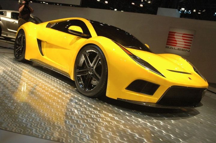
While bigger brands create thousands of cars each year, some smaller manufacturers choose to focus on quality rather than numbers. Saleen is one of such companies, and this policy suits them well because they are mostly just developing racing cars. Their assortment includes one-offs, modifications, as well as some wild concepts.
Meaning and History
Boringly, Saleen brand has two elements that a lot of other brands also use. Their name is derived from the surname of their founder, Steve Saleen in this instance. Secondly, their logo is mostly just their name. The company exists since 1983, and they never changed this design, nor do they seemingly need to.
1983 – now
Most of the space dedicated to their corporate logo is occupied by a large black word ‘Saleen’. The letters are a combination of multiple straight lines (as straight as possible), so even the A letter is just a triangle. Most of them also have square proportions, which could be the intentional hint that they know geometry.
There is also an emblem above this writing that the company sometimes uses standalone. Generally, it’s a red square figure made up from 6 piston-like images with thin shafts in the middle. The wavy space in the center is most likely just an artistic choice to make the emblem more attractive.
Symbol and Emblem
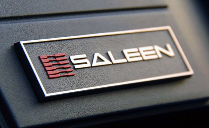
As for the car decoration, Saleen gives a little badge to most of their cars. It depicts the same images as the logo, but the background is black and the writing (now white) is much smaller. On specific occasions, their cars may wear the logos from different companies or no logos at all if the model is created in partnership or as a one-off.
The Legends
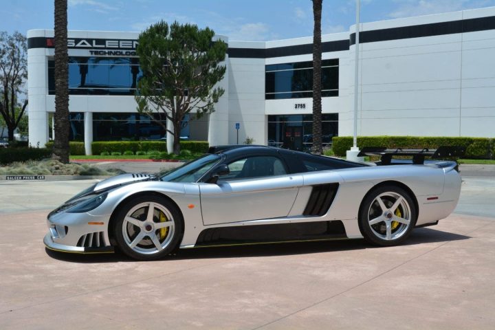
Saleen mostly creates sports cars and tests them on race treks, but they aren’t cheap or mass produced, so not many people know about them. S7 is an iconic Saleen model which amalgamates most of the characteristics these cars are known for – speed, good design and luxury.

