Saturn Logo
Saturn is the name of the General Motors Company subdivision, created in 1985 and discontinued in 2010. The idea behind the brand was to build a different management system, and the branch was privately owned by its employees.
Meaning and history
The GMC subdivision was on the American market for only 25 years, and during all this time it used only one logo, created in the middle of the 1980s. In the 2000s the image gained three-dimensional contours, but the color palette and the design concept have never been changed.
The main idea behind the label’s logo was a simple graphical representation of one of the solar system’s planets, Saturn. Though red color is usually associated with Mars, the contours of the car brand’s logo repeat the shape and the orbit of the Saturn, and the creative color palette elevated the whole picture, making it sleek and stylish.
Emblem
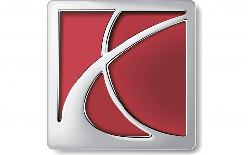
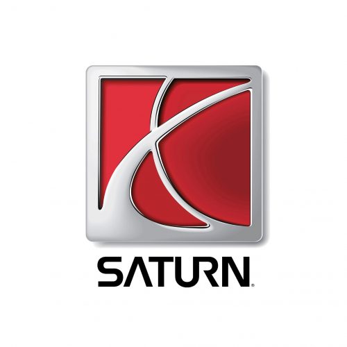
The Saturn logo was composed of a clean solid square in a silver frame. The main background color was scarlet red, which created a chic and bright contrast with the glossy metallic details of the badge.
Two smooth silver curves, placed on a red background and merging with the thick frame, represent the planet, resembling the letter “X”.
The emblem was usually accompanied by a custom sans-serif wordmark in black, which was placed on the right. The main feature of the inscription was in its letters “U” and “R”, which were connected, and the “A” where the horizontal bar was missing. All these details evoke a futuristic sense, making the brand’s visual identity even more related to its “space” naming.
The silver and red Saturn symbol is a brilliant example of contemporary design and a minimalist approach in art. It is simple, clean, yet extremely elegant and memorable. Though the planet Saturn is always depicted in yellow shades, the company’s symbol in red looks distinctive and powerful, representing the passion and energy of the brand, and its determination.
Symbol
Of course, the planetary explanation is the first that comes in mind when seeing the name of the brand and looking at its logo, but there is actually one more meaning for Saturn. It was the name of the NASA rockets from the 1960s, and the smooth “X” from the Saturn symbol also can be read as a rocket orbit.


