Scion Logo
Scion is the name of a discontinued Toyota subdivision, which was established in 2003 and existed until 2016. The branch mainly focused on the production of low-bushes small vehicles and worked in the North America region.
Meaning and history
The Japanese car brand, oriented in the American market, only existed for 13 years, but it didn’t die, it just turned into Toyota in 2016, keeping some of the Scion car models being produced under the new name.
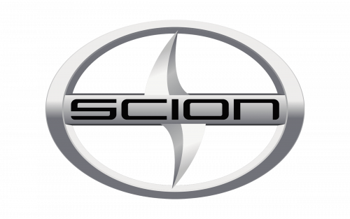
During the brand’s short history, there was only one logo designed for it, and despite its simplicity, it was a very modern and sharp insignia, with a strong character.
The logo was executed in silver and black, it featured an oval shape, which looked brilliantly on bonnets and grills of the Scion cars. There was something very powerful in that minimalist badge, and the clean sans-serif wordmark, which was placed in the middle of the oval.
Emblem
The three-dimensional oval frame was horizontally divided into two equal parts by the silver-gray plate with black lettering on it. It could be just another ordinary car logo, if not the thick sharp curve, going vertically through the middle of the oval.
The line can be read as a stylized letter “S”, which elevated the logo, accenting on the brand’s name and its strong character and edgy approach to design and manufacturing.
As for the color palette of the Scion emblem, it is a traditional silver metallic, which suits any color of the car, adding elegance and style, plus it works truly great with the sharp “S”, reflecting progress and movement to the future.
Symbol
The vertical line, crossing the nameplate and enclosed into an oval actually resembles many things. Starting with the letter “S”, or a wide road into tomorrow. It also looks like a sharp blade of ninja weapon or the shark’s fin.
Scion made the simple things work together as a very interesting composition, with many possible meanings, and this is what makes the brand’s symbol memorable and recognizable even today, after the discontinuation of the label.
