TVR Logo
![]() TVR Logo PNG
TVR Logo PNG
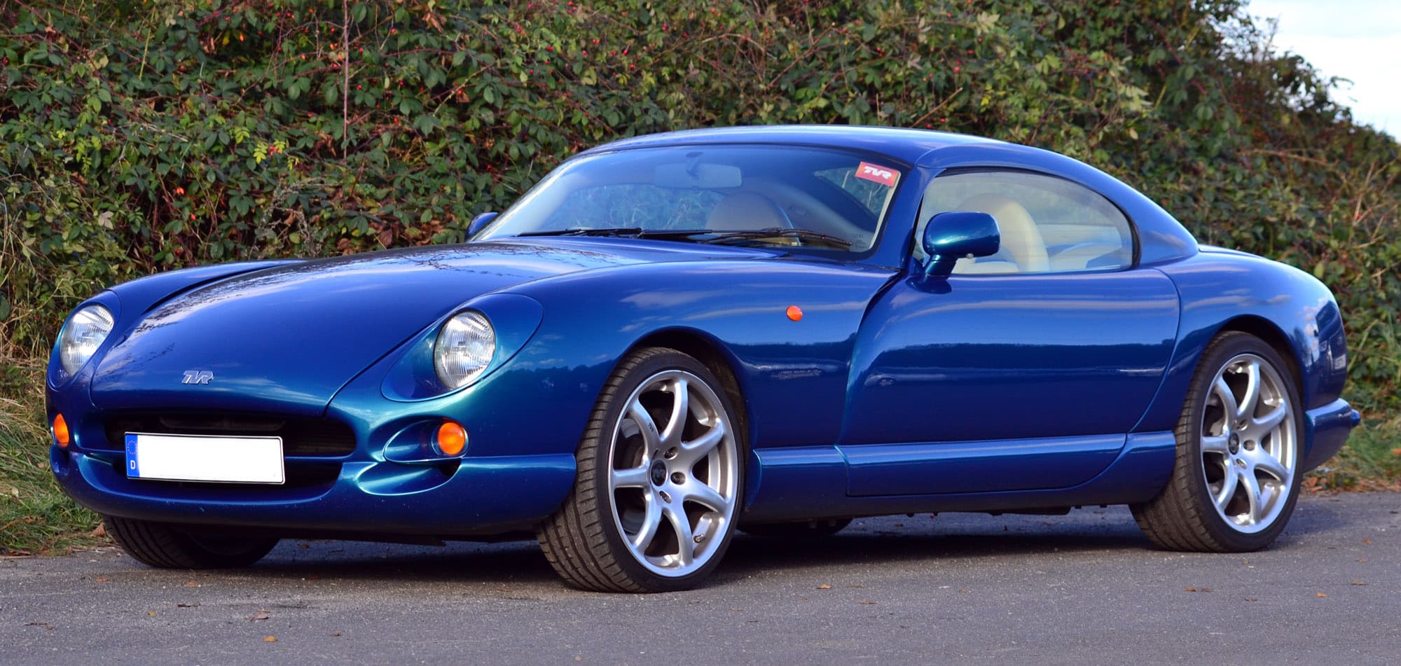
TVR is a fairly old company, although it’s not known to anyone besides the Brits. It’s been founded in 1946 at Lancashire. Given their usual product assortment – high quality sports cars – they have been competing with the leaders of the industry like Aston Martin, McLaren and other British titans. Unlike them, TVR are focused on home market.
Meaning and History
![]()
Their emblem simply depicts their name in big letters, and it’s probably been like that since the beginning. However, there is no clear evidence of their earlier logos, nor do we know when the current design first surfaced. As for the name, the meaning behind it is simple, almost comical – the founder’s name was Trevor (TreVoR).
1946 – 1961
![]()
The first brand logotype is a black triangle with white-and-black outline. In the center of the triangle, there was an oval with three lines. The brand name was located inside this oval. The inscription consisted of ‘T’ and ‘R’ letters with and a ‘V’, incorporated into the oval and having four lines styled as wings. The letters were colored white, but ‘T’ and ‘R’ character had black outlines.
1961 – 2010
![]()
It’s unknown what logo the company had on its earlier stages. The cars from the 50s and 60s had different badges, but it’s not exactly the same. Somewhere in the second part of the 20th century, the bosses decided to adopt this design, and it stays even now.
The emblem depicts three big tilted letters comprised by a collection of horizontal black lines. Design-wise, they overlap one another – the right top corner of T is continued by the left top corner of V, while V and R share a vertical line.
This version also has a rich metallic filling behind the letters, but they got rid of it afterwards.
It’s known that this design was used as early as 60s, because there is evidence that their Tuscans and some late Granturas wore the badges with this style of abbreviation on their fronts.
2010 – 2017
![]()
Everything remained virtually the same on this stage of evolution, but they added a noticeable glint to the ‘metal’ covering in the back of the logo. As a result, it had a significant shade stretching out from the bottom, as well as a big glint on the left of most variations (an artistic decision). This logotype was often colored metal-gray and black, though there were many other variations.
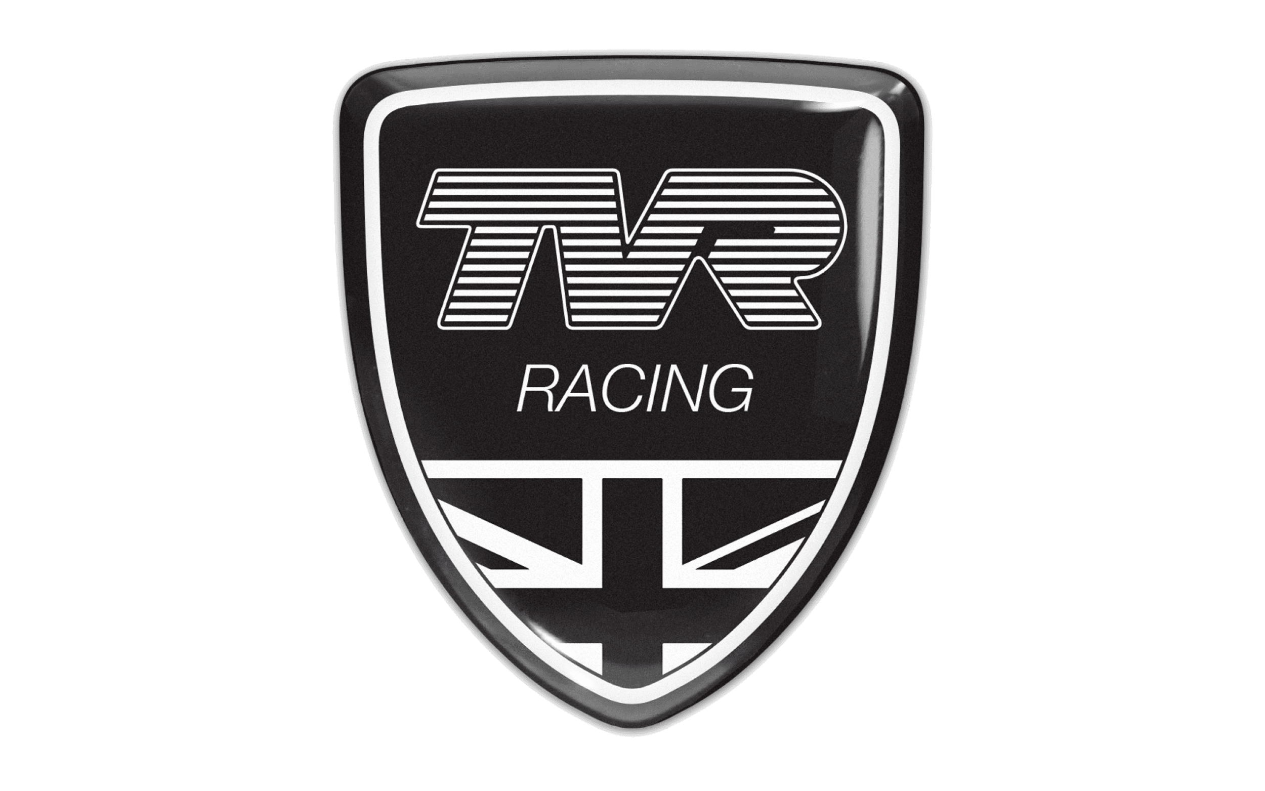
2017 – today
![]()
For this version, they just removed the filling with all its additional characteristics, so there are just the black lines now. The decision to do so is dictated mostly by today’s fashion rather than some rationalizing on the part of designers. Most other manufacturers also get rid of the 3D elements on their logos. Also, this logotype doesn’t have the background, so the simple black lines look minimalistic and gorgeous.
Emblem and Symbol
The history of the official TVR emblem is covered in mystery, but from the older photos we can see the earlier version of the TVR car badges that early Grantura models wore. They were triangles with a TVR abbreviation in the middle and some wing imagery that resembled both V and T. So, the current logo design was probably adopted in mid 60s.
The Legends
The old TVR models are a stable source of interest for British collectors as well as usual car enthusiasts. They are especially attracted by the old Grantura model, whose modifications spanned across the 60s.

Then there are also the M-series (1600M, 2500M, 3000M, Taimar, and so on), which are the same small brisk sports cars as Granturas, but faster and created throughout the 70s.


-
 Taiwan car brands
-
 Romanian car brands
-
 Czech car brands
-
 Spanish car brands
-
 Dutch car brands
-
 Indian Car Brands
-
 Canadian Car Brands
-
 Russian Car Brands
-
 Swedish Car Brands
-
 Italian Car Brands
-
 American Car Brands
-
 Japanese Car Brands
-
 European Car Brands
-
 Chinese Car Brands
-
 Korean Car Brands
-
 Australian Car Brands
-
 British Car Brands
-
 French Car Brands
-
 German Car Brands