Vauxhall Logo
![]() Vauxhall Logo PNG
Vauxhall Logo PNG
The history of Vauxhall counts more than 150 years, but they weren’t a successful automobile brand since the birth. At first, they made steam engines and other such parts for Thames-faring and seafaring. Their first enterprise was conveniently positioned for this job, being located in the Vauxhall region of London, hence the name.
Meaning and History
![]()
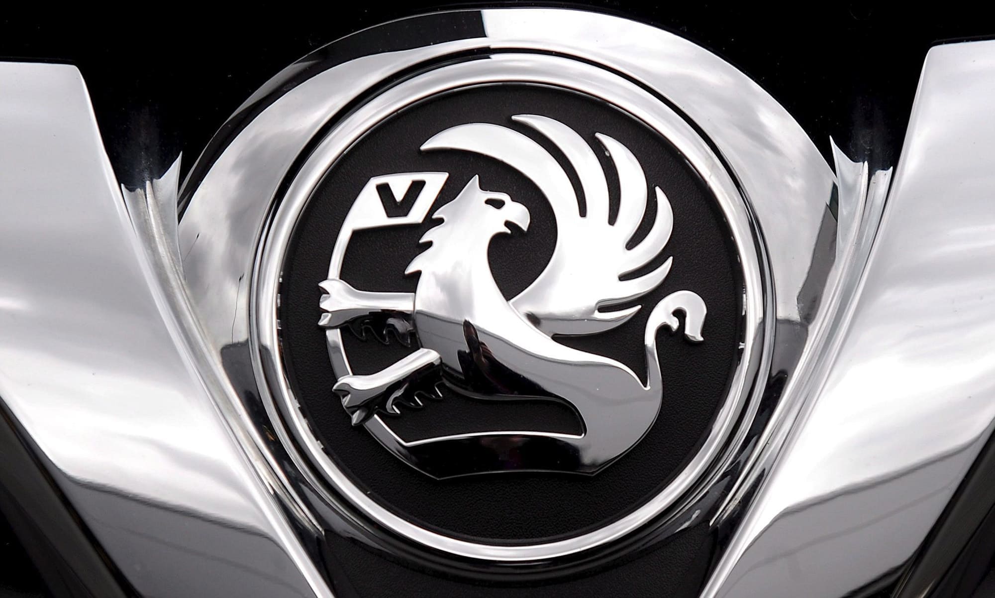
The brand is, of course, named Vauxhall after the area in Central London where first of their enterprises was opened in 1857. Even then, and up until 1983, they used a symbol of griffon as their emblem. The choice was mostly made because the historic owner of this land, Falkes de Breaute, used the same emblem.
1857 – 1983
![]()
Since its birth and for the following 126 years, the company had this logo. It was also this logo that they used when the company introduced their first car 1903. It depicted a griffon – a mythological animal that combines the features of a lion (torso, and rear paws) and an eagle (front legs, head, and wings).
The base of the logo is a black bar in the bottom of the emblem. The griffon stands on its rear paws, which are hidden somewhere beneath the right end. Its front limbs are snatching the flagpole that sticks out of the left end. The flagpole culminates in a square flag with the white V letter on it.
The animal is fairly detailed: they designed a lot of separate hairs, all the feathers are distinct, and there is a white eye on the head (turned right).
1983 – 1989
![]()
For this version, the logo was pretty much left as it was, albeit with less detail. It was inverted white and put into a vast red square with the word Vauxhall in white serif font right below the emblem itself. The square was further outlined in white and then by a thin grey line.
The animal experienced a minor change. Most details from the previous design were simplified, and the entire emblem was given an overall square shape. Furthermore, the V letter was disposed of, and the eyes of the griffon are barely visible.
1989 – 2003
![]()
In this version, the composition and the details were pretty much returned from the initial logo (except for the pike). However, the color palette remained the same as in 1983. Except, now the emblem isn’t located inside the square, but rather a circle – and its borders are much closer to the ends of the emblem.
To reflect this new shape, some elements were rounded – for instance, the flagpole was given a curve, and the feathers now extend over the griffin’s head, to the left.
The name was placed beneath the logo as a result of this overhaul. And it’s not white serif now, but a bunch of big black and simple letters, all in uppercase.
2003 – 2008
![]()
This version only used the emblem part without the text. In this one, the white parts were given a metal texture, which gave them a lot of volume. In addition, they introduced lighting, which made colors lighter the in the left top corner and created a big shade in the bottom right area.
2008 – 2021
![]()
In 2008, Vauxhall changed their logo once again. This time, the image of a griffin was enhanced and the circle now included only the head, the upper torso, the flag and the top-most feather. The metallic texture was given even more volume. It was now divided into many components with different tilts and shades.
2009 – 2011
![]()
The red elements were replaced with the black ones, and they encircled the entire emblem with a metal ring-like outline with the texture much like the griffin.
2011 – 2020
![]()
The text made a comeback, but the location was changed to the very top of the ring, with the letters standing along its curve. The font and the color (black) remained the same as in the 1989 version.
2020 – now
![]()
The newest version was severely simplified. It now has only two colors – the bright red one and the white inside. The metal parts (including the rings and the remaining griffin) are red, and the black background is white. In addition, the white is also now a color of the V letter (still there) and an eye.
The image was enhanced even more – the emblem only includes the flag itself and the head. The text is once more below the logo: the font and the size are virtually the same as 1989 variant, but the color has become dark blue rather than black.
Emblem and Symbol
The development of the official logotype happened behind the scene. In 2009-2020, the company used different emblems for their ads. They gradually distanced the design from the 2008 variant. So, the new logo is more or less built upon the three versions used for commercials, and not the previous version.
The Legends
Easily the most legendary Vauxhall car is Astra. It is a hugely successful family car produced by both Opel and Vauxhall since 1991. Of course, there are other candidates, like the VXR line (the high-performance modifications of Astra, Corsa and Insignia) that rocks the modern market, as well as many more models.


-
 Taiwan car brands
-
 Romanian car brands
-
 Czech car brands
-
 Spanish car brands
-
 Dutch car brands
-
 Indian Car Brands
-
 Canadian Car Brands
-
 Russian Car Brands
-
 Swedish Car Brands
-
 Italian Car Brands
-
 American Car Brands
-
 Japanese Car Brands
-
 European Car Brands
-
 Chinese Car Brands
-
 Korean Car Brands
-
 Australian Car Brands
-
 British Car Brands
-
 French Car Brands
-
 German Car Brands