Xpeng Logo
![]() Xpeng Logo PNG
Xpeng Logo PNG
Xpeng is a Chinese automaker, which specializes in the design and manufacturing of electric vehicles. The company, which is also known as Xiaopeng Motors, was established in 2014 by He Xiaopeng. Since its foundation, the company has introduced two models of electric cars — G3 SUV and P7 Sedan.
Meaning and history
![]()
The visual identity of a modern Chinese automakers looks strong and futuristic. Its logo, composed of an emblem and a wordmark, is minimalist yet futuristic and memorable.
Being a young company, Xpeng has already changed the typeface of its logo once, yet the concept and composition of its visual identity remained the same. The brand’s emblem, which is also used as the badge on the company’s cars, looks like a stylized letter “X” and replaces the first letter of the brand’s name.
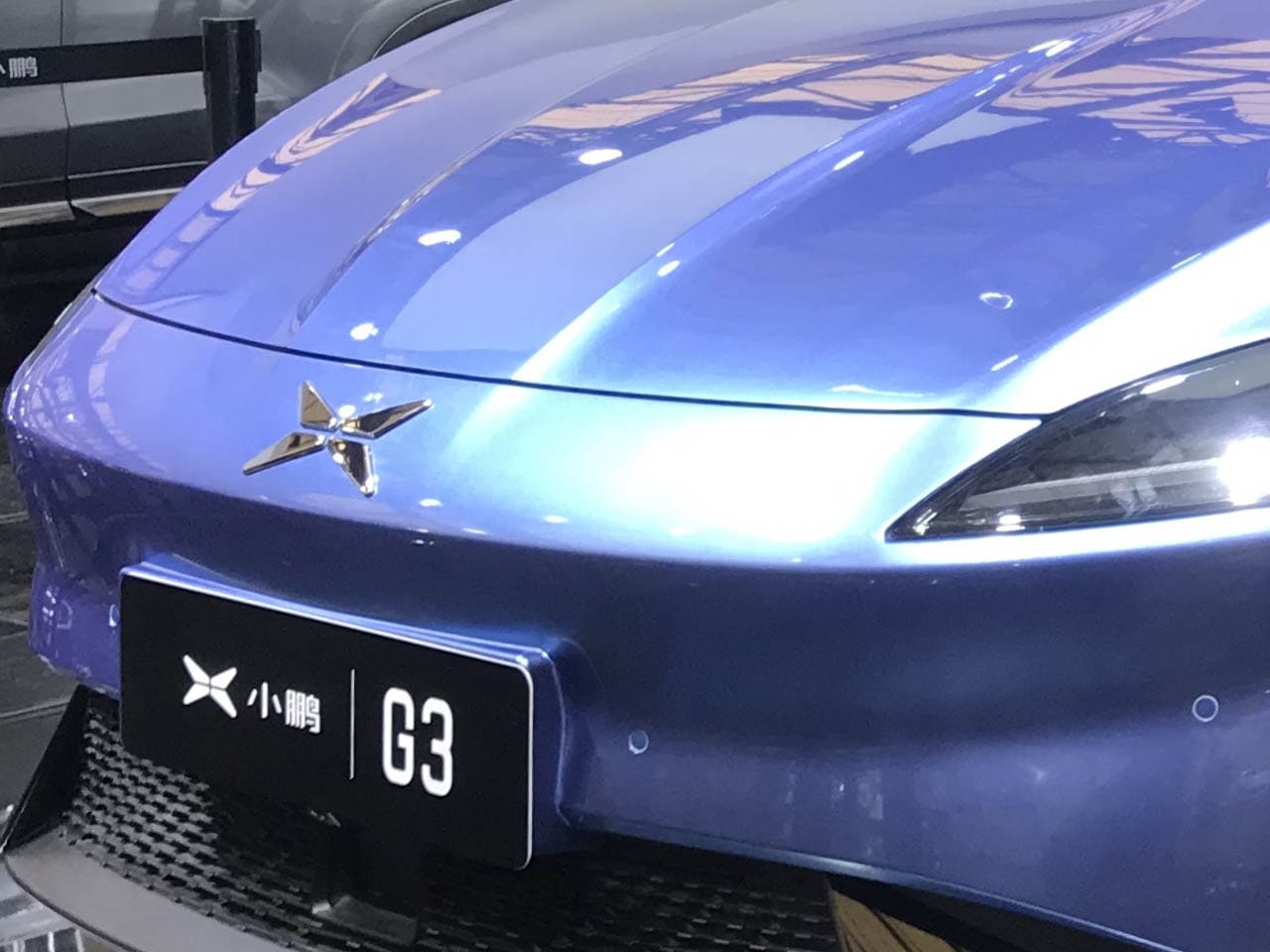
2014 – 2021
![]()
The signature “X” is composed of four equal parts, which form a thin stiff in the negative space. As for the edges, they are smooth and sleek, resembling a boomerang.
For printed documents and advertising the brand uses a two-dimensional version of the logo in monochrome or red, while when placed on the cars, the badge is executed in gray metallic and looks progressive and remarkable.
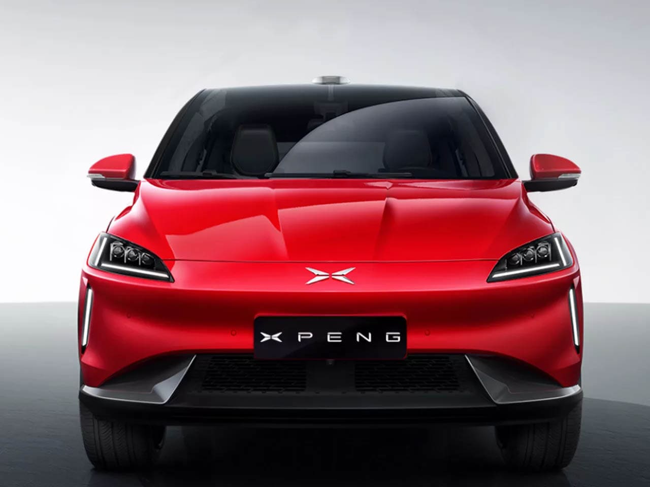
2021 – now
![]()
The black and white color combination is a traditional choice for any company, which wants to show its professionalism and reliability, while red symbolizes passion and energy, the qualities that characterize the Asian automaker at its best.
The simplicity of the Xpeng logo elevates it and makes the brand stand out. It perfectly represents the nature and essence of the company, accenting its attention to detail and value of style and comfort.

Font
The wordmark of the electric vehicles manufacturer is written in all capitals of a custom sans-serif typeface, which is based on a traditional geometric font but has its edges cut diagonally, which adds a sense of progress and innovations. Another unique detail of the inscription is the absence of the vertical bar in the upper part of the letter “P”. It evokes a sense of speed and motion.
As for the previous version of the company’s visual identity, the nameplate was executed in a smoother and more traditional sans-serif with delicate stencils and slightly arched sides of the letters.
![]()


-
 Taiwan car brands
-
 Romanian car brands
-
 Czech car brands
-
 Spanish car brands
-
 Dutch car brands
-
 Indian Car Brands
-
 Canadian Car Brands
-
 Russian Car Brands
-
 Swedish Car Brands
-
 Italian Car Brands
-
 American Car Brands
-
 Japanese Car Brands
-
 European Car Brands
-
 Chinese Car Brands
-
 Korean Car Brands
-
 Australian Car Brands
-
 British Car Brands
-
 French Car Brands
-
 German Car Brands