Mazda Logo
Mazda Motor Corporation is one of the best Japanese car brands of our time. Today, the concern has concentrated on creating just a few sedan models and a line of crossovers. The Japanese were among the first to be able to properly adapt to changes in demand for cars. In fact, the company has been the best at adapting to the interests of customers throughout the years. Mazda has established itself as a reputable brand, driven by its innovative developments and premium cars. The most surprising thing is that initially, the company had nothing to do with the production of cars since it originally manufactured products from the cork. The auto brand continues to develop and attracts attention with exquisite urban crossovers. The company is also planning to enter the premium market.
Meaning and History
Mazda was founded in 1920 in Hiroshima by Jujiro Matsuda and has gone through up and downs to become an established car manufacturer. In the first decades of the company’s life Mazda engineers were looking for opportunities to get recognition in automotive industry, yet it was not before 1960s that they decided to concentrate the efforts on alternative powerplants, namely the Wankel rotary engines. It proved to be a good idea as Mazda boosted the sales and expanded to foreign markets, including the North America.
However, as the oil crisis struck the automotive world in 1973, the demand in vehicles powered by rotary engines suffered a major decline due to poor fuel efficiency. That caused setback in Mazda expansion and the company was forced to sell a big stake to Ford Motor Company. The Japanese car manufacturer went on to engineer mass-market models but did not write off completely the idea to stand out with the Wankel engine-powered vehicles.
That resulted in building the legendary RX-7 model that became a favorite among professional and amateur racers. The company’s all-time bestsellers include Mazda 323, Mazda 626, Mazda Millenia, Mazda 3, Mazda 6. Mazda cars are known for high quality and exceptional driving experience, best tracked in sporty models, such as MX-5 Miata.
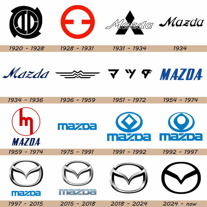
1920 – 1928
 The initial logo had a vaguely round shape. The borders consisted of four claw-like lines, fused into one blue ring. Inside were what seems to be two letters ‘D’, arranged in a mirrored pattern. They looked differently, and each had a cut in two different spots. These are supposed to be Japanese characters from the original native name.
1928 – 1931
 The next logo used a normal red ring instead. What’s more, there was an incomplete red line, stretching horizontally from side to side. Its middle section was missing. The rest of the inner area was white.
1931 – 1934
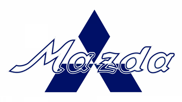 The 1931 logo used the ‘Mazda’ lettering, written in artistic, tilted letters. The borders were dark blue, but the rest was transparent. Behind it, designers put the contemporary Mitsubishi logo – three rhombs, joined in the middle. They also colored it dark blue, instead of the usual red. The presence of Mitsubishi symbols refers to the fact that this company was responsible for selling the Mazda trucks at the time.
1934
The very first logo used on Mazda vehicles was merely the company’s name written in specific font.
They scrapped the Mitsubishi symbol in 1934. It was now just the name writing in a very similar style, but colored black.
1934 – 1936
 After that, they decided to remodel the letters once more. They colored them dark blue and changed the font. The letters were now thinner, sharper and wavier, compared to the previous round, smooth characters.
1936 – 1959
The emblem, used from 1936 through 1962, became a true logo as it featured three M letters, placed above each other. They stood for Mazda Motor Manufacturer and symbolized the three mountains of Hiroshima.
The next design included three horizontal lines, located one beneath the other. They had the same boldness, but were of different length. Each of these broke into a letter ‘M’ in the middle, although they shrank in size closer to the bottom. The coloring was fully black.
1951 – 1972

This design was primarily used in home market. It depicted the name ‘Mazda’, but written in Japanese. As such, there were three black glyphs, situated some distance from one another. The style was abrupt and linear.
1954 – 1974

This international logo was adopted in 1954. It used a similar style to the 1951 logo, but in English and with taller letters. They were closer to one another, thin and just as abrupt. The coloring was blue for all of them.
1959 – 1974
It was later replaced with another stylized black M letter placed inside a circle.
This was an additional logo that used the same English brand name, but in dark blue and with an extra emblem. The emblem was much larger than the name bit, by comparison. It was located right above the former and included a red ring with a letter ‘M’ inside. It was a lowercase ‘M’, connected to the ring by two lines that extended up from its left side and down from its right side, respectively.
1975 – 1991
In 1975 Mazda started using the brand’s name as a logo again, but designed a custom font for that matter.
A new name look dropped in 1975. This time, they used a combination of mostly lowercase letters (save for the ‘D’, which looked uppercase but was the same size, for some reason). The letters were grouped very close together, fusing into one another. The color was a light blue. The font used simple, bold letters with square proportions.
1991 – 1992
In 1991 the company adopted a completely new emblem that represented a sun and a flame placed on red background.
A new emblem was added in addition to the name. Above it, there is now a blue ring with a rhomb shape inside. Further inside the rhomb, there is a similar white area. All of these lines grow smaller the higher up you go, creating a sense of perspective.
1992 – 1997
However, it resembled a diamond-shaped Renault logo and had to be updated soon. The sharp edges of the diamond, representing the flame, were smoothed, which made it look like the company’s trademark rotary engine.
In 1992, the rhomb was replaced with a diamond shape (an ellipse with pointed tips). The hollow space inside the figure is now round, for its part. The border around were also thinned out even further.
1997 – 2015
Yet that logo did not stand long as five years later the new one was introduced. It was a stylized M letter inside an oval shape, representing the company and the sun. It also looks like stretched wings, symbolizing the brand’s philosophy of aspiring to the future and freedom of expression. The logo is accompanied with the brand’s name right below it, written in blue letters and copying the logo from 1970s and 1980s. This elegant emblem has been used ever since and has taken the Japanese brand to new heights.
2015 – 2018
Only the name bit changed in 2015. It’s a very similar design, but with a few modifications. They increased the entire thing in size, added a bit of width and placed the letters slightly apart. As for the coloring, they turned a metallic grey with a good deal of shading. The blue persisted in the form of thin borders surrounding the letters.
2018 – 2024
The entire logo seems even more chromed in this version. They added more shading and lighting and made these effects more pronounced. That includes the letters, as well. Lastly, the blue borders around them turned black.
2024 – Today
Following the global trend for simplification, the Mazda company introduced its new badge in 2024. The iconic bird-like emblem inscribed into an oval frame was redrawn in a black-and-white color palette, removing all the gradients and volumes. However, the contours of the logo remained the same, but their perception has changed, and now the image evokes such feelings as confidence, progress, and power.
Description
Throughout the history Mazda has had several major redesigns of the logo in search of the one that would best represent the brand’s identity on global market. The current Mazda emblem is designed in silver color and features an effective stylized M letter, looking like a pair of stretched wings.
This image is embedded into an oval-shaped figure and completed with the company’s name below, printed in custom font in blue letters.
Shape
Mazda logo officially represents the deeply stylized first letter of the brand’s name, but its shape is widely recognized as a 3D-model of stretched wings, placed inside an oval. Many people also note that the shape of Mazda emblem resembles an owl, however, this has nothing to do with the company’s symbolism.
Color
Like most modern car emblems, Mazda logo is designed in several hues of silver color and features black shades. The Mazda inscription below the logo is made in trademark blue color.
Emblem
Official Mazda website: www.mazda.com
