Volkswagen Logo
Volkswagen Logo PNG
Meaning and History
Volkswagen is one of the global leaders in automotive industry and the largest European car manufacturer. However, the company’s history is not as long as one might think and dates back to 1930s, when Germany government was looking for an affordable family car to satisfy the needs of the people. The concept of what later became the legendary Beetle was introduced by Ferdinand Porsche before World War II, but the new auto manufacturer, called Volkswagen, or The People’s Car, was only established in 1946.
The company became the symbol of the German post-war restoration and the budget Volkswagen Beetle became a major commercial hit both in Europe and across the ocean and beat the Ford Model T’s sales record, selling over 15 million units by 1972 and 21 million overall. The company, headquartered in Wolfsburg, the town especially built to serve the factory, went on to launch other bestselling models, such as Polo, Golf and Passat. Volkswagen is also successful in commercial transport, SUV and small city car segments. The company currently owns such brands as Audi, Skoda, SEAT, Lamborghini, Bentley, Bugatti, Ducati and Scania.
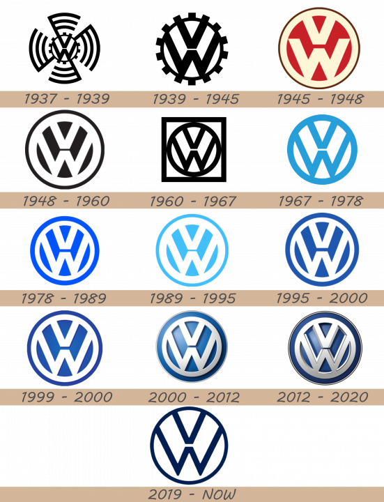
1937 – 1939
Volkswagen’s very first logo featured a VW inscription and the black symbol, inspired by the Nazi livery.
Every part of the symbol had three lines. The lines were drawn in the way so the whole logo looked like a big circle. The central part of the livery was styled as a gear, inside which we can see the VW symbol, split by a small white gap in two letters. The symbol didn’t have any background, so the logotype was easy to use in various situations.
1939 – 1945
However, the latter was omitted once the War was over and the VW sign was embedded into a black circle. This circle was even more alike gear than it was previously.
1945 – 1948
 After the war, Volkswagen had to rebrand. The letters in their fresh logotype became smaller and also were recolored beige. The space between them became bright red. There was also an outline, one of which was the same color as letters, while another was brawn.
1948 – 1960
 In 1948, the brand designers changed the color palette from red-beige & brawn to a simple black-and-white.
1960 – 1967
 The following logotype consists of the 1948 emblem embedded into a square.
1967 – 1978
In 1967 the emblem received a new color scheme as black was replaced with light blue, creating a friendly global image.
1978 – 1989
In 1978 another change in occurred as the logo colors were inverted. The VW letters became white and were placed on blue background. The blue part of the logo became a bit darker than it was previously, but still reflected the global image of the company.
1989 – 1995

The 1989 version of the logotype depicts the bright blue and white watermark.
1995 – 2000
In 1995 the blue color became deeper, while the latest update saw the logo acquire 3D-shades and silver hues. Remarkably, the VW sign itself has virtually remained intact since the 1930s. Today it symbolizes the German technical excellence and commercial success throughout the world. The 1995 VW logo color palette was something middle between the black variant of 1948 and bright one of 1989.
1999 – 2000

2000 – 2012
 The following watermark depicted the familiar elements as previously, but this time the small blue lines were turned to shadows from the letters. The colors of the logo became metal-white and metal-blue, and the logo itself was getting darker from one angle to another, like it was shined with a flashlight. Also, there was a thing gray outline of the whole logo.
2012 – 2020

2020 – today
In 2020, the brand designers decided to completely change the logo style. They removed all of the contours and colored lines and saved the simple deep blue letters incorporated into the same colored circle. The background was white.
Description
Volkswagen emblem is a very memorable combination of silver V and W letters, the company’s name initials, the former placed above the latter. This symbol, embedded into a silver circle, is designed on blue background.
This logo has decorated Volkswagen vehicles from the very roots of the brand and has become the proud representation of one of the global leaders in automotive industry.
Shape
The configuration of The V and W letters is designed in exquisitely stylish way. At the same, it looks as a precise mechanism, highlighting the German technical traditions. The VW symbol is encompassed by a perfect circle, completing the sharp logo.
Color
Today Volkswagen’s emblem is closely associated with blue, white and silver colors. The present logo was adopted in 2000. However, upon the company’s launch, the logo used to be black. It was in 1960s that Volkswagen decided to switch from black to light blue palette in order to create a more friendly image of the brand.
Emblem
Official Volkswagen website: volkswagen.com

